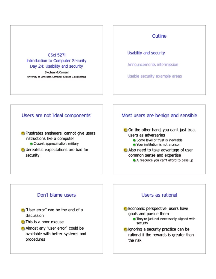

Outline Usability and security CSci 5271 Introduction to Computer Security Announcements intermission Day 24: Usability and security Stephen McCamant Usable security example areas University of Minnesota, Computer Science & Engineering Users are not ‘ideal components’ Most users are benign and sensible On the other hand, you can’t just treat Frustrates engineers: cannot give users users as adversaries instructions like a computer Some level of trust is inevitable Closest approximation: military Your institution is not a prison Unrealistic expectations are bad for Also need to take advantage of user security common sense and expertise A resource you can’t afford to pass up Don’t blame users Users as rational Economic perspective: users have “User error” can be the end of a goals and pursue them discussion They’re just not necessarily aligned with This is a poor excuse security Almost any “user error” could be Ignoring a security practice can be avoidable with better systems and rational if the rewards is greater than procedures the risk
Perspectives from psychology User attention is a resource Users become habituated to Users have limited attention to devote experiences and processes to security Learn “skill” of clicking OK in dialog boxes Exaggeration: treat as fixed Heuristic factors affect perception of If you waste attention on unimportant risk things, it won’t be available when you Level of control, salience of examples need it Social pressures can override security Fable of the boy who cried wolf rules “Social engineering” attacks Research: ecological validity Research: deception and ethics User behavior with respect to security Have to be very careful about ethics of is hard to study experiments with human subjects Experimental settings are not like real Enforced by institutional review systems situations When is it acceptable to deceive Subjects often: subjects? Have little really at stake Many security problems naturally include Expect experimenters will protect them deception Do what seems socially acceptable Do what they think the experimenters want Outline Note to early readers Usability and security This is the section of the slides most likely to change in the final version Announcements intermission If class has already happened, make sure you have the latest slides for Usable security example areas announcements
Outline Email encryption Technology became available with PGP in the early 90s Usability and security Classic depressing study: “Why Johnny can’t encrypt: a usability evaluation of Announcements intermission PGP 5.0” (USENIX Security 1999) Usable security example areas Still an open “challenge problem” Also some other non-UI difficulties: adoption, govt. policy Phishing Phishing defenses Educate users to pay attention to ❳ : Attacker sends email appearing to Spelling ✦ copy from real emails come from an institution you trust URL ✦ homograph attacks SSL “lock” icon ✦ fake lock icon, or Links to web site where you type your SSL-hosted attack password, etc. Extended validation (green bar) Spear phishing : individually targeted, certificates can be much more effective Phishing URL blacklists SSL warnings: prevalence Older SSL warning Browsers will warn on SSL certificate problems In the wild, most are false positives ❢♦♦✳❝♦♠ vs. ✇✇✇✳❢♦♦✳❝♦♠ Recently expired Technical problems with validation Self-signed certificates (HA2) Classic warning-fatigue danger
SSL warnings: effectiveness Modern Firefox warning Early warnings fared very poorly in lab settings Recent browsers have a new generation of designs: Harder to click through mindlessly Persistent storage of exceptions Recent telemetry study: they work pretty well Modern Firefox warning (2) Modern Firefox warning (3) Spam-advertised purchases Advance fee fraud “Replica” Rolex watches, herbal “Why do Nigerian Scammers say they ❱✦❅❣r❅ , etc. are from Nigeria?” (Herley, WEIS 2012) This business is clearly unscrupulous; if Short answer: false positives I pay, will I get anything at all? Sending spam is cheap Empirical answer: yes, almost always But, luring victims is expensive Scammer wants to minimize victims who Not a scam, a black market respond but ultimately don’t pay Importance of credit-card bank relationships
Trusted UI Smartphone app permissions Smartphone OSes have more Tricky to ask users to make trust fine-grained per-application permissions decisions based on UI appearance Access to GPS, microphone Lock icon in browser, etc. Access to address book Attacking code can draw lookalike Make calls indicators Phone also has more tempting targets Lock favicon Users install more apps from small Picture-in-picture attack providers Permissions manifest Time-of-use checks Android approach: present listed of iOS approach: for narrower set of requested permissions at install time permissions, ask on each use Can be hard question to answer Proper context makes decisions clearer hypothetically But, have to avoid asking about Users may have hard time understanding common things implications iOS app store is also more closely User choices seem to put low value on curated privacy Trusted UI for privileged actions Trusted UI works better when asking permission (e.g., Oakland’12) Say, “take picture” button in phone app Requested by app Drawn and interpreted by OS OS well positioned to be sure click is real Little value to attacker in drawing fake button
Recommend
More recommend