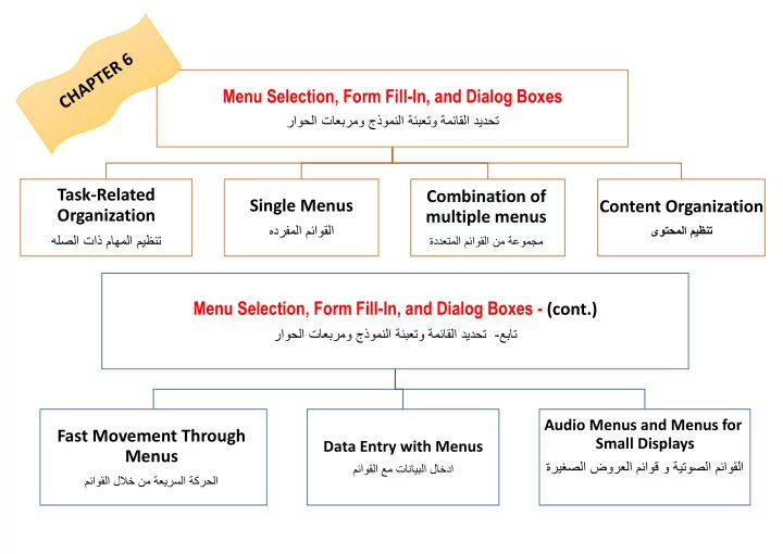

Menu Selection, Form Fill-In, and Dialog Boxes راوحلا تاعبرمو جذومنلا ةئبعتو ةمئاقلا ديدحت Task-Related Combination of Single Menus Content Organization Organization multiple menus هدرفملا مئاوقلا ىوتحملا ميظنت هلصلا تاذ ماهملا ميظنت ةددعتملا مئاوقلا نم ةعومجم Menu Selection, Form Fill-In, and Dialog Boxes - (cont.) عبات-راوحلا تاعبرمو جذومنلا ةئبعتو ةمئاقلا ديدحت Audio Menus and Menus for Fast Movement Through Small Displays Data Entry with Menus Menus صلا ضورعلا مئاوق و ةيتوصلا مئاوقلاةريغ مئاوقلا عم تانايبلا لاخدا مئاوقلا للبخ نم ةعيرسلا ةكرحلا
Task-Related Organization The primary goal for menu, form fill-in, and dialog-box designers is to create a sensible, comprehensible, memorable, and convenient organization relevant to the user's task."
Mnemonic letters - Radio Buttons - Button Choice Binary Menus Pull-down menus Always available to the user by making selections on a top menu bar Pull-down menus (cont.) Key board shortcuts Pull-down, pop-up, and toolbar E.g., Ctrl-C important to support expert user efficiency menus Toolbars, iconic menus, and palletes Offers actions on a displayed object Pop-up menus Appear on a display in response to a check or tap with a pointing device. Multiple-item Menus Scrolling menus, combo boxes, and fisheye menus - Scrolling menus display the first portion of the menu and an additional menu item, typically an arrow that Multiple-selection menus Single Menus leads to the next set of items in the menu sequence. or check boxes - Combo boxes combine a scrolling menu with a text-entry filed. هدرفملا مئاوقلا - Fisheye menus display all of the menu items on the screen at once, but show only items near the cursor at full size. Sliders and alphasliders - When items consist of ranges or numerical values, a slider is a natural choice to allow the selection of a value. - The alphaslider uses multiple levels of granularity in moving the slider thumb and therefore can support tens Menus for long lists or hundreds of thousand of items. Two-dimensional menus “ Fast and vast” two -dimensional menus give users a good overview of the choices, reduce the number of required actions, and allow rapid selection. - Embedded menus are an alternative to explicit menus Embedded menus and hotlinks - It is natural to allow users reading about people, events, and places to retrieve detailed information by selecting menus in context.
Linear - Guide the user through complex decision-making process. E.g. cue cards or "Wizards" Linear menu sequences and - Effective for novice users performing simple tasks simultaneous menus Simultaneous Present multiple active menus at the same time and allows users to enter choices in any order - Designers can form categories of similar items to create a tree structure E.g., fonts, size style, spacing - Fast retrieved if natural and comprehensive Tree-structured menus - Use terminology from the task domain Combination of - Expanding menus maintain the full context of each choice multiple menus E.g., Windows Explorer ةددعتملا مئاوقلا نم جيزم - Menu maps can help users stay oriented in a large menu tree Menu Maps - Effective for providing overviews to minimize user disorientation. - Useful for - social relationships - transportation routing Acyclic and Cyclic Networks - scientific-journal citations - Can cause confusion and disorientation
- Create groups of logically similar items Task-related - Form groups that cover all possibilities grouping in tree - Make sure that items are nonoverlapping organization - Use familiar terminology, but ensure that items are distinct from one another The order of items in the menu is important, and should take natural sequence into account when possible : - Time - Numeric ordering - Physical properties Item Presentation When cases have no task-related orderings, the designer must choose from such possibilities as : Sequence - Alphabetic sequence of terms - Grouping of related items - Most frequently used items first - Most important items first. Titles Content Organization - For single menus, use a simple descriptive title. ىوتحملا ميظنت - For tree-structured menus, use the exact same words in the higher-level menu items as in the titles for the next lower-level menu. E.g. if a menu item is called Business and Financial Services, the next screen should have that phrase as its title - Phrasing of menu items Use familiar and consistent terminology Ensure that items are distinct from one another Use consistent and concise phrasing Bring the keyword to the left . Graphic layout and design Constraints : - screen width and length -display rate -character set - Highlighting techniques Menu layout Establish guidelines for consistency of at least these menu components: - Titles - Item placement - Instructions - Error messages - Status reports Techniques - Indentation - Upper/lower case characters - Symbols such as * or - to create separators or outlines - Position markers - Cascading or walking menus - Magic lens
Supports expert use Fast Movement Through Menus Can make translation to a foreign language more difficult مئاوقلا للبخ نم ةعيرسلا ةكرحلا Keyboard shortcuts Bookmarks in browsers User configured toolbars Appropriate when many fields of data must be entered: - Full complement of information is visible to user. - Display resembles familiar paper forms. - Few instructions are required for many types of entries. Form Fill-in Users must be familiar with: - Keyboards - Use of TAB key or mouse to move the cursor - Error correction methods - Field-label meanings - Permissible field contents - Use of the ENTER and/or RETURN key. Coded fields Format-specific field - Telephone numbers - Social-security numbers - Times - Dates - Dollar amounts (or other currency) Combination of menu and form fill-in techniques. Data Entry with Menus Internal layout guidelines: - Meaningful title, consistent style - Top-left to bottom-right sequencing مئاوقلا عم تانايبلا لاخدا Clustering and emphasis - Consistent layouts (margins, grid, white space, lines, boxes) - Consistent terminology, fonts, capitalization, justification Dialog Boxes - Standard buttons (OK, Cancel) - Error prevention by direct manipulation External Relationship Smooth appearance and disappearance - Distinguishable but small boundary - Size small enough to reduce overlap problems - Display close to appropriate items - No overlap of required items - Easy to make disappear - Clear how to complete/cancel Novel design - Pie menus - Control menus combining menus and direct manipulation - Marking menus - Flow menus - Toolglass
- Verbal prompts and option descriptions - Input is normally verbal or keypad Audio menus - Not persistent, like a visual display, so memorization is required. - Request users can avoid listening to options Audio Menus and Menus for Small Displays ةريغصلا ضورعلل مئاوق و ةيتوصلا مئاوقلا - E.g., entertainment, communication services - Learnability is a key issue - Hardware buttons Menu for small Navigation, select displays - Expect interactions - Tap interface - GPS and radio frequency identification provides same automatic input
Recommend
More recommend