Introduction to Human Computer Interaction Course on NPTEL, Spring - PowerPoint PPT Presentation
Introduction to Human Computer Interaction Course on NPTEL, Spring 2018 Week 8 & 9 Visual Design, Colors, Fitts Law, Gulfs Ponnurangam Kumaraguru (PK) Associate Professor ACM Distinguished & TEDx Speaker Linkedin/in/ponguru/ 1
Introduction to Human Computer Interaction Course on NPTEL, Spring 2018 Week 8 & 9 Visual Design, Colors, Fitts Law, Gulfs Ponnurangam Kumaraguru (“PK”) Associate Professor ACM Distinguished & TEDx Speaker Linkedin/in/ponguru/ 1 fb/ponnurangam.kumaraguru, @ponguru
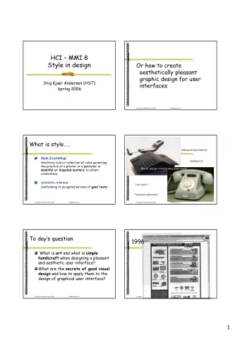
1997
2018
1994
1994
1995
1996
1996
Fundamentals of Visual Design 12
Outline ● Grid Systems ● Hierarchy of Size ● Grouping ● Small Multiples ● Repetition ● Color 13
Example Grid – Amazon (1/3) 14
Visual Grouping: Proximity 15
Visual Grouping: Similarity 16
Visual Grouping: Connections 17
Visual Grouping: Ordering 18
Making Things Distinct Size Value Orientation Texture Shape Position (2D / 3D) Kevin Mullet and Darrell Sano, Designing Visual Interfaces 19
Small Multiples 20
Outline ● Grid Systems ● Hierarchy of Size ● Grouping ● Small Multiples ● Repetition ● Color 21
Repetition of design elements 22
Map #1 23
Map #2 24
25
Visual Grouping: Ordering 26
Visual Grouping: Ordering 27
Visual Grouping: Ordering 28
How to Get Color Right Design Tip ● Design your UIs in grayscale first ● Forces you to focus on intensity ● Can use a photocopier to help here ● Keep luminance (intensity) values from grayscale when moving to color ● Helps ensure everything remains clear 29
Focus Design Implication ● Pure (saturated) colors require more focusing than less pure (desaturated, pastels) ● Don’t use saturated colors in UIs unless you really need something to stand out (stop sign) 30
https://color.adobe.com/ 31
Any human cognitive work that you are aware of? ● Cognitive Science ● How is your brain processing information? ● How does it recognize objects / words? ● Michael Just & Tom Mitchel’s work 32
Fitts’ Law ● http://www.youtube.com/watch?v=pPKymEC_Hss
So What Went Wrong? 34
How to fix it? 35
Fitts’ Law “Model of human movement primarily used in human–computer interaction and ergonomics that predicts that the time required to rapidly move to a target area is a function of the distance to the target and the size of the target.” 36
Fitts’ Law ● Fitts’ law tells us about difficulty for pointing and selection tasks ● Predicts time to make a movement ● Moving hand is a series of micro-corrections ● Time = A + B*log 2 (Dist / Size + 1) ● A and B are empirically derived constants ● Time to move the hand depends only on relative precision required 37
Fitts’ Law Example Pop-up Linear Menu Pop-up Pie Menu Today Sunday Monday Tuesday Wednesday Thursday Friday Saturday • Which will be faster on average? – pie menu (bigger targets & less distance) 38
Pie Menus in Practice Pie menus are example of an interaction technique 39
Pie Menus in Practice ● If better, why don’t we see them more? ● Harder to implement ● Don’t scale past a few items ● Unfamiliar to people ● E.g. iPod? 40
The Interface Cycle I want to add a thin black box around the title 41
The Interface Cycle Display SYSTEM ● Updates display 42
The Interface Cycle Display USER SYSTEM ● Evaluates and ● Updates display understands display 43
The Interface Cycle Display USER SYSTEM ● Evaluates and ● Updates display understands display ● Formulates goals and actions 44
The Interface Cycle Display USER SYSTEM ● Evaluates and ● Updates display understands display ● Formulates goals and actions ● Acts to produce inputs 45
The Interface Cycle Display USER SYSTEM ● Evaluates and ● Updates display understands display ● Formulates goals and actions ● Interprets input ● Acts to produce inputs events Input Devices 46
The Interface Cycle Display USER SYSTEM ● Evaluates and ● Updates display understands display ● Updates internal state ● Formulates goals and actions ● Interprets input ● Acts to produce inputs events Input Devices 47
Norman’s Gulfs ● Norman describes two user activities bridging users and systems ● The Gulf of Evaluation ● User perceives & interprets state of system User System 48
Norman’s Gulfs ● Norman describes two user activities bridging users and systems ● The Gulf of Evaluation ● User perceives and interprets state of system ● The Gulf of Execution ● User formulates inputs to achieve goals ● Shrinking these “gulfs” makes interfaces easier to use User System 49
Example Gulfs of Evaluation? I want to add a thin black box around the title 50
Example Gulfs of Evaluation? ● User understands & evaluates display ● Pretty easy to see no black box around text yet ● Compare editing web page in text editor 51
Example Gulfs of Evaluation? ● User understands & evaluates display ● Pretty easy to see no black box around text yet ● Compare editing web page in text editor ● Formulates goals and actions ● Add a black box ● Acts to produce inputs ● Too many buttons? ● Too many menus? ● What’s dog on side for? 52
Why Does Gulf of Evaluation Happen? 53
Why Does Gulf of Evaluation Happen? ● Some causes of Gulf of Evaluation ● Poor use of colors ● Bad layout, poor grouping ● Important information looks same as unimportant ● Forcing people to remember lots of things ● Lack of feedback in response to inputs ● Unfamiliar display of information ● Design patterns, convention 54
Why Does Gulf of Execution Happen? 55
Why Does Gulf of Execution Happen? ● Some causes of Gulf of Execution ● Unfamiliar devices ● Unfamiliar interactions ● Don’t know what is possible ● Widgets might not have meaning (solvable with experience) ● Interaction patterns might not have meaning (see above) ● Example patterns: Dialogs, Shopping Carts 56
Activity ● Find one interface that is cognizant and apply Fitt’s law and one interface that is not ● Find two interfaces where the gulf of evaluation is high and two interfaces where the gulf of execution is high ● Post it to the mailing list 57
Outcomes of the activity? ● What did you learn? 58
Ponnurangam Kumaraguru (“PK”) Associate Professor Indraprastha Institute of Information Technology New Delhi – 110078 pk@iiitd.ac.in precog.iiitd.edu.in
Recommend
More recommend
Explore More Topics
Stay informed with curated content and fresh updates.






![Clustering Analysis Basics Ke Chen Reading: [Ch. 7, EA], [25.1, KPM] COMP24111 Machine Learning](https://c.sambuz.com/833937/clustering-analysis-basics-s.webp)
