Intr Introduction t oduction to St o Stanf anfor ord' d's s - PDF document
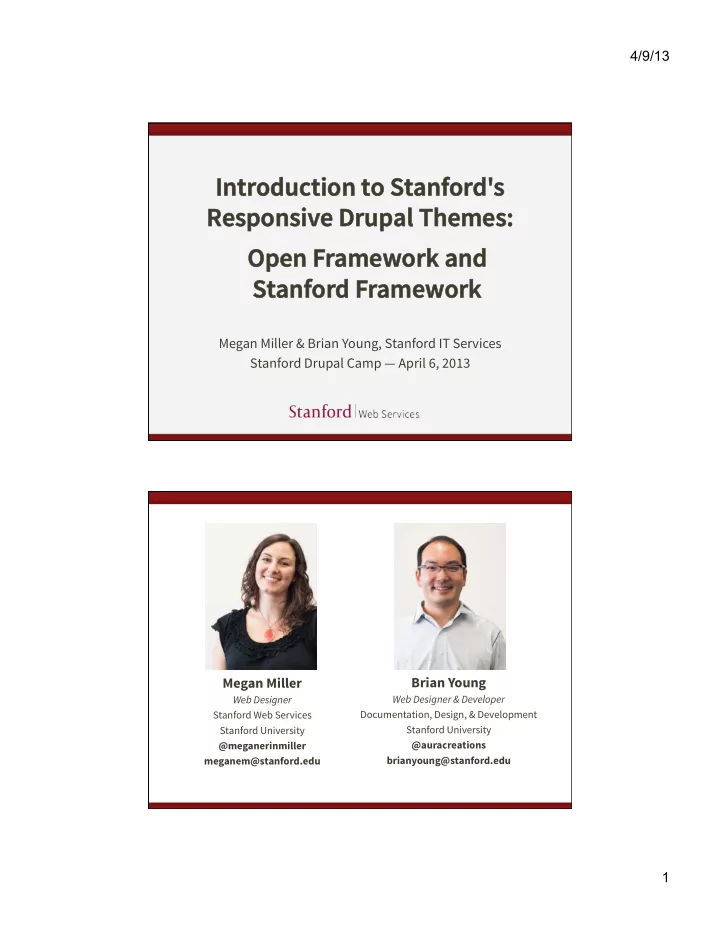
4/9/13 Intr Introduction t oduction to St o Stanf anfor ord' d's s Responsiv esponsive Drup e Drupal Themes: al Themes: Open F Open Framew amework and ork and St Stanf anfor ord F d Framew amework ork Megan Miller & Brian
4/9/13 Intr Introduction t oduction to St o Stanf anfor ord' d's s Responsiv esponsive Drup e Drupal Themes: al Themes: Open F Open Framew amework and ork and St Stanf anfor ord F d Framew amework ork Megan Miller & Brian Young, Stanford IT Services Stanford Drupal Camp — April 6, 2013 Megan Miller Brian Young Web Designer Web Designer & Developer Stanford Web Services Documentation, Design, & Development Stanford University Stanford University @meganerinmiller @auracreations meganem@stanford.edu brianyoung@stanford.edu 1
4/9/13 Drupal at Stanford There are several ways to have a Drupal website at Stanford. • AFS http://afs.stanford.edu • Collaboration Tools Installer http://tools.stanford.edu • Stanford Sites http://sites.stanford.edu Centralized Tools and Resources 2
4/9/13 Centralized Tools and Resources • Technical training • Self-help web services and documentation • Stanford Sites hosting service • Stanford-specific Drupal features • Drupal themes • And much more. What is a Drupal theme? The look and feel of your site. The “Skin.” The design, separate from content. 3
4/9/13 Our themes are: • Centrally maintained • Accessible • Standards compliant • Mobile responsive • Stanford branded We want to make it easy. 4
4/9/13 In this talk, we will cover: • What we mean by responsive • How we developed our themes • How our theme stack is structured • Which theme is right for you • How to create a subtheme What is Responsive Web Design? 5
4/9/13 Back in the day... But now... an explosion of devices! Source: http://mobiforge.com/developing/story/device-diversity and http://jquerymobile.com 6
4/9/13 Device diversity We can't predict the device of the future . How can we know what size of device we are designing for? "Mobile" Trends 35% of American adults own a smartphone 25% of smartphone users say they only use their phone to browse the web Source: Pew Internet & American Life Project – http://www.pewinternet.org/Reports/2011/Smartphones.aspx 7
4/9/13 In an ideal world... A custom experience for every device. We go responsive. same content reused for each screen size Sparkbox website at di ff erent browser sizes (from http://mediaqueri.es) 8
4/9/13 "Responsive" A design that responds to the size of the browser or device. Microso f website at di ff erent browser sizes (from http://mediaqueri.es) "Design" We mostly mean layout when referring to "design" in RWD. 9
4/9/13 A single code base Creating one website , and displaying it in di ff erent ways. Atlanta Ballet website at di ff erent browser sizes (from http://mediaqueri.es) Embrace Flexibility RWD is a philosophy and a practice . By embracing the inherent flexibility of the web, we can design for the future. 10
4/9/13 How do you implement Responsive Web Design? Flexible Grid-Based Layout Flexible Images and Media Media Queries 11
4/9/13 Flexible Grid Express your layout proportionally . 25% 50% 25% Be flexible — not pixel-perfect. Flexible Media Flexible containers constrain proportions of images and media by using max-‑width:100%; ¡ image fills width of container 12
4/9/13 Media Queries Detect your device screen width , then load di ff erent styles. @media ¡screen ¡and ¡(max-‑width: ¡ 480px ) ¡{ ¡ .mything ¡{ ¡ width:100%; ¡ } ¡ } ¡ @media ¡screen ¡and ¡(max-‑width: ¡ 1200px ) ¡{ ¡ .mything ¡{ ¡ width:30%; ¡ } ¡ } ¡ What should you consider when designing responsive websites? 13
4/9/13 Responsive Layouts Are about preserving content hierarchy and legibility . Content Hierarchy What content is most important ? Give it emphasis through size and order . 14
4/9/13 Preserve Content Hierarchy On small devices, what shows up first ? Legibility Legibility of text , but also "legibility" of micro-layouts . 15
4/9/13 Preserve legibility Don't let things get too squished or stretched ! normal squished Preserve legibility A good solution: normal image on top 16
4/9/13 Preserve legibility An even better solution... Build a responsive theme that never requires a drastic size adjustment of micro-layouts. ~ same size on desktop size... mobile! Preserve legibility The holy grail? ~ same size on desktop size... mobile! 17
4/9/13 "Content First" Considering preservation of content hierarchy and legibility as a top priority. How we developed our themes 18
4/9/13 We surveyed lots of sites at Stanford 19
4/9/13 We started with content We developed a " layout library " — sets of common layouts that we needed to support. 20
4/9/13 Homepage layouts Landing page layouts 21
4/9/13 Subpage layouts Articulating responsive behavior We created a set of responsive flow wireframes . 22
4/9/13 One and two sidebars No sidebars 23
4/9/13 Content area blocks This is complicated! Can we find a way to support all this sophisticated behavior in a theme? Can we make it easy to implement for site builders and content creators? 24
4/9/13 Our Solution Open Framework uses new responsive block regions to add sophisticated responsive behaviors in an easy-to-use fashion. Blocks and regions are native to Drupal, so we capitalized on that. Sophisticated responsive behaviors Open Framework provides support for two conflicting responsive patterns: • Row preference • Column preference 25
4/9/13 Row Preference Row preference forces elements to bump other elements down when the screen gets smaller. We call these " flow " regions . Column Preference Column preference forces elements to stack side-by-side in columns. We call these " stacked " regions . 26
4/9/13 A combination approach Through a combination of stacked and flow region behaviors, we can create complex layouts that respond well at every breakpoint. New responsive regions New set of responsive regions that support " flow " and " stacked " behavior. Content placed in specific block regions will respond based on that region’s pre-defined behavior . 27
4/9/13 Drupal-specific styles support Open Framework takes the basics of Twitter Bootstrap and adds in Drupal-friendly , semantic styles. Some examples: ¡ ¡ ¡.more-‑link ¡ ¡ ¡ ¡.descriptor ¡ ¡ ¡ ¡.border-‑simple ¡ Support for common micro-layouts We have developed a set of styles and implementation strategies for common micro- layouts we refer to as " postcard " layouts. 28
4/9/13 Support for common micro-layouts We have developed a set of styles and implementation strategies for common micro- layouts we refer to as " postcard " layouts. <div ¡class="postcard-‑left"> ¡ ¡<div>left</div> ¡ ¡<div>right</div> ¡ </div> ¡ .po .post stcar ard-right d-right .postcard-left .po .post stcar ard-le d-le f -wr -wrap ap .po .post stcar ard-right d-right-wr -wrap ap 29
4/9/13 A truly Drupal style guide Open Framework has a sortable style guide . Let's take a look... http://openframework.stanford.edu 30
4/9/13 The Stanford Theme Stack Stanford’s Drupal Themes 31
4/9/13 More code at the bottom Subthemes at the top 32
4/9/13 Each theme builds on the themes below. This allows for interchangeability and easy subtheming. 33
4/9/13 Twitter Bootstrap • Base styles • Responsive behaviors Note: This is NOT a Drupal theme! Just a CSS/Javascript framework. Open Framework • Additional base styles • Drupal block regions • Theme pre-processors All the stu ff you need to get started. 34
4/9/13 Stanford Framework • Stanford brand bars • Stanford styles (colors and fonts) • Site title theme options that follow identity guidelines Sub-themes • Stanford Modern • Stanford Jordan • Stanford Wilbur These provide unique, fully-developed designs. 35
4/9/13 Which theme is right for you? Schools , departments , and other o ff icial groups requiring Stanford branding on your Drupal site: • Can request use of Stanford-branded themes, such as Stanford Modern , Wilbur , or Jordan • Can request Stanford Framework as a base theme on which to build your own subtheme Which theme is right for you? Other university organizations , such as a student groups, or an individual looking to create a personal website: • Can use Stanford Basic or Open Framework • Can use Open Framework as a base theme on which to build a subtheme 36
4/9/13 When/Where can I get my theme? For Drupal 7 sites: • Open Framework, Stanford Framework, Stanford Modern, Jordan, and Wilbur will be available starting end of March 2013 • Stanford Basic is available now on Stanford Sites or Collaboration Tools Installer When/Where can I get my theme? For Drupal 6 sites: • Stanford departments and o ff icial groups can request to use Stanford Modern via HelpSU 37
4/9/13 Site Building with Open Framework (and its subthemes) Modules that play nice • Block Class • Views • BEAN • Context • CSS Injector 38
4/9/13 OFW styled with CSS Injector Making your own subtheme 39
Recommend
More recommend
Explore More Topics
Stay informed with curated content and fresh updates.
