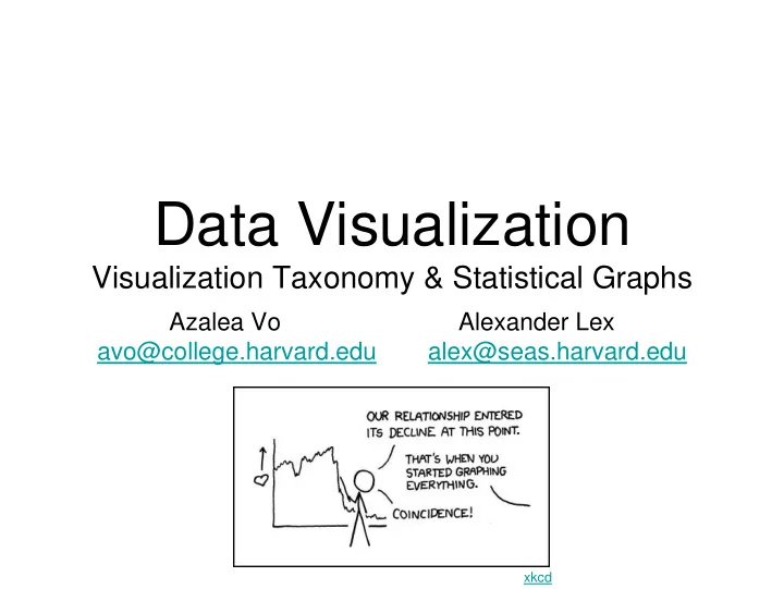
Data Visualization Visualization Taxonomy & Statistical Graphs - PowerPoint PPT Presentation
Data Visualization Visualization Taxonomy & Statistical Graphs Azalea Vo Alexander Lex avo@college.harvard.edu alex@seas.harvard.edu xkcd Administrivia Thursday: guest lecture on Tableau Jock D. Mackinlay Friday: Tableau and
Data Visualization Visualization Taxonomy & Statistical Graphs Azalea Vo Alexander Lex avo@college.harvard.edu alex@seas.harvard.edu xkcd
Administrivia • Thursday: guest lecture on Tableau Jock D. Mackinlay • Friday: Tableau and ManyEyes lab Blake and Shirley • Readings for this week Chapter 1
Homework 2 • Topic: • Project 1 proposal! • Advanced web scraping • Working with APIs • Look at lecture 3 (Ian) and Friday‘s lab Lab video: http://tinyurl.com/cs171lab1video Sources: http://tinyurl.com/cs171lab1
Project I • Has to use data you scraped yourself! • Update your Process Books continually • Your choice of visualization tools • We support ManyEyes and Tableau
Design Critique Learning Catalytics Session ID 118785 http://mariandoerk.de/edgemaps/demo/
Comparisons
Bar Chart How Much Does Beer Consumption Vary by Country? Bottles per person per week
Length VizWiz Blog
Direction Nicolas Rapp
Negative Values US Department of the Treasury "The Financial Crisis Response In Charts"
Naveen Sinha, 2009
Waterfall Chart VizWiz Blog
3D Few, “Show me the Numbers”
Excel Charts Blog
Employment Law HQ Blog
Bullet Graphs http://en.wikipedia.org/wiki/Bullet_graph
Bars vs. Lines Line implies trend. Do not use for categorical data. Zacks 1999
Relationships
Dot Plots
De novo mutations revealed by whole-exome sequencing are strongly associated with autism Sanders et. Al Figure: Identification of multiple de novo mutations in the same gene reliably distinguishes risk-associated mutations. Nature , May 2012
Proportions
WILLIAM PLAYFAIR 1759-1823 2
Pie Charts
Total: 104% VizWiz Blog
Showing Change v.s. VizWiz Blog
Showing Change v.s. VizWiz Blog
Coffee Drinks Illustrated The Perfect Pour
3D Pie Charts Few, “Show me the Numbers”
Why 3D pie charts are bad Kevin Fox
Green vs. Purple
Fox News, 2009 wikipedia.org
No Comments...
Donut Chart The Economist Daily Chart
Total % ? WSJ Graphics Blog
Stacked Bar Chart Few, “Show me the Numbers”
Storytelling with Data Blog
Small Multiples Peltier Tech Blog
Stacked Area Chart Asymco
JOSEPH MINARD 1781-1870 4
Stacked 100% Area Chart Flowingdata, Changes in Consumer Spending
v.s. leancrew.com & Practically Efficient
Area as Intersection WSJ Graphics Blog
WSJ Graphics Blog
http://maryandmatt.net/
Summary: Comparison, Proportions
Ivan Cash
Visualization Taxonomy
Motivation Useful Junk? The Chartjunk Debate
Visual Literacy Periodic Table
Melanie Tory and Torsten Moller, Infovis04 Jeffrey Heer and Ben Shneiderman, ACM
Distributions
Histogram ggplot2
Population Pyramid – A Histogram [Wikipedia]
Bin Width binwidth = 0.1 binwidth = 0.01 ggplot2
Density Plots
takeasweater.com
Box & Whisker Plots Few, “Show me the Numbers”
ggplot2
Correlations
Scatterplots http://xkcd.com/388/
Scatterplots ggplot2
Don‘t [Spotfire]
Box Office Quant Blog
Overplotting ggplot2
Overplotting alpha = 1/10 alpha = 1/100 ggplot2
Binning http:// vis.stanford.edu/projects/datavore/splom
Trend Lines ggplot2
Residual Graph • Plot vertical distance from trend line [Cleveland 85]
Trend Lines NY Times, March 2009
Quadrants http://www.asymco.com/2010/10/05/the-symmetry-of-share-shifts-in-mobile-phones/
Relative Changes Junk Charts
Path Plots New York Times
Trends
WILLIAM PLAYFAIR 1759-1823 85
JOSEPH MINARD 1781-1870 86
Yahoo! Finance
Data & Trend Plot The Daily Dish
Trend Histories New York Times, Porcupine Graphics
Trend Projections Washington Post
Russell Investments
Design?
Fox News flowingdata.com
Aspect Ratio & Scales
Aspect Ratio Yearly CO2 concentrations [Cleveland 95] Slide based on J. Heer / M. Agrawala
Banking to 45 [Cleveland] Two line segments are maximally discriminable when their average absolute angle is 45° • Optimize the aspect ratio to bank to 45 Slide based on J. Heer / M. Agrawala
Banking to 45 Degrees Aspect Ratio = 1.17 CO 2 Measurements William S. Cleveland Aspect Ratio = 7.87 Visualizing Data Slide based on J. Heer / M. Agrawala
Non-Zero Based Scales Few, “Show me the Numbers”
Recommend
More recommend
Explore More Topics
Stay informed with curated content and fresh updates.
