Critique to QuickTime 4.0 player Very old QuickTime player version - PowerPoint PPT Presentation
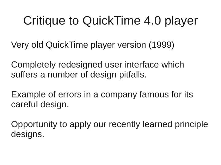
Critique to QuickTime 4.0 player Very old QuickTime player version (1999) Completely redesigned user interface which suffers a number of design pitfalls. Example of errors in a company famous for its careful design. Opportunity to apply our
Critique to QuickTime 4.0 player Very old QuickTime player version (1999) Completely redesigned user interface which suffers a number of design pitfalls. Example of errors in a company famous for its careful design. Opportunity to apply our recently learned principle designs.
Look Interface designed so that it "looks like" a physical consumer product. Users will more readily be able to transfer their knowledge of real-world objects to the software (metaphor). Windows interface
Limitations of the physical device A thumbwheel is designed to be operated by a thumb, not a mouse. The user can click the player just about anywhere near the thumbwheel and drag the mouse to control the volume. There is no visual indication that this is possible.
Limitations of the physical device Player as it appears using the default size of the movie window for one selected movie. Appears as though it might fit very comfortably in one's hand, results in a waste of screen space.
Colors Brushed-metal appearance with dark gray controls. All of the controls appear to be unavailable. before loading a movie after loading a movie Aspect of the Play button after it has been clicked and released, that is, while a movie is playing
Colors Certain controls have the exact same visual characteristics as incidental graphics. The lack of contrast in the player controls controls will necessarily mean that many older users will be not a unable to discern the symbols. control
Again the metaphor The extent to which the drawer can "open" is a function of where the player is located in relation to the bottom of the screen. The number of favorite movies is limited. No titles, tool tips... All sound files will be assigned the same image. Often the first frame of a movie is a black screen.
Again the metaphor What's the control that looks like a shirt button ? No tool tip. Advanced controls on top of favorites drawer.
Recommend
More recommend
Explore More Topics
Stay informed with curated content and fresh updates.




![Bad Sushi: Beating Phishers at their Own Game Nitesh Dhanjani & Billy Rios [BlackHat DC 2008]](https://c.sambuz.com/254629/bad-sushi-beating-phishers-at-their-own-game-nitesh-s.webp)


