Color in Images A Slide Presentation by Nancy A. Pickering, Pen and - PDF document
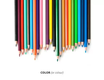
Color in Images A Slide Presentation by Nancy A. Pickering, Pen and Brush Communications This is a slide presentation I created for my chapter of Business Network International in 2009. Pen and Brush Communications is the name of my Graphic
Color in Images A Slide Presentation by Nancy A. Pickering, Pen and Brush Communications This is a slide presentation I created for my chapter of Business Network International in 2009. “Pen and Brush Communications” is the name of my Graphic Design business. Nancy A. Pickering Slide 1
Color in Images A Slide Presentation by Nancy A. Pickering, Pen and Brush Communications Here’s the Agenda for today’s presentation so you can see the direction I’m going to take . Actually, color is only one part of the discussion, as you see on the Agenda. There will be technical content included, both for print and web. Slide 2
Color in Images A Slide Presentation by Nancy A. Pickering, Pen and Brush Communications Terminology Relationships This slide categorizes the many terms you may have already heard used by graphic designers and others when referring to images and color. We’ll talk about each rectangle in turn, but right now you can see there are four main categories to study. Each category could be a couple of lessons all by themselves, so in the time allowed I’ll only be able to “hit the main points” about each. I won’t be talking about the Color Wheel or Complimentary colors or Analogous Colors or Monochromatic Colors or anything about color theory or color schemes – that’s another discussion and we don’t have time. Notice also the color coding of the text on this slide. Those items which are characteristic of Print use are in a dark fuschia color, while those which are characteristic of Web use are in a dark blue color. But some characteristics are at work in both media, and so they stay black in color. Slide 3
Color in Images A Slide Presentation by Nancy A. Pickering, Pen and Brush Communications Image Technology Let’s define “image” for today. I’m not referring to a piece of art created using a real marker of some type on a real surface, such as an oil painting or a charcoal drawing. The images I’ll be discussing today are those which can be electronically created or altered in some way, and are either reproduced in print or posted for viewing electronically on the web. Vector images are those created with Drawing programs on the computer. Using points and paths, they use geometrical building blocks such as lines, curves, shapes, or polygons, which are all based on mathematical equations, to represent images. • So for example, a circle is defined as a point at a particular position, and a radius of a certain measurement, and the computer is told to create a circle with that information. And if you reduce the size of the radius, you still get a clear and crisp-edged circle, not one with “jaggies” or rough “stair step” edges along the arc of the curve. • The most well-known computer software made for drawing is Adobe Illustrator, but there are plenty of others, such as Corel Draw. And there are simpler ones, too: When you create shapes in Microsoft Word or Powerpoint or Visio, for example, you’re drawing vector shapes. A Raster image is put together with a grid of pixels, or points of color. Raster technology is typically used for the representation of photographic images, such as with digital cameras. • “Bitmap” images are a type of Windows raster image. A bitmap is technically characterized by the width and height of the image in pixels. • Software programs which create raster images are called “Painting” programs, as opposed to vector drawing programs. If you greatly reduce or especially enlarge the size of the image in a painting program, you can compromise the clarity of the image – it may blur or the edges of curves may become “jaggy”. • The most well-known “paint” software made for making raster images is Adobe Photoshop, but Paint Shop Pro (PSP) and even the small program which comes with a new Windows PC, MS Paint, qualifies as another paint program. (Macs have such programs, too). Slide 4
Color in Images A Slide Presentation by Nancy A. Pickering, Pen and Brush Communications Also note that vectors and rasters are both used in print and on the web. Vectors often have to be converted to another format before they’re ready for final use, and rasters often do, too, depending on whether the final destination is print or web. The formats commonly used are on the next slide. How about converting a vector image into a raster image, or vice versa? It is possible to import a vector drawing into a raster program and convert the file. And, some simpler raster files – but not all – can sometimes be converted to vector drawings. There are limitations to doing this, though. Slide 5
Color in Images A Slide Presentation by Nancy A. Pickering, Pen and Brush Communications Image File Formats What are the most common graphics file formats? You see many of them here. In the first line, AI stands for Adobe Illustrator, and it’s a vector format. EPS is another vector format used by Adobe Illustrator. It’s a more universal format and can be read more readily by other programs, such as Photoshop. Professional Print houses like the EPS format because it is more generic. I separated the TIF format on this slide. This format is for print, but you create it with a “save as” command in a paint program like Photoshop, converted from another format. It is usually a large file (in MB) because it generally is a high resolution format. The next line are two variations of bitmap or raster formats. You already know photographs from your digital camera produces the JPG format. JPGs can be used for either print or web, but the resolution must be high for print, and lower for the web. The last two are web formats. “GIF” has been the more common of the two. GIFs generally take up smaller amounts of space and therefore load fairly fast on a web page. They also can have transparent pixels, which is handy around the edges of a central object. But it has some limitations, such as a maximum color palette of only 256 colors. The PNG format is much newer (but gaining in popularity), and combines the best of both the GIF and the JPG formats, but it is not as universal— so it’s not as common. Both formats, by the way, include compression features, which allow you to reduce the file size for faster downloads. Slide 6
Color in Images A Slide Presentation by Nancy A. Pickering, Pen and Brush Communications Image Resolution This is one of the most difficult concepts to understand. Resolution is measured in dots per inch (dpi) or pixels per inch (ppi). The more dots or pixels per inch, the finer the detail, and the bigger the file in kilobytes or megabytes when saved. An image only has a set number of pixels in width or height, called the physical dimensions. You can always reduce the physical dimensions of an image (such as reducing by 50%) without touching the resolution, and the result will be (almost) as clear and detailed as the original, even though it is a different physical size. If you wish to create finer detail by cramming more pixels to the inch, though, then you’d be altering the resolution -- and your finished physical dimensions will be smaller. However, the clarity of the image will be much better. Do be careful of trying to INCREASE the physical size of an image. Unless you have high resolution to begin with, you risk a poor quality result. This is called “upsampling” and requires that your software “invent” the in-between pixels needed to accomplish the increased size. • The typical resolution on a computer monitor is only 72 ppi, sometimes 96 ppi. • Newspaper printing is often at 150 to 200 dpi. • Full-color print pieces like brochures and business cards, and most books, are at 300 dpi. Some really excellent books – like a coffee table book of photographs, or pictures from an art gallery – can be 600 dpi or finer. The biggest danger for Designers is trying to use a photo or image from the web (which is only 72 ppi) for a project that will be printed. Quite likely it’ll look rather fuzzy in print. To look crisp, request that your source send you the image at 300 dpi if at all possible, even though the file size (in kb or MB) may be quite large. Some photographers use cameras set to 72 ppi to take photos that are as big as 8” x 10”, but then they use Photoshop to change the size and resolution for print purposes in a newsletter. Slide 7
Recommend
More recommend
Explore More Topics
Stay informed with curated content and fresh updates.
