C hecklist of principles & best practices for the most effective - PDF document
INFORMATION HIGHWAYMAN ACE COPYWRITER &ATTENTION-THIEF FOR HIRE A C hecklist of principles & best practices for the most effective presentation of copy on the web; produced by D Bnonn Tennant for the edification of his excellent clients
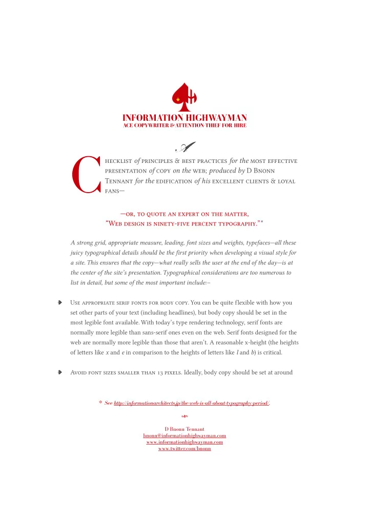
INFORMATION HIGHWAYMAN ACE COPYWRITER &ATTENTION-THIEF FOR HIRE A C hecklist of principles & best practices for the most effective presentation of copy on the web; produced by D Bnonn Tennant for the edification of his excellent clients & loyal fans— —or, to quote an expert on the matter, “Web design is ninety-five percent typography.”* A strong grid, appropriate measure, leading, font sizes and weights, typefaces—all these juicy typographical details should be the first priority when developing a visual style for a site. This ensures that the copy—what really sells the user at the end of the day—is at the center of the site’s presentation. Typographical considerations are too numerous to list in detail, but some of the most important include:– Use appropriate serif fonts for body copy. You can be quite flexible with how you ♠ set other parts of your text (including headlines), but body copy should be set in the most legible font available. With today’s type rendering technology, serif fonts are normally more legible than sans-serif ones even on the web. Serif fonts designed for the web are normally more legible than those that aren’t. A reasonable x-height (the heights of letters like x and e in comparison to the heights of letters like l and b ) is critical. Avoid font sizes smaller than pixels. Ideally, body copy should be set at around ♠ * See http://informationarchitects.jp/the-web-is-all-about-typography-period/. \ D Bnonn Tennant bnonn@informationhighwayman.com www. informationhighwayman.com www.twitter.com/bnonn
px—on most screens this is displayed at a similar size to printed -point text. Do not make body copy smaller for the sake of accommodating text to an existing layout, or because of de facto standards set by competitors for stylistic (as opposed to UX or accessibility) reasons. Any text set below px in size should be considered illegible. Avoid unnecessary formatting. Italics should be used only where emphasis is ♠ genuinely required. Underlining should be avoided entirely, except on hyperlinks, which is what it represents. Centered and even fully justified body text, along with any other kinds of unusual layout which make the text hard to read, should be avoided. Colored type should be used very sparingly, if it all, as it may be mistaken for hyperlinks. Use a white or very light background. Unless otherwise dictated by branding ♠ requirements or visual appeal, a pale background with dark type will be less of a strain to read than vice versa. For maximum legibility, a text color of # set against a slightly off-white background yields excellent results. Limit line measure to – characters. Keeping rows of text in a column below ♠ characters in length is optimal for legibility. In general, a css reset rule as follows is recommended: blockquote,li,p,textarea{ max-width:75ex; } Maintain a –% leading. All text should be aligned to a vertical grid as much as ♠ possible; this grid should set adjacent rows of body text so that the distance between the bottom of one line and the bottom of the next is between . to . times the font size. A css reset rule such as this is recommended: body{ font:100%/1.5em serif; } Utilize scannable features. For optimum legibility, ensure that headlines or subheads ♠ are placed in body copy at least often enough that there will always be one visible at common screen resolutions. This ensures the text is properly scannable. Further breaking up body copy using lists to summarize salient items, and heavy font weights to emphasize keywords, is also a good idea. Use a single column of text. As compared to popular two- or three- column layouts, ♠ single columns are more legible. If the site layout and information architecture will
accommodate it, set all text in a single column, with navigation elements above and/or below rather than floating at the sides of the page. Avoid elements which will distract users. In particular, elements such as outbound ♠ links or graphics, which will interrupt the natural progression from the headline to the call to action, are highly inadvisable. To ensure optimal usability, and commensurately a maximum conversion rate, there should be nothing to divert users to irrelevant pages, or—worse—other websites. Include critical elements above the fold. This doesn’t necessarily mean any critical ♠ element, but rather elements whose positioning high on the page is very important. For instance, a call to action is frequently effective at the end of the copy; but a search field should never be hidden from view when a user first arrives on the site. Where reasonable, include graphics. Features, benefits, and value (especially in the ♠ form of figures) can often be powerfully represented by graphics—provided these are of a high quality. Questions may sometimes be answered more readily through graphics, as well as or instead of text. It’s also sometimes advisable to include a hero shot if applicable, remembering that:– it should have a caption; ♠ it should be clickable; and ♠ if feasible, the hero should be looking toward the most important page element. ♠ \
Recommend
More recommend
Explore More Topics
Stay informed with curated content and fresh updates.

