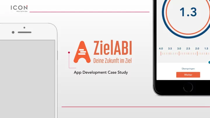

App Development Case Study
Creative Brief The First Abitur Calculator App for iOS & Android We were tasked with creating an app that helped calculate students’ Abitur scores so that they could easily see what grades they needed to get into the University of their choice, no matter where in Germany they live.
Target Abitur Score & Course Selection ZielABI revolves around students setting The goal with the initial wireframing was Students can tap multiple times to select their initial Abitur goal. The visual target, to keep things simple. The complicated options to differentiate between types of and slide selector, make this step easy to formulas fade away and the sudent only courses. complete. sees a few simple questions.
Grade Input and Saving Scenarios Abitur calcuation requires a large amount As students enter their grades, the Abitur Saving scenarios allows students to of data input by students which is score is updated below. When they return to the app and adjust their score managed via a combination of easy tap, reach their target a pop-up as grades become actual. slide, and scroll motions. congratulations message appears.
Design and Logo ZielABI Identity Design ZielABI is designed to empower students to achieve their goals by simplifying the stressful and complicated Abitur calculation. The typography and colors are deliberately warm and friendly. The logo is motivational in spirit. Final Logo Logo Design The tagline: Deine Zunkunft im Ziel "Your The final ZielABI logo uses just two Working to visualize the business in a future on target" is presumptive. colors to make an impact. This inverted motivational manner, the "A" from design helps it to stand out among the Abitur is excuted in a compass style icon. other apps on a users’s screen. A list within implies data collection.
Final Designs The design for this screen retains much A simple yes/no question needs no Much of this screen is carried over from of the initial design concept, with some complication. the initial design, with a simplified extra refinement. interface for categorizing classes.
Final Designs Preserving much of the initial design, this A pop-up shows the student when they Students can compare various scenarios, page adds greater legibility to semester have reached their goal. with different goals and class grades. grades and brings the progress bar to the bottom of the screen.
iOS Development Swift Custom Libraries Using the latest version of Apple’s design We used highly customisable open source language, we were able to implement powerful libraries to speed up the development process formulas behind a simple interface and create while ensuring that elements of the app stayed an app that could easily be translated in true to our design. multiple languages. By testing on beta versions of the next major iOS Bubble Design iOS release we ensured the app worked as expected with the release of iOS 11. Inspiration for the design of the class selector ‘bubbles’ on the app came from design features in Apple’s latest release of iOS.
Android Development Java Powerful Frameworks By coding natively in Java we were able to In using the most modern and powerful tools develop an efficient code base for the Android and frameworks we achieved effectiveness in app. the development process. The custom layouts and animations make the application more Through the implementation of standard code attractive and user friendly. libraries we are able to insure compadibility Android Bubble Design across a whole range of mobile devices. We also included different analytics and crashlytics libraries to track and investigate the Android keeps the ‘bubbles’ from the app’s behavior and results. iOS design, but organizes them, instead, in a simple Android-inspired grid.
Final Release Website The design of the website draws elements from the app and includes animated mockups of the ZielABI app. Included in the site is more information about the app and how it works with a different set of calculations for each German state. We created it with simple HTML, CSS, and JavaScript. ziel-abi.de
Recommend
More recommend