1. Find the values of the following expressions: (a) 1 + (2 9 6) + - PowerPoint PPT Presentation
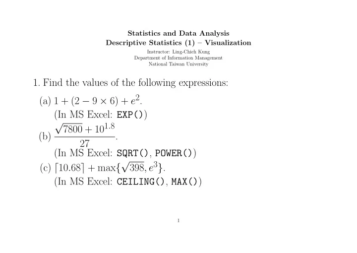
Statistics and Data Analysis Descriptive Statistics (1) Visualization Instructor: Ling-Chieh Kung Department of Information Management National Taiwan University 1. Find the values of the following expressions: (a) 1 + (2 9 6) + e 2
Statistics and Data Analysis Descriptive Statistics (1) – Visualization Instructor: Ling-Chieh Kung Department of Information Management National Taiwan University 1. Find the values of the following expressions: (a) 1 + (2 − 9 × 6) + e 2 . (In MS Excel: EXP() ) √ 7800 + 10 1 . 8 (b) . 27 (In MS Excel: SQRT() , POWER() ) √ 398 , e 3 } . (c) ⌈ 10 . 68 ⌉ + max { (In MS Excel: CEILING() , MAX() ) 1
2. Consider the sheet “Team Height.” Assume that 1 foot is 30 cm and 1 inch is 2.5 cm. (a) Convert the texts in Cells A1 and A2 into 20 numbers. Put them in a single column. (In MS Excel: Text to columns, Paste special/transpose) (b) How tall are all the team members in feet and inches? (In MS Excel: FLOOR() , MOD() ) (c) Find those team members who are shorter than 180 cm. (In MS Excel: IF() ) (d) Find the average height, in cm, for those members who are shorter than 180 cm. (In MS Excel: SUMPRODUCT() , SUM() ) 2
3. Consider the sheet “Team Height” again. (a) Construct a frequency distribution with five classes [160 , 165), [165 , 170), ..., and [180 , 185). Which class has the highest fre- quency? What is that frequency? (In MS Excel: COUNTIF() OR FREQUENCY() ) (b) Draw a histogram for the above frequency distribution. (In MS Excel: Insert/Column) 3
4. Consider the sheet “Wholesale,” which is a Portugal-based whole- saler’s records of the amount of sales (in $1000) of six categories of items in two channels at three regions in a one year. It is known that channel 1 is for hotel/restaurant/cafe, channel 2 is for retail stores, region 1 is Lisbon, region 2 is Oporto, and region 3 is the rest area in Portugal. (a) Draw a histogram for all the fresh food sales. Choose the number of classes by yourself. (b) Is there any extreme values? If so, identify the index of that extreme value. 4
5. Consider the sheet “Wholesale-aggregate”. (a) Draw a pie chart for the total sales of milk in the six channel- region pairs. (In MS Excel: Insert/Pie) (b) Draw a bar chart for the total sales of milk in the six channel- region pairs. (In MS Excel: Insert/Column) (c) For each channel-region pair, find the average sales of milk per buyer in that channel and region. (d) Is it appropriate to draw a pie chart for these six values? Why or why not? 5
6. Consider the sheet “Wholesale” again. (a) Draw a scatter plot for grocery and detergents & paper. How do these two sets of data relate to each other? (In MS Excel: Insert/Scatter) (b) Draw a scatter plot for fresh food and grocery. How do these two sets of data relate to each other? (c) Draw a scatter plot for fresh food and milk in channel 1 and region 2. Is there any extreme value? 6
7. Consider the sheet “Bike Day”. (a) Draw scatter plots for “temp” and “atemp,” “atemp” and “cnt,” and “windspeed” and “cnt.” What do you observe? (b) Draw a histogram for “cnt” and determine whether the distri- bution is skewed to the right, skewed to the left, or symmetric. Determine whether it is uni-modal or multi-modal. (c) Draw a line chart to depict “cnt”. Draw a line chart to depict “temp”. Combine the two line charts to show their relationship, if any. 7
8. Consider the sheet “Bike Day”. (a) Consider the column “firstday”, which contains the dates of the first days of the 24 months. Find their “cnt” and put these values in the column “cnt firstday”. (In MS Excel: LOOKUP() ) (b) Draw a line chart for the 24 values. Use the column “firstday” as the x -axis labels. (c) Delete the three rows for July, August, and September in 2011 and shift cells up. What do you observe on the line chart? What is the difference when plotting the line chart with and without using “firstday” as the x -axis labels? 8
Recommend
More recommend
Explore More Topics
Stay informed with curated content and fresh updates.
