Workstation Design Agenda Review Functional Anthropometry and - PowerPoint PPT Presentation
Workstation Design Agenda Review Functional Anthropometry and Design Workstation Design Review Anthropometric Data Structural Data: Static Segment length or link length Segment density Mass Center-of-mass
Workstation Design Agenda Review Functional Anthropometry and Design Workstation Design
Review Anthropometric Data Structural Data: Static Segment length or link length Segment density Mass Center-of-mass location Functional Data: Dynamic Reach envelop (e.g. could be arm plus extended torso)
Review Name the following movements Knee flexion Knee flexion
Review Use anthropometric data for design When designing the public wash basin height o Can’t accommodate all users (kids vs. adults) o Ideally design for different age group (multiple dimensions to accommodate)
Functional Anthropometry and Design Measure functional anthropometry Reach envelop o Reach envelops need to be constructed for actual working positions and for explicit design purposes. Dependent on the task, motion, and function to be accomplished by the reach action. o Limited reach data on standard anthropometric positions are available in sources of static and dynamic anthropometric data. Task specific o Reach envelops may be related to a body reference point (e.g., the shoulder joint), or to a design point (e.g., a seat reference point).
Functional Anthropometry and Design Example Horizontal reach envelop for seated workstation design o Seated Arm Horizontal Reach envelops (Normal): The shoulders are relaxed, the test upper arm is approximately vertical (90 o at elbow), the elbows are held loosely against the torso with no more than 20 degrees abduction. The normal reach envelop could be measured by sweeping only the forearm from left to right with upper arm vertically located. At least 5 positions (left right) should be recorded to draw the envelop o Seated Arm Horizontal Reach envelops (Maximum): Measured similarly to normal reach, except that • the test arm is held straight forward • and the test shoulder is extended forward as far as possible while the other shoulder is kept still
Functional Anthropometry and Design Range of motion
Body Movement –Planes/Axes, cont’d Functional Anthropometry Posture vs. Strength Neutral Posture o The resting position of each joint-the position in which there is the least tension or pressure on nerves, tendons, muscles and bones. o It is also the position in which muscles are at their resting length-neither contracted nor stretched. Muscles at this length can develop maximum force most efficiently. o Example Hand posture on grip strength
Workstation Design
Workstation Design
EXTREME Workstations Workstation Design
Workstation Design
EXTREME Workstations Workstation Design
Workstation Design
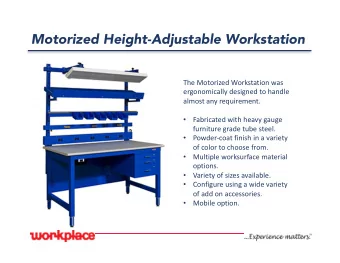
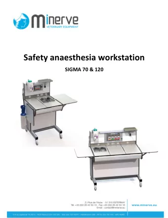
Workstation Design Workstation Components Tools Enclosure (e.g., cab) Materials Doors / doorways Fixtures, work holding devices Windows Displays Seats / supports Controls Lighting fixtures Computers and other Heating, ventilating, and air electronics conditioning equipment Reference materials Life support equipment Communication equipment Material handling equipment (in, within, out) Personal protective equipment Storage facilities Personal items Work surfaces
Workstation Design Goals of Ergonomic Workstation Design and Layout Maximize performance and minimize hazards o Accommodate the worker An uncomfortable workstation results in increased energy demands, fatigue, decreased worker performance, and occupational injuries o Minimize postural stress and fatigue (e.g. due to static loading) Risk factor for work-related injury o Provide reach capability Anthropometry o Minimize motion times and error rates Work measurement (e.g. time increase 30% when working overhead) o Provide force capability strength data and models
Workstation Design Common Risk Factors Awkward postures o Maintaining an unsupported fixed or awkward posture such as bending, reaching, or twisting Over exertion o Above maximum limits Repetition, Vibration Static loading Environmental (heat, cold, poison, etc)
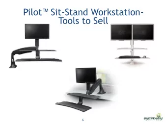
Workstation Design Workstation Types Sit Sit/Stand Stand
Workstation Design Pros and Cons of Seated Work Advantages of seated postures: o Greater stability for tasks requiring high visual and motor control o Less energy consumption o Less stress on the lower extremities o Delays the onset of fatigue (weight is taken off the legs, lower energy requirements, lower cardio-respiratory demands, avoid unnatural body postures) o Allows for the use of foot controls Disadvantages of seated postures: o Pitfalls of prolonged sitting Negative effects on the curvature of the spine Disruption of body functions (blood flow, breathing, etc.) Weakened abdominal muscles
Workstation Design Pros and Cons of Seated Work Disadvantages of seated postures: o Example i. Disc force (pressure) is lower in relaxed standing ii. Forces are higher in any unsupported sitting posture ( ≥ 2x) Disc pressure measurements in standing and unsupported sitting postures (Chaffin et al, 2006)
Workstation Design Pros and Cons of Seated Work Trade-off considerations o Duration for each tasks, majority of tasks takes precedence o Optimize extended reaches and exertion forces Sit when o Fine assembly, data entry, precise control, etc. o Needed items can be reached, assessed, and handled within the seated workstation. Reach envelop o Items handled are approximately 6” above and 16” in front of the worker o No large forces, no weights greater than 10lbs
Workstation Design Seating Design Measurements – Work Surface Depth HORIZONTAL work surface depth o Normal area: a sweep of the forearm while the upper arm hangs in a natural position o Max area: reached by extending the arm from the shoulder o These functional anthropometric dimensions are used to determine the placement of switches and controls E.g., Car interiors panel
Workstation Design Pros and Cons of Standing Work Advantages of standing postures: o Greater Reach Capacity (larger work envelop) o Biomechanical Advantage (more leverage) o Lower Disc Pressure (only when not flexed) o Close to neural posture, e.g., spine o Increased Trunk Power (we can work harder) o Less Leg Room Required (horizontally)
Workstation Design Pros and Cons of Standing Work Disadvantages of standing postures: o Facilitates Greater Postural Stress Greater reach capacity (larger work envelop) Working height of the hands is too high: Extension in the low back (excessive lordosis) Work Surface is too low: Trunk flexion, back muscle strain Lack of Toe Clearance: Increase horizontal distance (moment arm) Asymmetric or “Non-neutral” postural constraints: Eliminate fixity, if no, then make work posture as natural as possible Asymmetrical loading/Working away from the midline of the body: Twisting makes the spine more prone to injury
Workstation Design Pros and Cons of Standing Work Disadvantages of standing postures: o Facilitates Greater Task Stress Because biomechanical advantage (more leverage) We have a greater work capacity when standing • Leaves the opportunity for greater task demand: Fatigue, High Joint Loads, Less support
Workstation Design Reduce posture stress: i.e., low back loads
Workstation Design Work Height vs Work Surface Height
Workstation Design Optimal Work Zone Best Work Zone o As far forward as your wrist when you hold your arm slightly bent o As wide as the shoulders o Upper level at about heart height o Lower level at about waist height Preferred Work Zone o As far forward as your hand when you hold your arm out straight o A foot on either side of the shoulders o Upper level at shoulder height o Lower level at tip of fingers with hands held at the side
Workstation Design Considerations for Workstation Components Layout Clearance requirements o Consider the largest users (95 th percentile) Reach requirements o Consider the smallest users (5 th percentile) Adjustability requirements o Adjusting the workstation (shape, location, and orientation of the workstation) o Adjusting the worker position relative to the workstation (change in seat height, use of platforms or step-up stools) o Adjusting the work piece (lift tables, parts bin for easier access) o Adjusting the tool (adjustable length tool)
Workstation Design Considerations for Workstation Components Layout Work needs to be in front of the employee o We need to design tasks in this manner: Reaching behind the body or working with the upper arm raised should be avoided.
Workstation Design Considerations for Workstation Components Layout Visibility and Normal Line of Sight o Normal line of sight is the preferred direction of gaze when the eyes are at a resting condition. Most researchers consider it to be about 10-15 degrees below the horizontal plane. o Visual displays should be placed within +/- 15 degrees in radius around the normal line of sight. This is called the Primary Viewing Area.
Recommend
More recommend
Explore More Topics
Stay informed with curated content and fresh updates.


