Week 4 The psychology of the user interface Why UIs are like they - PowerPoint PPT Presentation
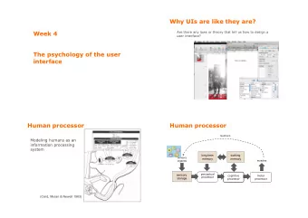
Week 4 The psychology of the user interface Why UIs are like they are? Are there any laws or theory that tell us how to design a user interface? Human processor Modeling humans as an information processing system (Card, Moran & Newell
Week 4 The psychology of the user interface
Why UIs are like they are? Are there any laws or theory that tell us how to design a user interface?
Human processor Modeling humans as an information processing system (Card, Moran & Newell 1983)
Human processor feedback long term working sensory memory memory muscles organes perceptual sensory cognitive motor processor storage processor processor
Human processor feedback long term working sensory memory memory muscles organes perceptual sensory cognitive motor processor storage processor processor attention (Wickens, 1984)
Processors Each processor has a processing cycle Necessary duration to treat an input and produce an output Speed of processing depends on individual humans and external conditions (e.g., intensity of the stimulus, noise, alcohol,…) The fastest speed can be 10 times faster than the slowest perceptual cognitive motor processor processor processor T p ≈ 100ms (50-200 ms) T c ≈ 70ms (30-100 ms) T m ≈ 70ms (25-170 ms)
Visual perception
Visual perception red-green color blindness (daltonism) is very common (8% of adult males) Don’t use only color to highlight di fg erences, or use choose colors that are di ffj cult to confuse
Visual perception Colors of di fg erent wavelengths are hard to tell apart Don’t use red text on blue background With age, blue becomes harder to read Change Blindness (Cécité au changement) Di ffj cult to see visual changes when our vision is interrupted Avoid abrupt changes in the interface (show animations, highlight changes)
Visual perception
Visual perception
Gestaltism (psych. of the form) A theory claiming that the perception processing and the mental/cognitive representation of information, process spontaneously (« pre-attentively ») the surrounding phenomena as groups of structures (forms), and not as several discrete elements Theory that has a psychological, philosophical and biological influences and implications, and is relevant to perception and cognition
Gestalt laws of perception Continuity Proximity Similarity Symmetry Closure Common fate Past experience Figure-ground These laws act at the same time and can be occasionally contradictory
Continuity Elements arranged on a line or curve are perceived as more related than elements not on the line or curve http://www.smashingmagazine.com/2014/03/28/design-principles-visual-perception-and-the-principles-of-gestalt/
Continuity Elements arranged on a line or curve are perceived as more related than elements not on the line or curve eclipse splash screen
Continuity We tend to perceive elements grouped together, and integrated into perceptual « wholes » if they are aligned http://sixrevisions.com/usability/data-visualization-gestalt-laws/
Continuity We tend to perceive elements grouped together, and integrated into perceptual « wholes » if they are aligned e.g., di fg erent style options in a UI presented one after the other
Proximity We group objects first by their proximity between them e.g., functions in a dialogue box
Similarity If distance (proximity) does not allow grouping, we tend to group objects based on their perceived similarity in form e.g., similar file icons to visually organize and remember their applications (shape, size, color)
Symmetry Symmetries are aesthetically pleasing, and we tend to group symmetrical objects as one group with a central point { } [ ] ( ) e.g., symmetrical actions in the UI have symmetrical icons and are seen as a group
Closure We perceive objects such as shapes, letters, pictures, etc., as being whole even when they are not complete (we complete the missing parts) e.g., we can group items in a UI by explicit or implicit borders
Common fate Elements moving in the same trajectory with the same speed are seen as a group e.g., if you select and drag some icons, shadows of these items all move at the same direction and speed
Past experience Past experience and context affect the interpretation of elements in a group
Figure - Ground Perception consists of a distinction between the graphical figure (target) and ground (context). It should always be clear in the UI
Cognition
Cognitive processes Responsible for decisions Comparison and process of stimuli and selection of a response Types Mechanical, based on habits and repetition (e.g. walk, point, speak) Bases on rules (e.g. if there is an obstacle walk around it) Based on knowledge and experience (problem solving)
Reaction time A lamp will be lit. Press on the associated button (in your head) as fast as possible
Reaction time
Reaction time
Reaction time
Hick-Hyman law Describes the time it takes to make a simple decision given a number of choices T = a+b � log 2 (n+1) n : number of choices a, b : constants Humans divide the number of choices in categories: binary search
Attention Capacity to focus on important things/objects linked to visual and auditory perception but .... humans have limited cognitive resources
Attention Attention resources divided attention: many stimuli, shallow level focused attention: few stimuli, deep level practice reduces required attention
Attention It is easier to pay attention to well structured information
Attention Make important information that needs attending salient (noticeable) colour, animation, underline, etc. but do not unnecessarily distract users Structure information (ordering, spacing) Avoid non-functional clutter
Memory and learning Responsible for encoding, maintaining & retrieving information: filtering (what) context (when, where)
Memory and learning To be shown for a few seconds. Try to memorize them.
Memory and learning Write down as many as you can.
Memory and learning Short term memory Working memory Small storage duration (10 – 30s) Small capacity: 7 ± 2 items (Miller, 56) Later studies have shown that this range can be lower and depends on several factors, e.g., type & complexity of the item Long term memory Infinite capacity Unlimited storage duration Associative access
Memory and learning Learning and memorization by repetition (short term � long term) Interferences degrade short term memory faster
Chunking (grouping) Perception and memory elements are grouped in « chunks » Try to memorize this number: 456789067
Chunking (grouping) Perception and memory elements are grouped in « chunks » Try to memorize this number: 456789067 … and then this one: 456-789-067
Chunking (grouping) Perception and memory elements are grouped in « chunks » Try to memorize this number: 456789067 … and then this one: 456-789-067 The 7± 2 rule for short term memory is applicable on the number of « chunks » rather than number of unique elements
The rule of 7 plus/minus 2 Some UI design guidelines suggest the the application of the rule to menus, toolbars, slides, etc. Do you think that this is appropriate?
The rule of 7 plus/minus 2 Some UI design guidelines suggest the the application of the rule to menus, toolbars, slides, etc. Do you think that this is appropriate? Consider that such elements require us to recognize, not to recall! They have nothing to do with working memory.
Recall vs. Recognition We are better at recognizing then remembering command line vs. GUI search box vs. list of options keyboard shortcut vs. actions in the menu We are better at remembering images than words icons vs. items of a menu
Interferences: Stroop effect Test 1 Identify the color of the following words in order, as fast as possible
Stroop effect Book Crayon Car Time Mouse
Stroop effect Test 2 Identify the color of the following words in order, as fast as possible
Stroop effect Black Blue Red Green Orange
Stroop effect Interference between the main task ( identify the color ) and a cognitive process (read a word) Affects reaction time and error rate
Some general guides Avoid complex mappings (risk of interferences) Support both recall and recognition but recognition is easier (e.g., menus, icons, lists) Group/chunk related information e.g., tabs, sub-menus Aid associative learning e.g., help, hints Aid association by providing context e.g., colors, labeling, temporal metadata
Externalization of cognition External representations and tools to support cognition Ε xternalizing to reduce cognitive load computational offloading annotating and cognitive tracing
Externalization of cognition Externalization to reduce cognitive load (memory) agendas, calendars, notes, lists, … External representations to remind us: that we need to do something (e.g., alarm) what to do (e.g., pay taxes) when to do them (e.g., the 15 of April)
Externalization of cognition Computational offloading e.g., paper and pen, calculator, spreadsheet Try to calculate 234 x 456 =? (a) in your mind (b) on paper (c) with a calculator
Recommend
More recommend
Explore More Topics
Stay informed with curated content and fresh updates.
