Usability and Accessibility CS 4720 Mobile Application Development - PowerPoint PPT Presentation
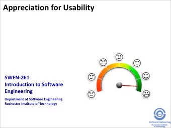
Usability and Accessibility CS 4720 Mobile Application Development CS 4720 What makes a good interface? Don't say anything but SIS. What are it's characteristics? How do you just KNOW that you're using something that has
Usability and Accessibility CS 4720 – Mobile Application Development CS 4720
What makes a good interface? • Don't say “anything but SIS.” • What are it's characteristics? • How do you just KNOW that you're using something that has been thought out properly? CS 4720 2
Not Just the UI • The experience begins with the first time you launch an app or go to a web site • There are several components here – Initial impression – User interface – 80/20 rule (sometimes the 90/10 rule) – Graphic design – Information presentation • All of this adds up to the user experience (UX) CS 4720 3
10 Rules… • 10 Rules to Mobile HCI CS 4720 4
Evaluating an Interface • Rule 1: Visibility of system status • The system should always keep users informed about what is going on through appropriate feedback within reasonable time. CS 4720 5
Evaluating an Interface • Rule 2: Match the system to the real world • The system should follow real-world conventions, making information appear in natural and logical order. CS 4720 6
Evaluating an Interface • Rule 3: The “uh-oh” button • Users often choose system functions by mistake (particularly on mobile) and will need a clearly marked “ emergency exit ” to leave the unwanted state without having to go through extended steps. • Systems should support undo and redo. CS 4720 7
Evaluating an Interface • Rule 4: Consistency and standards • User should not have to wonder whether different words, situations, or actions mean the same thing. • The system should follow platform conventions. CS 4720 8
Evaluating an Interface • Rule 5: Error prevention • Add input checks – How many digits in that phone number? – How many digits in that credit card number? – Are there really 39 days in July? CS 4720 9
Evaluating an Interface • Rule 6: Recognition rather than recall • An icon should represent the action and should immediately recognizable as to what it does • Part of this is following platform standards, part is being consistent in your own application • An action/swipe/etc should be consistent across screens CS 4720 10
Evaluating an Interface • Rule 7: Flexibility • Accelerators, shortcuts, etc. (which are unseen by the novice user) can speed up interactions for the expert user to such an extent that the system can cater to both inexperienced and experienced users. CS 4720 11
Evaluating an Interface • Rule 8: Aesthetic and minimalist design • Every extra unit of information in a dialog competes with the relevant units of information and diminishes their relative visibility. CS 4720 12
Evaluating an Interface • Rule 9: Error explanations • Error messages should be expressed in plain language (NO CODES), precisely indicate the problem, and constructively suggest a solution. CS 4720 13
Evaluating an Interface • Rule 10: Help! • Have reasonable help information available in the app if possible. CS 4720 14
The Ten Rules • 1. Visibility of Status • 2. System = Real World • 3. The “uh-oh” button • 4. Consistency and Standards • 5. Error Prevention • 6. Recognition rather than Recall • 7. Flexibility • 8. Minimalist Design • 9. Error Explanation • 10. Help! CS 4720 15
Software Interface • Let's look at a few interfaces CS 4720 16
Image Galleries CS 4720 17
Empty Lists CS 4720 18
Describing Places CS 4720 19
Sending Money CS 4720 20
Playing Music CS 4720 21
Contacts CS 4720 22
One Hand or Two Hands? • Large, obvious buttons • Controls toward the center of the screen so you don't have to stretch • Controls have space between them if possible • Put only needed items on the screen • Eliminate unnecessary words • Make transitions between states obvious • Apps: Phone, Contacts, Urbanspoon CS 4720 23
One Hand or Two Hands? • Theoretically, the user is not moving, so controls can be more complex • Stylus control • Keyboard in landscape mode (soft or hard) • More information to proces • Apps: Amazon, AllRecipes CS 4720 24
Rules of Thumb • Easy traversals between states • Audio sparingly (remember – audio may be turned off!) • Build for the input device (click wheel, touch screen, stylus) • Provide shortcuts when possible • Try to use direct-manipulation widgets for input with immediate feedback • Menus must be tailored to the device input CS 4720 25
Rules of Thumb • Typing isn't easy – provide ways to remember text • Use contextual information whenever possible (use GPS coords automatically in a Google search, have the last contact up for making a phone call, etc) CS 4720 26
My UI works great now! • But it still doesn't look “slick!” • Simple is beautiful • Get a friend to pick out the color scheme for you. Seriously. • Imitation is the greatest form of flattery • If all else fails… ask a graphic design student • Or check the patterns: – http://sixrevisions.com/user-interface/mobile-ui- design-patterns-inspiration/ CS 4720 27
Recommend
More recommend
Explore More Topics
Stay informed with curated content and fresh updates.
