RESPONSIVE DESIGN One Site, Many Devices Matt Ryan Carleton - PDF document
RESPONSIVE DESIGN One Site, Many Devices Matt Ryan Carleton College mryan@carleton.edu @mryand UAD6 Monday, October 8, 12 Welcome to UAD6. Im Matt Ryan. If I say something particularly brilliant or stupid this afternoon, you can
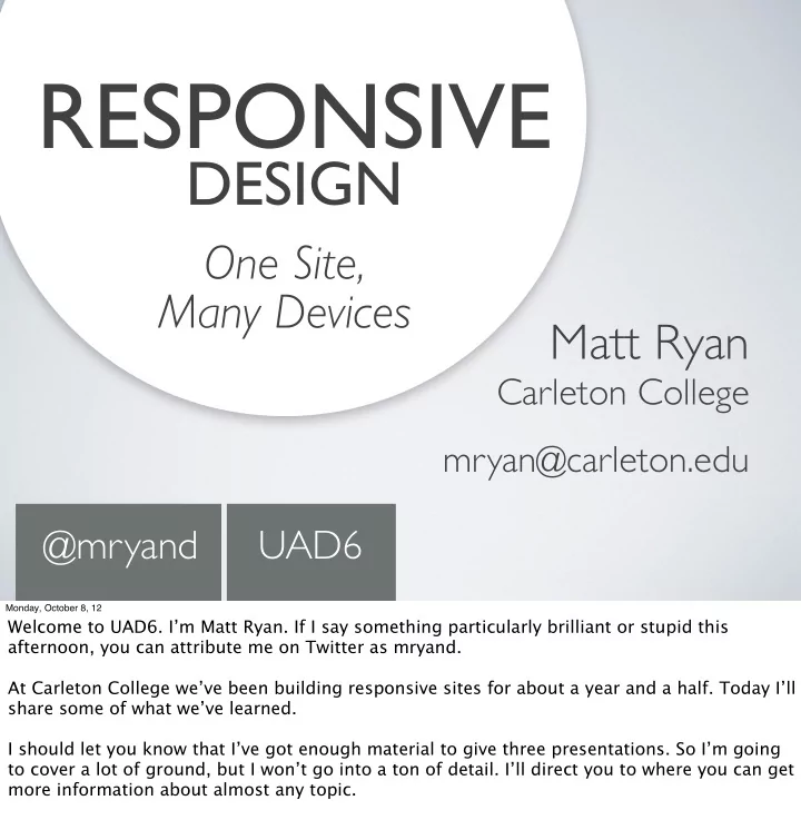
RESPONSIVE DESIGN One Site, Many Devices Matt Ryan Carleton College mryan@carleton.edu @mryand UAD6 Monday, October 8, 12 Welcome to UAD6. I’m Matt Ryan. If I say something particularly brilliant or stupid this afternoon, you can attribute me on Twitter as mryand. At Carleton College we’ve been building responsive sites for about a year and a half. Today I’ll share some of what we’ve learned. I should let you know that I’ve got enough material to give three presentations. So I’m going to cover a lot of ground, but I won’t go into a ton of detail. I’ll direct you to where you can get more information about almost any topic.
@mryand Monday, October 8, 12 Before we start, I have some questions for you: I’m assuming most of you are designers or front-end developers. How many of you are *not* designers or front-end developers? (put hands down) Okay, of those of you *are* designers or front-end developers, how many of you have designed or built a responsive site? Finally, how many of you have already been to another presentation about responsive design today? I hope that I can add something useful to what you’ve already heard. This talk is in three parts. We have:
1 The Essentials: Making pages look good & work well on any device @mryand Monday, October 8, 12 Before we start, I have some questions for you: I’m assuming most of you are designers or front-end developers. How many of you are *not* designers or front-end developers? (put hands down) Okay, of those of you *are* designers or front-end developers, how many of you have designed or built a responsive site? Finally, how many of you have already been to another presentation about responsive design today? I hope that I can add something useful to what you’ve already heard. This talk is in three parts. We have:
2 Optimization: Downloading only what’s needed @mryand Monday, October 8, 12 Before we start, I have some questions for you: I’m assuming most of you are designers or front-end developers. How many of you are *not* designers or front-end developers? (put hands down) Okay, of those of you *are* designers or front-end developers, how many of you have designed or built a responsive site? Finally, how many of you have already been to another presentation about responsive design today? I hope that I can add something useful to what you’ve already heard. This talk is in three parts. We have:
3 Strategy: The big picture @mryand Monday, October 8, 12 Before we start, I have some questions for you: I’m assuming most of you are designers or front-end developers. How many of you are *not* designers or front-end developers? (put hands down) Okay, of those of you *are* designers or front-end developers, how many of you have designed or built a responsive site? Finally, how many of you have already been to another presentation about responsive design today? I hope that I can add something useful to what you’ve already heard. This talk is in three parts. We have:
@mryand Monday, October 8, 12 Before we start, I have some questions for you: I’m assuming most of you are designers or front-end developers. How many of you are *not* designers or front-end developers? (put hands down) Okay, of those of you *are* designers or front-end developers, how many of you have designed or built a responsive site? Finally, how many of you have already been to another presentation about responsive design today? I hope that I can add something useful to what you’ve already heard. This talk is in three parts. We have:
Responsive Design is a CSS- based approach to layout that allows a single site to adapt to its environment. @mryand Monday, October 8, 12 First, what the heck is Responsive Design? This is the definition I’ll use for this presentation.
go.carleton.edu/responsive @mryand Monday, October 8, 12 We’ll be using this demo site throughout the presentation. We felt it would be useful to have a stripped-down site for this purpose. You can follow along on your device if you’d like, or check it out later. (go to browser and show how site adjusts; show in iphone/ipad?) (Present definition of responsive design)
1 The Essentials: Making pages look good & work well on any device @mryand Monday, October 8, 12
The ESSENTIALS @mryand Monday, October 8, 12 The two main design tools for creating responsive designs are fluid layouts* and media queries*.
The ESSENTIALS Fluid Layouts @mryand Monday, October 8, 12 The two main design tools for creating responsive designs are fluid layouts* and media queries*.
The ESSENTIALS Fluid Layouts Media Queries & Breakpoints @mryand Monday, October 8, 12 The two main design tools for creating responsive designs are fluid layouts* and media queries*.
The ESSENTIALS Fluid Layouts Media Queries & Breakpoints @mryand Monday, October 8, 12 The two main design tools for creating responsive designs are fluid layouts* and media queries*.
The ESSENTIALS Fluid Layouts Media Queries & Breakpoints @mryand Monday, October 8, 12 I’ve cover fluid layouts first.
Fluid Layouts @mryand Monday, October 8, 12 I’ve cover fluid layouts first.
Fluid Layouts @mryand Monday, October 8, 12 Fluid layouts are as old as the web itself.
Fluid Layouts OLD @mryand Monday, October 8, 12 Fluid layouts are as old as the web itself.
Fluid Layouts OLD @mryand Monday, October 8, 12 This is the first web page ever, and it adjusted to fit big, * medium * and small screens. It’s not pretty, but it’s fluid. Obviously fluid layouts have come a long way since then, but they are a classic design tool. If you’ve been creating fluid designs, you’re already halfway there to responsive design.
Fluid Layouts OLD @mryand Monday, October 8, 12 This is the first web page ever, and it adjusted to fit big, * medium * and small screens. It’s not pretty, but it’s fluid. Obviously fluid layouts have come a long way since then, but they are a classic design tool. If you’ve been creating fluid designs, you’re already halfway there to responsive design.
Fluid Layouts OLD @mryand Monday, October 8, 12 This is the first web page ever, and it adjusted to fit big, * medium * and small screens. It’s not pretty, but it’s fluid. Obviously fluid layouts have come a long way since then, but they are a classic design tool. If you’ve been creating fluid designs, you’re already halfway there to responsive design.
Fluid Layouts OLD @mryand Monday, October 8, 12 If you haven’t, it’s really not that hard. You can take any pixel-based grid and make it fluid by changing all the horizontal dimensions from pixels to percentages. So, in a 960 pixel grid your 480 pixel column becomes 50% wide. And we can do one better than classic fluid designs -- we can put a min- and max-width on the wrapper to ensure that things don’t get too wide or too narrow in our new, fluid layout.
The ESSENTIALS Fluid Layouts Media Queries & Breakpoints @mryand Monday, October 8, 12 But fluid designs break down at a certain point. If you have the example site up, switch over to the fluid layout and note that below about 800 pixels wide, thing start to get pretty terrible. On a very small screen it would be completely broken. And this was about as good as it got until recently, when the Web Gods handed us Media Queries.
The ESSENTIALS Fluid Layouts Media Queries & Breakpoints @mryand Monday, October 8, 12 But fluid designs break down at a certain point. If you have the example site up, switch over to the fluid layout and note that below about 800 pixels wide, thing start to get pretty terrible. On a very small screen it would be completely broken. And this was about as good as it got until recently, when the Web Gods handed us Media Queries.
The ESSENTIALS Fluid Layouts Media Queries & Breakpoints @mryand Monday, October 8, 12 But fluid designs break down at a certain point. If you have the example site up, switch over to the fluid layout and note that below about 800 pixels wide, thing start to get pretty terrible. On a very small screen it would be completely broken. And this was about as good as it got until recently, when the Web Gods handed us Media Queries.
The ESSENTIALS Fluid Layouts Media Queries & Breakpoints @mryand Monday, October 8, 12 Media Queries are relatively new*, compared to fluid layouts. (This* is media queries, and this* the the W3C). They are what allow us to adjust our designs to handle a much broader range of screen sizes, from large monitors* to mobile phones*. From a design perspective, these allow us to define breakpoints, which are window sizes at which the design changes. For example, between these two layouts there is a breakpoint that is where the design shifts between one and two columns. If you have the demo site up, you can resize your browser across that breakpoint to see the shift happen in real-time.
Recommend
More recommend
Explore More Topics
Stay informed with curated content and fresh updates.
