Relationships Session 7 PMAP 8921: Data Visualization with R - PowerPoint PPT Presentation
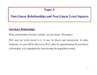
Relationships Session 7 PMAP 8921: Data Visualization with R Andrew Young School of Policy Studies May 2020 1 / 53 Plan for today The dangers of dual y-axes Visualizing correlations Visualizing regressions 2 / 53 The dangers of dual
Relationships Session 7 PMAP 8921: Data Visualization with R Andrew Young School of Policy Studies May 2020 1 / 53
Plan for today The dangers of dual y-axes Visualizing correlations Visualizing regressions 2 / 53
The dangers of dual y-axes 3 / 53
Stop eating margarine! Source: Tyler Vigen's spurious correlations 4 / 53
Why not use double y-axes? You have to choose where the y-axes start and stop, which means… …you can force the two trends to line up however you want! 5 / 53
It even happens in The Economist! 6 / 53
The rare triple y-axis! Source: Daron Acemoglu and Pascual Restrepo, "The Race Between Man and Machine: Implications of Technology for Growth, Factor Shares and Employment" 7 / 53
When is it legal? When the two axes measure the same thing 8 / 53
When is it legal? 9 / 53
Adding a second scale in R # From the uncertainty example weather_atl <- read_csv("data/atl-weather-2019.csv") ggplot(weather_atl, aes(x = time, y = temperatureHigh)) + geom_line() + geom_smooth() + scale_y_continuous( sec.axis = sec_axis(trans = ~ (32 - .) * -5/9, name = "Celsius") ) + labs(x = NULL, y = "Fahrenheit") 10 / 53
Adding a second scale in R car_counts <- mpg %>% group_by(drv) %>% summarize(total = n()) total_cars <- sum(car_counts$total) ggplot(car_counts, aes(x = drv, y = total, fill = drv)) + geom_col() + scale_y_continuous( sec.axis = sec_axis( trans = ~ . / total_cars, labels = scales::percent) ) + guides(fill = FALSE) 11 / 53
Alternative 1: Use another aesthetic 12 / 53
Alternative 2: Use multiple plots Anti-trafficking policy timeline in Honduras 13 / 53
Alternative 2: Use multiple plots library (patchwork) temp_plot <- ggplot(weather_atl, aes(x = time, y = temperatureHigh)) geom_line() + geom_smooth() + labs(x = NULL, y = "Fahrenheit") humid_plot <- ggplot(weather_atl, aes(x = time, y = humidity)) + geom_line() + geom_smooth() + labs(x = NULL, y = "Humidity") temp_plot + humid_plot + plot_layout(ncol = 1, heights = c(0.7, 0.3)) 14 / 53
Visualizing correlations 15 / 53
What is correlation? As the value of X goes up, r x , y = cov( x , y ) Y tends to go up (or down) σ x σ y a lot/a little/not at all Says nothing about how much Y changes when X changes 16 / 53
Correlation values r Rough meaning ±0.1–0.3 Modest ±0.3–0.5 Moderate ±0.5–0.8 Strong ±0.8–0.9 Very strong 17 / 53
Scatterplot matrices library (GGally) cars_smaller <- mtcars %>% select(mpg, cyl, gear, hp, qsec) ggpairs(cars_smaller) 18 / 53
Correlograms: Heatmaps 19 / 53
Correlograms: Points 20 / 53
Visualizing regressions 21 / 53
Drawing lines 22 / 53
Drawing lines with math y = mx + b A number y A number x Slope ( ) rise m run y-intercept b 23 / 53
Slopes and intercepts y = 2 x − 1 y = −0.5 x + 6 24 / 53
Drawing lines with stats ^ y = β 0 + β 1 x 1 + ε Outcome variable (DV) ^ y y Explanatory variable (IV) x x 1 Slope m β 1 y-intercept b β 0 Error (residuals) ε 25 / 53
Building models in R name_of_model <- lm(<Y> ~ <X>, data = <DATA>) summary(name_of_model) # See model details library (broom) # Convert model results to a data frame for plotting tidy(name_of_model) # Convert model diagnostics to a data frame glance(name_of_model) 26 / 53
Modeling displacement and MPG ^ hwy = β 0 + β 1 displ + ε car_model <- lm(hwy ~ displ, data = mpg) 27 / 53
Modeling displacement and MPG tidy(car_model, conf.int = TRUE) ## # A tibble: 2 x 7 ## term estimate std.error statistic p.value conf.low conf.high ## <chr> <dbl> <dbl> <dbl> <dbl> <dbl> <dbl> ## 1 (Intercept) 35.7 0.720 49.6 2.12e-125 34.3 37.1 ## 2 displ -3.53 0.195 -18.2 2.04e- 46 -3.91 -3.15 glance(car_model) ## # A tibble: 1 x 11 ## r.squared adj.r.squared sigma statistic p.value df logLik AIC BIC ## <dbl> <dbl> <dbl> <dbl> <dbl> <int> <dbl> <dbl> <dbl> ## 1 0.587 0.585 3.84 329. 2.04e-46 2 -646. 1297. 1308. ## # … with 2 more variables: deviance <dbl>, df.residual <int> 28 / 53
Translating results to math ## # A tibble: 2 x 2 ## term estimate ## <chr> <dbl> ## 1 (Intercept) 35.7 ## 2 displ -3.53 ^ hwy = 35.7 + (−3.53) × displ + ε 29 / 53
Template for single variables A one unit increase in X is associated with a β 1 increase (or decrease) in Y, on average ^ hwy = β 0 + β 1 displ + ε ^ hwy = 35.7 + (−3.53) × displ + ε This is easy to visualize! It's a line! 30 / 53
Multiple regression We're not limited to just one explanatory variable! ^ y = β 0 + β 1 x 1 + β 2 x 2 + ⋯ + β n x n + ε car_model_big <- lm(hwy ~ displ + cyl + drv, data = mpg) ^ hwy = β 0 + β 1 displ + β 2 cyl + β 3 drv:f + β 4 drv:r + ε 31 / 53
Modeling lots of things and MPG tidy(car_model_big, conf.int = TRUE) ## # A tibble: 5 x 7 ## term estimate std.error statistic p.value conf.low conf.high ## <chr> <dbl> <dbl> <dbl> <dbl> <dbl> <dbl> ## 1 (Intercept) 33.1 1.03 32.1 9.49e-87 31.1 35.1 ## 2 displ -1.12 0.461 -2.44 1.56e- 2 -2.03 -0.215 ## 3 cyl -1.45 0.333 -4.36 1.99e- 5 -2.11 -0.796 ## 4 drvf 5.04 0.513 9.83 3.07e-19 4.03 6.06 ## 5 drvr 4.89 0.712 6.86 6.20e-11 3.48 6.29 ^ hwy = 33.1 + (−1.12) × displ + (−1.45) × cyl + (5.04) × drv:f + (4.89) × drv:r + ε 32 / 53
Sliders and switches 33 / 53
Sliders and switches 34 / 53
Template for continuous variables Holding everything else constant , a one unit increase in X is associated with a β n increase (or decrease) in Y, on average ^ hwy = 33.1 + (−1.12) × displ + (−1.45) × cyl + (5.04) × drv:f + (4.89) × drv:r + ε On average, a one unit increase in cylinders is associated with 1.45 lower highway MPG, holding everything else constant 35 / 53
Template for categorical variables Holding everything else constant , Y is β n units larger (or smaller) in X n , compared to X omitted , on average ^ hwy = 33.1 + (−1.12) × displ + (−1.45) × cyl + (5.04) × drv:f + (4.89) × drv:r + ε On average, front-wheel drive cars have 5.04 higher highway MPG than 4-wheel-drive cars, holding everything else constant 36 / 53
Good luck visualizng all this! You can't just draw a line! There are too many moving parts! 37 / 53
Main problems Each coefficient has its own estimate and standard errors Solution: Plot the coefficients and their errors with a coefficient plot The results change as you move each slider up and down and flip each switch on and off Solution: Plot the marginal effects for the coefficients you're interested in 38 / 53
Coefficient plots Convert the model results to a data frame with tidy() car_model_big <- lm(hwy ~ displ + cyl + drv, data = mpg) car_coefs <- tidy(car_model_big, conf.int = TRUE) %>% filter(term != "(Intercept)") # We can typically skip plotting the intercept, so remove it car_coefs ## # A tibble: 4 x 7 ## term estimate std.error statistic p.value conf.low conf.high ## <chr> <dbl> <dbl> <dbl> <dbl> <dbl> <dbl> ## 1 displ -1.12 0.461 -2.44 1.56e- 2 -2.03 -0.215 ## 2 cyl -1.45 0.333 -4.36 1.99e- 5 -2.11 -0.796 ## 3 drvf 5.04 0.513 9.83 3.07e-19 4.03 6.06 ## 4 drvr 4.89 0.712 6.86 6.20e-11 3.48 6.29 39 / 53
Coefficient plots Plot the estimate and confidence intervals with geom_pointrange() ggplot(car_coefs, aes(x = estimate, y = fct_rev(term))) + geom_pointrange(aes(xmin = conf.low, xmax = conf.high)) + geom_vline(xintercept = 0, color = "red") 40 / 53
Marginal effects plots Remember that we interpret individual coefficients while holding the others constant We move one slider while leaving all the other sliders and switches alone Same principle applies to visualizing the effect Plug a bunch of values into the model and find the predicted outcome Plot the values and predicted outcome 41 / 53
Marginal effects plots Create a data frame of values you want to manipulate and values you want to hold constant Must include all the explanatory variables in the model 42 / 53
Marginal effects plots cars_new_data <- tibble(displ = seq(2, 7, by = 0.1), cyl = mean(mpg$cyl), drv = "f") head(cars_new_data) ## # A tibble: 6 x 3 ## displ cyl drv ## <dbl> <dbl> <chr> ## 1 2 5.89 f ## 2 2.1 5.89 f ## 3 2.2 5.89 f ## 4 2.3 5.89 f ## 5 2.4 5.89 f ## 6 2.5 5.89 f 43 / 53
Recommend
More recommend
Explore More Topics
Stay informed with curated content and fresh updates.







![metric : [me-trik] A standard for measuring or evaluating something Validity : Su ffi](https://c.sambuz.com/743924/metric-me-trik-a-standard-for-measuring-or-evaluating-s.webp)

