MSE 408 POSTER PRESENTATION GUIDELINES Updated for the Department of - PDF document
MSE 408 POSTER PRESENTATION GUIDELINES Updated for the Department of Materials Science and Engineering at ankaya University from a document by Dina F. Mandoli, University of Washington, Department of Botany, Box 355325, Seattle, Washington
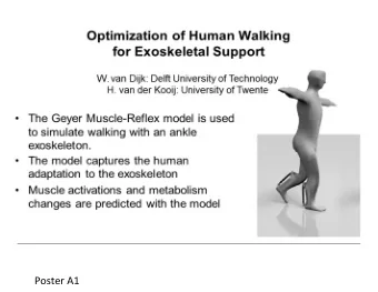
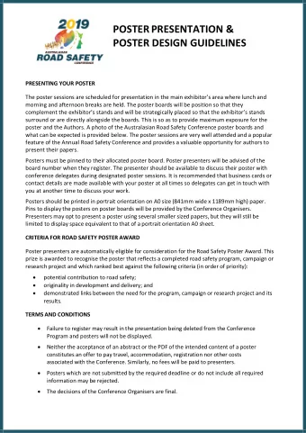
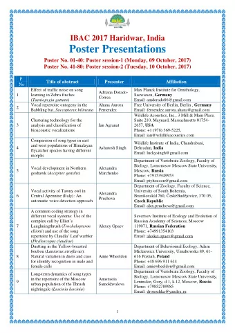
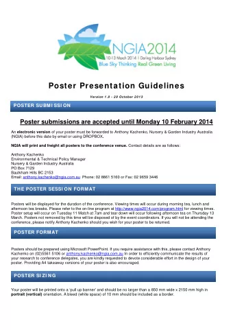
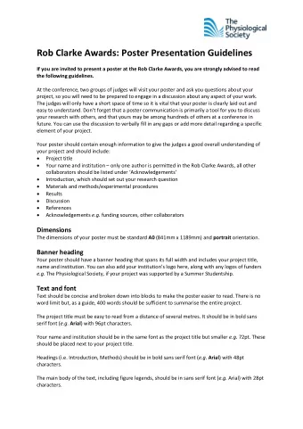
MSE 408 POSTER PRESENTATION GUIDELINES Updated for the Department of Materials Science and Engineering at Çankaya University from a document by Dina F. Mandoli, University of Washington, Department of Botany, Box 355325, Seattle, Washington 98195-5325. Making a great poster can be fun and is certainly a challenge. Here are some ideas about how to get the most attention for your efforts. The title banner of the poster includes the title of the work, names of the group members, names of the supervisors (academic rank excluded!) and the name of the department. These should appear justified in the banner. You may use official logos of the university and the company/companies. The main body should emphasize the problem statement of your work. For the headings, use at most 50 point font size with boldface. For the text, use at most 40 point font size. You may need boldface, underlined or italic font in the text, where available to emphasize the content. Use standard font types (Times New Roman, Arial, etc.). For ease of reading Arial could be preferred. Avoid using more than two font types in the same poster. Background color should be selected to provide high contrast with the foreground. Soft colors (pastels and grayscale colors) work well with the eye. You may prefer pale tones of grayscale with black font color. Minimum resolution of the poster (including text and visual content) should be at least 200 dpi to avoid blurriness in the printed copy. Paper size should be A 0 . Paper should weigh 90 g/m 2 or 120 g/m 2 . A GREAT POSTER IS... readable, Readability is a measure of how easily the ideas flow from one item to the next. Text that has lots of grammatical problems, complex or passive sentence structure, and misspellings is "hard to read". legible, If a text is legible, it can be deciphered. For example, an old book may not be legible if the paper has corroded or the lettering has faded. A common error in poster presentations is use of fonts that are too small to be read from 6-10 feet away, a typical distance for reading a poster. well organized, and 1
Spatial organization makes the difference between reaching 95% rather than just 5% of your audience: time spent hunting for the next idea or piece of data is time taken away from thinking about the science. succinct. Studies show that you have only 11 seconds to grab and retain your audience's attention so make the punchline prominant and brief. Most of your audience is going to absorb only the punchline. Those who are directly involved in related research will seek you out anyway and chat with you at length so you can afford to leave out all the details and tell those who are really interested the "nitty gritty" later. Here are some ideas about how to get the most attention for your efforts. I. TWO WAYS TO MAKE A POSTER ARE TO have someone else do it, or A professional illustrator will ask you about all the items in this presentation so they may not save you time if it is the decision making that is slowing you down! Although they will save you time in the execution of the work, you are the final arbiter of the quality and content of the poster. make your own. Designing the poster panels deserves consideration <How to make great slides - PDF, PPT (21 MB)>. Most posters are most quickly made using some kind of computer software. A word processing program plus a few graphics packages (e.g. Microsoft Powerpoint, Macromedia Freehand, Adobe Illustrator, Adobe Photoshop, Adobe PageMaker) are important tools. Of these, Powerpoint has the least sophisticated graphics options. If you have not tried computer graphics or are just starting out, find someone whose poster you like and ask them what they use and if they like it. II. CHOOSING BETWEEN TWO POPULAR FORMATS: a large format poster or These are printed as a single large sheet. a multiple panel poster . These are composed of printed individually elements, predominantly 8.5X11 inches each, that get assembled into a poster on site. The style you chose is a matter of cost and personal taste. What are the tradeoffs? Large format posters require access to a large format printer (Kinko's or other computer-based copying companies have these) and the latter can be done largely with tools in your office or lab. Both formats are portable although large format posters are awkward to carry without a good carrier tube with a shoulder strap. Both are affordable ($0.5 to 1.0 per inch versus about $50 for a multiple panel poster). In contrast to the multiple panel poster, you must reprint the whole large format poster if 1) the data change at the last minute or 2) the colors on printing turn out to be really ugly or 3) you spill a liquid on it 2
(unless laminated they run badly if they get wet). If any of these factors are at issue, you may wish to consider a multiple panel poster: it is easy to reprint individual elements without having to make the whole thing over again. Although there is no question that it is easier to mount the large format poster once on site - 4 tacks and you are done - there is no way to rearrange the panels within your large format poster once it is printed. If you are going to two meetings and need a different sized poster for each, then you might consider a large format poster instead since unless you omit panels or change the spacing between them, the multiple panel poster is somewhat harder to change in size. There are many ways to make the panels of your poster. For element composition within a panel please see <How to make great slides - PDF, PPT (21 MB)>. [Here, a panel is equal to a slide and an element is part of a panel.] For details on how to make and assemble a multiple panel poster, please go to the <Multiple panel poster details, How to make great slides - PDF, PPT (21 MB)>. III. TO BEGIN: decide what the main message is, Keep it short and sweet and make this your title! Use the active voice (i.e., avoid "ing" on the ends of verbs) and avoid the verb "to be" whenever possible. measure the space you have, Regardless of poster format, lay out the space physically as well as on paper to double- check yourself. If you can, make the poster flexible enough to change the size by adding or omitting panels or elements. This flexibility is handy if you are going to more than one meeting, if the poster boards are not exactly the size advertised, if the meetings have different in size requirements for posters, or if you wish to update your data between meetings. lay out your panels crudely, Before you actually spend time making the final panels of the poster, take pieces of paper that are about the right size and see if you can actually make it all fit. This will save you a lot of time in the long run. ELIMINATE all extraneous material, Given that the average poster gazer spends less than 10 minutes on your work and you have 11 seconds to trap your subject before they move on, only show data that adds to your central message. You do need a Title, Authors, Introduction, Results, and Conclusions. Some meetings require you to include the abstract also. Usually, omitting Materials & Methods is fine: most people will not read them anyway. If you wish, have a methods handout for those who ask for it. Although sometimes the method is essential to understand the data or the validity of the conclusions, most of the time, a short version here will do as well. Consider making handouts that include the full poster in miniature on one face and then all that other material on the opposite side. Methods, references, detailed contact information, advertisement for a postdoctoral fellowship (to ask for or to give out one), 3
Recommend
More recommend
Explore More Topics
Stay informed with curated content and fresh updates.
