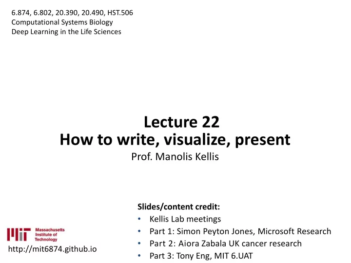
Lecture 22 How to write, visualize, present Prof. Manolis Kellis - PowerPoint PPT Presentation
6.874, 6.802, 20.390, 20.490, HST.506 Computational Systems Biology Deep Learning in the Life Sciences Lecture 22 How to write, visualize, present Prof. Manolis Kellis Slides/content credit: Kellis Lab meetings Part 1: Simon Peyton
How to write, visualize, present 1. P Paper per w writ iting ing a and d organi ganizat ation ion: conv nvey eyin ing • Write-first, single key idea, narrative, sharing, feedback • Readers first: intuition, examples, results-first, take-home • Simple direct language, active voice, explain, be understood 2. Figur ures: d displa playing ing infor ormat atio ion v n visua ually lly • Visual legends, axes:measure-vs-unit/reuse, minimize ink • Elements: marks/channels; figure types; group/order/simpl • Typography; composition/layout 3. Deliv liver ering i ng impac pactful o ul oral al pres esen entat ations ions • Importance of conveying: sharing makes work alive, point • Speak clearly: posture/voice/rhetoric/contact/flow/creativ • Planning: storyboarding, signposts, recovery • Convincing: rhetoric, ethos/pathos/logos, prepare/natural • Connect: audience first, guide, appreciate, adapt, payload
Labeling your axes “Count” • Number of enhancers • Number of enhancers showing differential enrichment “-log 10 P-value” -log 10 P-value (association is random) T2D association (-log 10 P-value)
Labeling your axes
2. Figures: Convey information visually 1. Key figures/legends advice 2. Elements: Marks and Channels 3. Choosing the right type of figure 4. Dealing with complexity 5. Typography 6. Composition and Layout 7. General Tips Slides des c credi edit: Aio Aiora Zabal Zabala Ph PhD D Environm onment ent. VTP P Graph aphic Des esign gn az296, 96, ai aior ora. a.zabal abala@ a@gm gmai ail.com om
1. Elements: Marks and channels Marks (geometric primitives): used to represent data Channels control the graphical appearance of marks: used to encode data, can be combined Images from Munzner
Types of channel Identity channels: categorical/ Magnitude channels: ordered/ qualitative attributes quantitative attributes Images from Munzner
Types of channel (continued) Rolandi et al 2011
Effectiveness of each channel: Quantitation perception The perceived magnitude of sensory channels follows a power law: S = I N Depending on the N of a given type of sensation, its perception is magnified (e.g. colour saturation) or compressed (e.g. brightness) Image from Munzner 2015
2. Figures: Convey information visually 1. Key figures/legends advice 2. Elements: Marks and Channels 3. Choosing the right type of figure 4. Dealing with complexity 5. Typography 6. Composition and Layout 7. General Tips
2. Choosing the type of figure ● Text, table or figure? – Text: one or two numbers Treatment 1 0.01 Treatment 2 0.13 – Table: Treatment 3 0.30 Exact numerical values ● Small datasets (a figure may ● 0.35 be best avoided if it has low 0.3 data density) 0.25 0.2 When the data presentation ● 0.15 requires many localised 0.1 0.05 comparisons 0 1 2 3
Things you can illustrate Slide from Babraham Bioinformatics
Each figure tells a different story
Each figure tells a story differently Democratic Republican 1,000 votes 1,000 votes 80,000 80,000 60,000 60,000 40,000 40,000 20,000 20,000 Democratic Republican 0 0 1988 1992 2000 2004 2012 2016 1996 2008 198 199 199 200 200 200 201 201 8 2 6 0 4 8 2 6 Democratic Republican Democratic Republican 1,000 votes 1,000 votes 80,000 70,000 60,000 66,000 40,000 62,000 20,000 0 58,000 200 201 201 200 201 201 8 2 6 8 2 6
Stripchart – comparison Only one of the axis is ● meaningful To explore small ● datasets (n < 100) and compare categories The most basic plot ● (rarely in publications)
Line chart – relationships To show a trend of ● continuous data (usually over time) For matched, paired or ● repeated data, and for time-series To tell a story: how data ● change, rather than the discrete values of the data Carter 2013
Bar chart – comparison To compare ● discrete quantities of non- continuous data ● For presenting results and emphasise differences (not so much to explore) Carter 2013
Bar chart – comparison The choice of the x axis and of point of reference can affect how comparisons are perceived Slide from Babraham Bioinformatics
Bar chart variations Normalised stacked Stacked bar chart bar chart ● For categorical data; heed the sample size
Pie chart – composition/ proportion To show relative ● proportions of a whole Not a great idea, ‘given ● their low data-density and failure to order numbers along a visual dimension’ (Tufte) Alternative: Polar area chart Wickham, 2010
Bar chart alternative for comparisons: Dotchart with confidence intervals Focuses attention on the ● relative values and their measure of variability , rather than on the absolute values (absolute values are ● better conveyed using the heights – in a barplot) Treatment 1 2 3 4
Histogram – distribution To show the distribution of a ● variable and the relative frequency of values; to explore the data Better on big datasets ● Estimate of the probability ● distribution of the variable ● The number of bins (resolution) affects the perceived shape of the distribution; the same perceptive distortion can occur when using histograms with discrete data ● Rules: Number of intervals ≈√N and Interval width ≈ Range ÷ √N
Boxplot – distribution Outlier s Maximum Cutoff = Q3 + Also box-and-whisker plot 1.5*IQR ● Shows the central value, ● the extremes, and the Upper area where 50% of the Quartile, Q3 Interquartil 75 th e Range values are located. percentile (IQR), 50% (3 rd quartile) of – Usually median, minimum, the data maximum, lowest and Media highest quartiles n Particularly useful to ● understand distribution of Lower Quartile, Q1 25 th not-normal data percentile (1 st quartile) Minimum
Boxplot variation: Violin/ Bean plots Stripchart A bean= a To the above, it adds a shows ‘batch’ of ● individual data stripchart of the data actual datapoints Shows the data ● density To understand the ● distribution in more detail Bimoda Uniform Norma l l Distributions Data density mirrored by the shape of the polygon Image from Babraham Bioinformatics
Scatterplot – relationships To show the relationship between two continuous variables Babraham Bioinformatics
Scatterplot – relationships For high-density data: use colours or transparency Problem: very big dataset Solution: smoothed densities colour representation Babraham Bioinformatics
Scatterplot variations Bubble scatterplot It adds a 3 rd dimension (but only for small datasets) From plot.ly
Scatterplot variations Scatterplot matrix (correlogram) Useful to explore bivariate associations in a large dataset Built using corrgram package for R
Heatmap – relationship Shows more ● complex relationships, e.g. many conditions Steps: ● normalisation, clustering Representation: ● colouring, filtering Babraham Bioinformatics
Heatmap A heatmap is basically a table that has colours in place of numbers Babraham Bioinformatics
Heatmap Colour scheme for grouping: Clustering (done usually via Euclidean distances –differences between values) Babraham Bioinformatics
Heatmap Heatmaps are great ● but: – Careful with clustering – Plot data that are changing ● Remove unchanging points to focus on differences Babraham Bioinformatics
Maps (a very quick look) Information shown over maps has great communication power Telegraph
Maps (a very quick look) But they are also highly prone to distortions and to biasing perceptions Telegraph
Maps (a very quick look) What is the message you want to emphasise? Geographical distribution? Proportions? The Guardian
Summary Plot Aim Main R function distribution stripchart() Stripchart relationships plot(type=”l”) Line chart comparison (and composition) barplot() Bar chart (stacked, norm. stacked) comparison dotchart() Dotchart with CI distribution hist() Histogram Boxplot (violin/ bean) distribution boxplot(), vioplot() Scatterplot (correlogram) relationships plot(x, y), corrgram package composition pie() Pie chart relationship heatmap() Heatmap
2. Figures: Convey information visually 1. Key figures/legends advice 2. Elements: Marks and Channels 3. Choosing the right type of figure 4. Dealing with complexity 5. Typography 6. Composition and Layout 7. General Tips
Dealing with complexity To focus the viewer’s attention onto the main point ● you want to convey (e.g. on specific subsets of data) To require less cognitive load for the viewer ● to understand the message
Grouping
Ordering (only for categories)
Diagonalizing (for heatmaps)
Filter, link, embed McInerny & Krzywinski 2015
Small multiples 100 120 120 A B 100 A B C D 80 80 100 60 60 40 40 80 20 20 0 0 60 120 120 C D 100 100 40 80 80 60 60 20 40 40 20 20 0 0 0
Small multiples 100 120 A A B C D 50 100 0 100 C 80 50 0 60 100 B 50 40 0 100 20 D 50 0 0
Small multiples McInerny & Krzywinski 2015
2. Figures: Convey information visually 1. Key figures/legends advice 2. Elements: Marks and Channels 3. Choosing the right type of figure 4. Dealing with complexity 5. Typography 6. Composition and Layout 7. General Tips
Typography (fonts) All the elements need to be labelled ● The essential criteria for choosing fonts is ● readability: – Scalability (readable at small sizes) – Contrast with the background Fonts convey a personality, mood or ● attitude (some more than others)
Typography serif Serif for large blocks of ● text, sans-serif for titles, labels and annotating figures – Sans-serif is easier to read at smaller sizes ● with sans Sizing : the size of fonts is serif serif given in points, and it’s the size of an imaginary block (without) of metal that is used in printing. – In practice, the only way to know exactly how well your Babraham Bioinformatics font will be read is to print
Typography Monospace is good for code, ● Monospace font keeps or for text intended to be the alignments tidy. aligned from line to line (e.g. (this is monospace!) pseudo-tables) m vs m ; i vs i g. Monospace font keeps Casing : ● the alignments tidy. – UPPERCASE, (not monospace font) – lowercase, – Sentence case, – Title Case. Each of the lines above Check the journal guidelines has 20 characters. ● for font types
Typography: Guidelines ✔ Avoid aspect-ratio distortions : changing font height or size. ✘ The same applies to ● images and circular objects Scale axes using ● comparable units Babraham Bioinformatics
Typography: Guidelines Minimise text; keep it simple Babraham Bioinformatics
Typography: Typesetting ● Is the arrangement (spacing) of characters in words, lines or paragraphs Tracking: space between characters ● Leading: line height ● ● Paragraph alignment: left, justified, etc. ● Important considerations where figures have many annotations, and in axis and figure titles. Babraham Bioinformatics
Typography: Guidelines Avoid colour in text, ● ✔ particularly in figures (to Typeset in maximise contrast) blocks of text that are text, always Do not tilt ● horizontal (or vertical) solid shapes ✘ Avoid Check scalability : text ● typeset in should be readable after blocks resizing of text that are not solid shapes Babraham Bioinformatics
Typography: Heed the numbers in your font Each font has different ● styles of numbers Make sure that the font you ● choose distinguishes them well (e.g. I in Gill Sans ) and is legible at small sizes
Typography: Think your words carefully Avoid wordiness… it’s a figure! ● Choose words that “precisely convey what ● you mean” Avoid contractions and spell out whenever ● possible
2. Figures: Convey information visually 1. Key figures/legends advice 2. Elements: Marks and Channels 3. Choosing the right type of figure 4. Dealing with complexity 5. Typography 6. Composition and Layout 7. General Tips
Composition and layout Draft ● Grid and alignments ● Balance and hierarchy ●
Composition and layout Have an idea of what your ● final figure will look like – What message are you trying to convey? – How does each figure contribute to that message? – Identify what is essential (Supporting Information) Outlines can reduce time ● spent moving or resizing images Babraham Bioinformatics
Grids Grids are the invisible structure ● behind a composition that makes it look balanced Every alignment (of a box, column, ● text line and text margin) creates a visual line in the grid Conversely, a composition where ● elements are aligned to a grid creates a sense of balance Grids can help to organize the spaces around and in-between elements. Rolandi et al 2011
Alignments
Alignments Use tools to align objects, don’t do it by eye! Most programmes have tools for automatic alignment and to distribute objects with equal space.
Using grids
Visual balance and hierarchy The composition of a Keep a balance between white graphic object and space , text and figures the emphasis on Visual weight/ emphasis: How much an object on the page ● each element will attracts and retains the attention of your viewer Depends on size, ● determine what is the ● colour, position, etc. Should match the relevance of hierarchy between the information elements , and how the eye will flow and These are some questions you can make to assess visual balance and flow: Is there a clear where it will (and justified) hierarchy or arrangement between focus elements? Can adjustments be made to make more relevant connections? Does the place feel cluttered/ scattered? (Krause, 2004)
Visual weight and balance Visual weight: A measure of how much an object on the page attracts and retains the attention of your viewer 100 100 80 80 60 60 40 40 20 20 0 0 In the left figure, the black diamond and, to a lesser extent, the circle stand out ( is this our intention? ). There is also little separation between the charts, which makes the figure look cluttered.
Visual weight and balance Visual weight: A measure of how much an object on the page attracts and retains the attention of your viewer Can help to guide the viewers eye through the figure
Use of white space
2. Figures: Convey information visually 1. Key figures/legends advice 2. Elements: Marks and Channels 3. Choosing the right type of figure 4. Dealing with complexity 5. Typography 6. Composition and Layout 7. General Tips
General tips Don’t-s : Do-s: Don’t distort the data One point per figure ● ● No unnecessary figures Summarise to clarify ● ● or elements: do we really Have a clear purpose/ ● need a figure? or a table message would suffice? Link to accompanying ● Don’t rely absolutely on ● text and statistics colour No 3D: in most cases it ● distorts perception
Can you find ten ways to improve this figure? Pascual et al. Targeting metastasis-initiating cells through the fatty acid receptor CD36. Nature. 7 December 2016
Work in progress...
Work in progress...
Checklist Is your figure effective? □ The figure is self contained : understandable without additional information □ Every element is labelled or explained in the caption, including x and y units □ x and y axis: scales show appropriate variation of the data, or are comparable □ Readability and contrast are appropriate □ Every use of colour has a reason □ The figure works in grayscale (except for very complex figures) □ If there are groupings , they help understand the message without manipulating □ There are no channel inconsistencies within the figure □ It is as simple as possible: i.e. no decorations, every piece that could be eliminated without losing information has been eliminated □ Has been validated with other people…
Recommend
More recommend
Explore More Topics
Stay informed with curated content and fresh updates.

