Human-Computer Interaction I3 Ethnography: What did you learn? I6: - PDF document
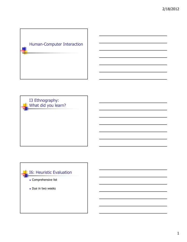
2/18/2012 Human-Computer Interaction I3 Ethnography: What did you learn? I6: Heuristic Evaluation Comprehensive list Due in two weeks 1 2/18/2012 T4: Paper Prototyping #1 Update storyboards in response to scenario to be sent to
2/18/2012 Human-Computer Interaction I3 Ethnography: What did you learn? I6: Heuristic Evaluation Comprehensive list Due in two weeks 1
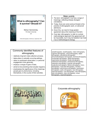
2/18/2012 T4: Paper Prototyping #1 Update storyboards in response to scenario to be sent to you Create a paper prototyping kit for your interface Practice on one person prior to... In-class exercise next week What is Design? Achieving goals within constraints Goals Constraints Trade-offs Golden Rule Understand your materials Computers People (“Know your users”) Who are they? Probably not like you Talk to them (how things really, vs should, happen) Watch them (what ... You want why) Look at the “stuff” they use Use your imagination 2
2/18/2012 Understanding People E.g., Impact of “stuff” E.g., Errors: Slips Errors Omissions Scenarios and Personas “ Force you to think about the design in detail and notice potential problem before they happen” Also help Communicate ideas Validate other models (e.g., task) Express dynamics (But be careful ... Only show one path) Persona Description of an ‘example’ user Not necessarily a real person Use as surrogate user What would “Ralph” think Details matter Realism helps in creation and use 3
2/18/2012 Example Betty is 37 years old, She has been Warehouse Manager for five years and worked for Simpkins Brothers Engineering for twelve years. She didn’t go to university, but has studied in her evenings for a business diploma. She has two children aged 15 and 7 and does not like to work late. She did part of an introductory in-house computer course some years ago, but it was interrupted when she was promoted and could no longer afford to take the time. Her vision is perfect, but her right-hand movement is slightly restricted following an industrial accident 3 years ago. She is enthusiastic about her work and is happy to delegate responsibility and take suggestions from her staff. However, she does feel threatened by the introduction of yet another new computer system (the third in her time at SBE). Scenario What will users want to do? Step-by-step walkthrough What can they see (sketches, screen shots) What do they do (keyboard, mouse etc.) What are they thinking? Use and reuse throughout design Scenario Example Brian would like to see the new film “Moments of Significance” and wants to invite Alison, but he knows she doesn’t like “arty” films. He decides to take a look at it to see if she would like it and so connects to one of the movie sharing networks. He uses his work machine as it has a higher bandwidth connection, but feels a bit guilty. He knows he will be getting an illegal copy of the film, but decides it is OK as he is intending to go to the cinema to watch it. After it downloads to his machine he takes out his new personal movie player. He presses the ‘menu’ button and on the small LCD screen he scrolls using the arrow keys to ‘bluetooth connect’ and presses the select button. On his computer the movie download program now has an icon showing that it has recognised a compatible device and he drags the icon of the film over the icon for the player. On the player the LCD screen says “downloading now”, a percent done indicator and small whirling icon. … … … 4
2/18/2012 Storyboards Storyboarding Notice how the storyboard tells a story. It is not just screenshots .... Context important 5
2/18/2012 Best to not get too fancy and stick with pencil if you can... Navigation Design / Local Structure Much interaction: goal seeking behavior People meander Important to Know where you are Know what you can do Know where you are going Know what will happen Know where you’ve been Know what you’ve done Network diagram Task oriented What leads to what What happens when Branches and loops main remove confirm screen user add user 6
2/18/2012 Cognitive failure due to modes Why didn’t Nokia figure this out? How would you figure out this is a problem? Aesthetics and Utility We will talk about design later... For now Pretty ≠ good But want well designed to look nice Beauty and utility may be at odds Examples? Evaluation Formative Start in a good place ... Iteration! Summative End of process Often far too late 7
2/18/2012 Iterative prototyping You never get it right first time If at first you don’t succeed … OK? done! design prototype evaluate re-design Pitfalls of prototyping Moving little by little … but to where Blue Hills or Mount Washington? Need a good start point 1. Need to understand what is wrong 2. Need paper napkins not cloth napkins 3. Design rules principles abstract design rules low authority high generality Guidelines increasing generality increasing generality standards specific design rules high authority Standards limited application guidelines lower authority increasing authority increasing authority more general application 8
2/18/2012 Principles to support usability Learnability the ease with which new users can begin effective interaction and achieve maximal performance Flexibility the multiplicity of ways the user and system exchange information Robustness the level of support provided the user in determining successful achievement and assessment of goal-directed behaviour Principles of learnability Predictability determining effect of future actions based on past interaction history operation visibility assumes user has a mental model Synthesizability assessing the effect of past actions immediate vs. eventual honesty Principles of learnability (ctd) Familiarity how prior knowledge applies to new system guessability; affordance Generalizability extending specific interaction knowledge to new situations Consistency likeness in input/output behaviour arising from similar situations or task objectives must be applied relative to something 9
2/18/2012 Principles of flexibility Dialogue initiative freedom from system imposed constraints on input dialogue system vs. user pre-emptiveness (Technically tricky) Maximize: user pre-empt the system Minimize: system pre-empt the user Multithreading ability of system to support user interaction for more than one task at a time concurrent vs. interleaving; multimodality Task migratability passing responsibility for task execution between user and system Principles of flexibility (ctd) Substitutivity allowing equivalent values of input and output to be substituted for each other representation multiplicity; equal opportunity Customizability modifiability of the user interface by user (adaptability) or system (adaptivity) Principles of robustness Observability ability of user to evaluate the internal state of the system from its perceivable representation browsability; defaults; reachability; persistence; operation visibility Recoverability ability of user to take corrective action once an error has been recognized reachability; forward/backward recovery; commensurate effort Difficult to undo, then difficult to do 10
2/18/2012 Principles of robustness (ctd) Responsiveness how the user perceives the rate of communication with the system Stability Task conformance degree to which system services support all of the user's tasks task completeness; task adequacy Standards set by national or international bodies to ensure compliance by a large community of designers standards require sound underlying theory and slowly changing technology hardware standards more common than software high authority and low level of detail ISO 9241 defines usability as effectiveness, efficiency and satisfaction with which users accomplish tasks Guidelines more suggestive and general many textbooks and reports full of guidelines abstract guidelines (principles) applicable during early life cycle activities detailed guidelines (style guides) applicable during later life cycle activities understanding justification for guidelines aids in resolving conflicts 11
2/18/2012 Golden rules and heuristics “Broad brush” design rules Useful check list for good design Better design using these than using nothing! Different collections e.g. Nielsen’s 10 Heuristics (see Chapter 9) Shneiderman’s 8 Golden Rules Norman’s 7 Principles Shneiderman’s 8 Golden Rules 1. Strive for consistency 2. Enable frequent users to use shortcuts 3. Offer informative feedback 4. Design dialogs to yield closure 5. Offer error prevention and simple error handling 6. Permit easy reversal of actions 7. Support internal locus of control 8. Reduce short-term memory load Norman’s 7 Principles 1. Use both knowledge in the world and knowledge in the head. 2. Simplify the structure of tasks. 3. Make things visible: bridge the gulfs of Execution and Evaluation. 4. Get the mappings right. 5. Exploit the power of constraints, both natural and artificial. 6. Design for error. 7. When all else fails, standardize. 12
Recommend
More recommend
Explore More Topics
Stay informed with curated content and fresh updates.
