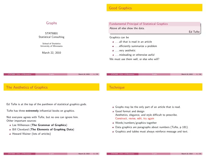

Good Graphics Graphs Fundamental Principal of Statistical Graphics Above all else show the data. Ed Tufte STAT8801 Statistical Consulting Graphics can be . . . all that is read in an article School of Statistics . . . efficiently summarize a problem University of Minnesota . . . very aesthetic March 22, 2010 . . . misleading or otherwise awful We must use them well, or else who will? STAT8801 (Univ. of Minnesota) Graphs March 22, 2010 1 / 35 STAT8801 (Univ. of Minnesota) Graphs March 22, 2010 2 / 35 The Aesthetics of Graphics Technique Ed Tufte is at the top of the pantheon of statistical graphics gods. Graphs may be the only part of an article that is read. Tufte has three extremely influential books on graphics. Good format and design Aesthetics, elegance, and style difficult to prescribe. Not everyone agrees with Tufte, but no one can ignore him. Construct, revise, edit, try again Other important sources: Words/numbers/graphics together Lee Wilkenson ( The Grammar of Graphics ) Data graphics are paragraphs about numbers (Tufte, p 181). Bill Cleveland ( The Elements of Graphing Data ) Graphics and tables must always reinforce message and text. Howard Wainer (lots of articles) STAT8801 (Univ. of Minnesota) Graphs March 22, 2010 3 / 35 STAT8801 (Univ. of Minnesota) Graphs March 22, 2010 4 / 35
Show the right data The Worst Graph Ever Challenger data 4 LS line Show the right data 3 Show enough data Failures Don’t hide important data ● ● 2 Keep data in context 1 ● ● ● ● ● 0 30 40 50 60 70 80 90 Temperature STAT8801 (Univ. of Minnesota) Graphs March 22, 2010 5 / 35 STAT8801 (Univ. of Minnesota) Graphs March 22, 2010 6 / 35 What they should have done From Tilman, Hill and Lehman (2006) Science, p. 1598 Challenger data 4 Poisson line 3 Failures ● ● 2 1 ● ● ● ● ● 0 ● ● ● ● ● ● ● ● ● ● ● ● ● ● ● ● 30 40 50 60 70 80 90 Temperature STAT8801 (Univ. of Minnesota) Graphs March 22, 2010 7 / 35 STAT8801 (Univ. of Minnesota) Graphs March 22, 2010 8 / 35
. . . adding prediction intervals . . . adding species indicator ● 500 ● 500 None ● Other legume Luppe ● Average above ground Biomass, g/m^2 Average above ground biomass, g/m^2 ● ● 400 400 ● ● ● ● ● ● ● ● ● ● ● ● ● ● ● ● ● ● ● ● ● ● ● ● ● ● ● ● 300 300 ● ● ● ● ● ● ● ● ● ● ● ● ● ● ● ● ● ● ● ● ● ● ● ● ● ● ● ● ● ● ● ● ● ● ● ● ● ● ● ● ● ● ● 200 ● ● 200 ● ● ● ● ● ● ● ● ● ● ● ● ● ● ● ● ● ● ● ● ● ● ● ● ● ● ● ● ● ● ● ● ● ● ● ● ● ● ● ● ● ● ● ● ● ● ● ● ● ● ● ● ● ● ● ● ● ● ● ● ● ● 100 ● 100 ● ● ● ● ● ● ● ● ● ● ● ● ● ● ● ● ● ● ● ● ● ● ● ● ● ● ● ● ● ● ● ● ● ● ● ● ● ● ● ● ● ● ● ● ● ● ● ● ● ● ● ● ● ● ● ● ● 5 10 15 0 5 10 15 Number of Species Number of Species STAT8801 (Univ. of Minnesota) Graphs March 22, 2010 9 / 35 STAT8801 (Univ. of Minnesota) Graphs March 22, 2010 10 / 35 Connecticut Traffic Deaths Correct for inflation STAT8801 (Univ. of Minnesota) Graphs March 22, 2010 11 / 35 STAT8801 (Univ. of Minnesota) Graphs March 22, 2010 12 / 35
Show only the data Bad data-ink ratio Definition (Data ink) Data ink is the “ink” that displays non-redundant data information. Definition (Data ink ratio) Proportion of a graphic’s ink devoted to the non-redundant display of data information. 1 Maximize data ink ratio, within reason 2 Erase non data ink, within reason 3 Erase redundant data ink, within reason STAT8801 (Univ. of Minnesota) Graphs March 22, 2010 13 / 35 STAT8801 (Univ. of Minnesota) Graphs March 22, 2010 14 / 35 Good data-ink ratio Zero data-ink ratio STAT8801 (Univ. of Minnesota) Graphs March 22, 2010 15 / 35 STAT8801 (Univ. of Minnesota) Graphs March 22, 2010 16 / 35
Maximizing data-ink ratio Erasable non-data ink p125 top and p125 bottom of Tufte STAT8801 (Univ. of Minnesota) Graphs March 22, 2010 17 / 35 STAT8801 (Univ. of Minnesota) Graphs March 22, 2010 18 / 35 Erasable non-data ink Improved non-data ink STAT8801 (Univ. of Minnesota) Graphs March 22, 2010 19 / 35 STAT8801 (Univ. of Minnesota) Graphs March 22, 2010 20 / 35
Show only the data Content-free decoration Non-data ink can be chartjunk. Could be shading, hatching, grid, etc. Get rid of it! STAT8801 (Univ. of Minnesota) Graphs March 22, 2010 21 / 35 STAT8801 (Univ. of Minnesota) Graphs March 22, 2010 22 / 35 Moir´ e patterns Show data, not frames STAT8801 (Univ. of Minnesota) Graphs March 22, 2010 23 / 35 STAT8801 (Univ. of Minnesota) Graphs March 22, 2010 24 / 35
Almost no information! Don’t lie with graphics Lies, damned lies, and statistics could also be Lies, damned lies, and graphics. What can we do to avoid misleading? STAT8801 (Univ. of Minnesota) Graphs March 22, 2010 25 / 35 STAT8801 (Univ. of Minnesota) Graphs March 22, 2010 26 / 35 Data, area and dimension Backward in time? The size of the representation of a number should be proportional to the number The number of information carrying dimensions should not exceed the dimension of the data. STAT8801 (Univ. of Minnesota) Graphs March 22, 2010 27 / 35 STAT8801 (Univ. of Minnesota) Graphs March 22, 2010 28 / 35
Perspective Change in axis meaning STAT8801 (Univ. of Minnesota) Graphs March 22, 2010 29 / 35 STAT8801 (Univ. of Minnesota) Graphs March 22, 2010 30 / 35 Paper usage, New York Times, Feb. 10, 2008 How to Display Data Badly (Wainer) 1 Show as few data as possible. 2 Hide what data you do show. 3 Ignore the visual metaphor. 4 Only order matters. 5 Graph data out of context. 6 Change scales in mid-axis. 7 Emphasize the trivial, not the important. 8 Jiggle the baseline. 9 Austria first. 10 Label illegibly, incompletely, inaccurately, and ambiguously. STAT8801 (Univ. of Minnesota) Graphs March 22, 2010 31 / 35 STAT8801 (Univ. of Minnesota) Graphs March 22, 2010 32 / 35
Don’t. . . Do. . . 1 . . . Mislead 2 . . . Use mysterious abbreviations 1 . . . use accessible friendly graphic 3 . . . Include too much clutter (forest for the trees) 2 . . . include axis labels, titles and legends 4 . . . Misuse placement of origin 3 . . . use sensible tick marks 5 . . . Include graphs without explanation 4 . . . facilitate comparisons between graphs by using common scales. 6 . . . Use gratuitous color/line variation 5 . . . avoid unclear abbreviations. 7 . . . SHOUT (use all capital letters) 8 . . . use chart junk 9 . . . use pie charts STAT8801 (Univ. of Minnesota) Graphs March 22, 2010 33 / 35 STAT8801 (Univ. of Minnesota) Graphs March 22, 2010 34 / 35 Summary Many, many ways to do things badly. Show the data. Do not distort. Cause no pain. STAT8801 (Univ. of Minnesota) Graphs March 22, 2010 35 / 35
Recommend
More recommend