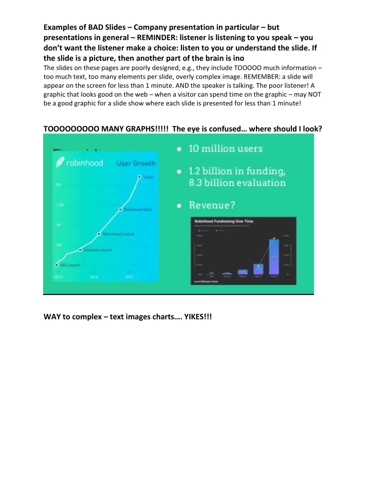

Examples of BAD Slides – Company presentation in particular – but presentations in general – REMINDER: listener is listening to you speak – you don’t want the listener make a choice: listen to you or understand the slide. If the slide is a picture, then another part of the brain is ino The slides on these pages are poorly designed, e.g., they include TOOOOO much information – too much text, too many elements per slide, overly complex image. REMEMBER: a slide will appear on the screen for less than 1 minute. AND the speaker is talking. The poor listener! A graphic that looks good on the web – when a visitor can spend time on the graphic – may NOT be a good graphic for a slide show where each slide is presented for less than 1 minute! TOOOOOOOOO MANY GRAPHS!!!!! The eye is confused… where should I look? WAY to complex – text images charts…. YIKES!!!
Examples of BAD Slides – Company presentation in particular – but presentations in general – REMINDER: listener is listening to you speak – you don’t want the listener make a choice: listen to you or understand the slide. If the slide is a picture, then another part of the brain is ino TEXT TEXT TEXT… TEXT TEXT TEXT…. Repeat after me: TEXT TEXT TEXT
Examples of BAD Slides – Company presentation in particular – but presentations in general – REMINDER: listener is listening to you speak – you don’t want the listener make a choice: listen to you or understand the slide. If the slide is a picture, then another part of the brain is ino Way TOOOOOOOOO complex!! And much too small to read! - BOTH SLIDES
Examples of BAD Slides – Company presentation in particular – but presentations in general – REMINDER: listener is listening to you speak – you don’t want the listener make a choice: listen to you or understand the slide. If the slide is a picture, then another part of the brain is ino Too many comparison!!! 3 -4 TOPS!!! Too much detail; text too small. WHAT IS IMPORTANT?
Examples of BAD Slides – Company presentation in particular – but presentations in general – REMINDER: listener is listening to you speak – you don’t want the listener make a choice: listen to you or understand the slide. If the slide is a picture, then another part of the brain is ino TEXT TEXT TEXT… TEXT TEXT TEXT…. Repeat after me: TEXT TEXT TEXT
Examples of BAD Slides – Company presentation in particular – but presentations in general – REMINDER: listener is listening to you speak – you don’t want the listener make a choice: listen to you or understand the slide. If the slide is a picture, then another part of the brain is ino TOOOOOOOOOO small – the graphs are tooooooo small – and look at all the wasted space on the left? And there are two graphs jammed together on the bottom slide – with text that is too small to read!
Examples of BAD Slides – Company presentation in particular – but presentations in general – REMINDER: listener is listening to you speak – you don’t want the listener make a choice: listen to you or understand the slide. If the slide is a picture, then another part of the brain is ino Upper slide: images are much too small to read – to even see – to even understand. Bottom slide: the graphic is incomprehensible. Plus the bullets are full sentences. I have NO idea what idea is being conveyed
Examples of BAD Slides – Company presentation in particular – but presentations in general – REMINDER: listener is listening to you speak – you don’t want the listener make a choice: listen to you or understand the slide. If the slide is a picture, then another part of the brain is ino JAMMING two graphs on one slide – BAD idea. 1 graph/slide. 1 big idea/slide. Next two slides: TOOOOO busy. By itself the graph on the left would be ok – except that all the surrounding text is WAY TOOOOOOOO small!! And the spreadsheet on the right – TOOOO much info!
Examples of BAD Slides – Company presentation in particular – but presentations in general – REMINDER: listener is listening to you speak – you don’t want the listener make a choice: listen to you or understand the slide. If the slide is a picture, then another part of the brain is ino YOUR TURN – what’s wrong with these two slides?
Examples of BAD Slides – Company presentation in particular – but presentations in general – REMINDER: listener is listening to you speak – you don’t want the listener make a choice: listen to you or understand the slide. If the slide is a picture, then another part of the brain is ino YOUR TURN – what ’s wrong with these three slides?
Examples of BAD Slides – Company presentation in particular – but presentations in general – REMINDER: listener is listening to you speak – you don’t want the listener make a choice: listen to you or understand the slide. If the slide is a picture, then another part of the brain is ino
Recommend
More recommend