Design Character Images-Lessons of Urbanism Future Land Use Map - PowerPoint PPT Presentation
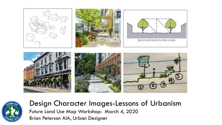
Design Character Images-Lessons of Urbanism Future Land Use Map Workshop: March 4, 2020 Brian Peterson AIA, Urban Designer Master Plan, University of North Carolina, Chapel Hill, 1785 A plan of the situation of ye Universityye ornamental
Design Character Images-Lessons of Urbanism Future Land Use Map Workshop: March 4, 2020 Brian Peterson AIA, Urban Designer
Master Plan, University of North Carolina, Chapel Hill, 1785 “A plan of the situation of ye University—ye ornamental ground, ye adjacent village…” 1. Review of Preference Image Comments 2. Urban Design Concepts and Issues Presentation Outline
Building City Neighborhood/District Street Introduction: Urban Design
Likes: 1. Great green space/provides room for street trees 2. Parking behind buildings 2 4 3. All images are appropriate 4. Can read each unit’s entrance 4 1 Dislikes: 1. Boring 3 1 4 4 Image Comments: Townhomes & Residences
Likes: 1. Transition from street to front door 1 2. Tree canopy 5 3. Stepbacks 2 3 2 4. Façade ornament (triangles) 5. Hanging planters 1 6. Change of façade material/color 4 Dislikes: 1. Lack of corner definition 2. Sterile looking 3 3. False balconies 4 4. Hard to find entrance 6 5. Vertical/horizontal relationship 6 6. Lack of articulation 7. First floor is unwelcoming 5 7 Image Comments: Multi-family Residential
Likes: 1. Wide sidewalks, good public realm 1 2. Integration of landscape 3. Use of glass is inviting 2 4. Integration of active spaces-rooftop & ground floor patio 2 1 Dislikes: 1. Looks suburban 2. Narrow sidewalk, lack of greenery 4 3. Boring façade, boxy 4 4. Buildings need to be taller than one 3 story 3 Image Comments: Commercial/Office
Likes: 1 1. Generous plaza 2. Lively space 3. Preserving existing trees Dislikes: 1. Not a fan 3 2. Boring, monotonous façade 3. Needs more green 4. Need public art 2 3 4 2 1 3 Image Comments: Multifamily, Shops and Offices
Likes: 1. Buildings feature good design and have green or other outdoor spaces 2 3 Dislikes: 1 1 1. Green spaces are bland, need 1 1 more trees, other vegetation 2. One story building not appropriate 3. Too suburban looking-like RTP 1 1 Image Comments: Light Industrial
Likes: 1 1. Beautiful 2 2. Interesting 3. Like the idea, too modern for C.H.? 1 4. Nice spaces, tool expansive for 4 C.H.? 3 Dislikes: 1 4 1. Too many hard surfaces-stark and not enough trees/green 2. Too suburban 3. Entrances need definition 4. Art should be included 1 2 2 4 4 Image Comments: Institutional/Civic
Likes: 1. Green space and active civic space as well 2. Accessible 3. Ability to use after dark 3 2 Dislikes: 1. Too formal for C.H. 2. Too much space shown for what is available in C.H. 2 1 1 1 Image Comments: Parks and Green/Gathering Spaces
People prefer enclosed spaces Introduction: Placemaking
The public realm is positive space defined by building edges Introduction: Placemaking
Buildings define the limits of public space Street Enclosure: Define the Outdoor Room
Massing: the size and three dimensional shape or forms of the building Articulation: how the forms are divided down to create scale Issue: Appropriate Massing for Large Buildings
Issue: Building Massing and Articulation
Ensure a relationship of the parts to the whole, stress verticality of an urban building, celebrate corners, entries Issue: Building Scale
horizontal emphasis vertical emphasis In urban settings building massing tends toward the vertical emphasis Issue: Building Scale-Horizontal vs. Vertical
• Avoid over-doing it with too many ins and outs and materials • Varying roof height can be effective and enough Issue: Building Scale- Breaking up the Massing of Large Buildings
Issue: Building Scale- Separate Buildings Connected
Provide human scale details, especially vital at the ground floor (moldings, trim, awnings, canopies, signage, planters, ornament, etc.) Issue: Human Scale-Articulation
“Eyes on the street” Residential frontages should feature a privacy gradient from public to private, in both the horizontal and vertical dimensions Issue: Human Scale: Transition from Public to Private
Works together as a whole to form the street wall but you can read the individual units 1. Every unit has a front door that you can see 2. Same basic massing, slight variations in color and architectural details Issue: Human Scale-Identification of Individual Units
Tree species have a shape that helps define the public realm Issue: Human Scale-Defining the Pedestrian zone
5’-10’ 3’-6’ 5’-10’ Issue: Commercial Retail Street Frontage-Zones
Transparency: what you see is what you Enticement: lure you in get Issue: Shopping Streets-Storefront Character
Signage should be viewable from different pedestrian perspectives Issue: Signage
• People are drawn to the edges of spaces • People are drawn to other people Issue: Successful Public Places-Plazas, Squares
Issue: Successful Public Places-Plazas, Squares
People are drawn into a space where there Plaza: 140 E. Franklin is a through-passage, not a seemingly dead end Issue: Successful Public Places-Plazas, Squares
3 1 2 3 3 Lakeshore East, Chicago IL 1. Keep the center available 2. Focal point off center 3. Numerous subspaces to accommodate various activities 4. Seating/habitation along the edges ssue: Vibrant Public Spaces-Open Middle Rodney Square, Wilmington DE
Make it easy for people to engage the edge of a public space Issue: Vibrant Public Spaces-Entrance Thresholds
If it’s 18” high, people will sit on it Allow choice with moveable chairs Issue: Vibrant Public Spaces-Places to Sit
Frederick, Matthew, and Vikas, Mehta. 101 Things I Learned in Urban Design School . New York: Three Rivers Press, 2018. Cherry, Nathan, and Nagle, Kurt. Grid/Street/Place . Chicago: American Planning Association Planners Press, 2009. Sucher, David. City Comforts-How to Build and Urban Village . Seattle: City Comforts Press, 1995. Whyte, William H., Jr. The Social Life of Small Urban Spaces. Washington, D.C. :Conservation Foundation, 1980. Jacobs, Allan B. Great Streets . Cambridge MA: The MIT Press, 1993. Turner, Paul Venable. Campus-An American Planning Tradition . Cambridge, MA: The MIT Press, 1984. Parking Structure, Central Library-Kansas City, Missouri Bibliography/References
Recommend
More recommend
Explore More Topics
Stay informed with curated content and fresh updates.






![1 Funnel Heap Introduced by Brodal et al. [1]. Based on merging instead of distribution.](https://c.sambuz.com/499945/1-funnel-heap-s.webp)
