
CTSNet & Chelsea Westminster Hospital Robotics User Interface Design by Ed Collins, Team 19
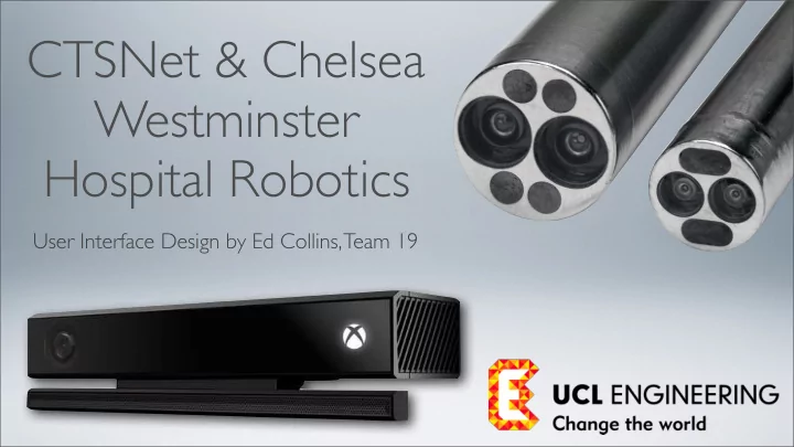
Project Outline As surgical technology advances, more and more emphasis is placed on Minimally Invasive Surgery. MIS lacks any form of depth sensing or haptic feedback due to its use of 2D endoscopes. This project aims to begin to solve this problem. Using an Xbox Kinect 2.0, a prototype for an endoscope that can observe depth and present this information to the surgeon will be created. The project will potentially then progress to using this information to provide haptic feedback for robotic surgery.
User Interface During minimally invasive, or laparoscopic surgery, the surgeon will use an endoscope inserted into the patients body, along with two to three other instruments, to perform the operation. The endoscope’s image is displayed on the monitor, as shown in the picture to the right. This project aims to redesign the way in which the endoscope gives feedback to the surgeon, to allow it to display how far away observed objects are. There are several options for how this feedback could be given.
Visual Augmentation The first way in which endoscopic feedback could be improved is through visual augmentation of the camera feed. This would mean overlaying a colour scheme to indicate depth or measuring the precise distance of tools from the camera and then displaying this information.
The options for augmenting the With this feed are design, the presented in surgeon has four four buttons in different options the top left for how the corner of the endoscope feed screen; which do will be not obscure the presented. surgeon’s view from the endoscope. Endoscope Interface: Redesigned
These are toggle Surgeon’s tools. The buttons. Each button surgeon gets no haptic augments the feed in a feedback from these, nor certain way. More than is there any accurate one can be toggled at sense of depth. This can once, to provide a lead to too much force multitude of ways to being applied to the tools, alter the image. which could be extremely dangerous. Design principles: Mapping: buttons show their functions, Visibility: buttons are always visible, Affordance: these are clearly buttons. Normal Feed
Design Principles: Consistency: buttons always visible. Feedback: buttons highlight when Red Touching flesh selected. Within 2 Orange mm of flesh Within 10 Yellow mm of flesh The tool’s depth is > 10 mm Green colour coded to show away from how far away the tools flesh are from the flesh of the body. This would show the surgeon when the tools are close to or Design Principles: touching the flesh, so Consistency: have used they know not to apply convention of red to too much force. indicate closeness, green Tool Proximity to indicate further away.
These toggle Less than 2 buttons are Red mm away highlighted when selected. More than 2 mm, less Orange than 4 mm This feed shows away how far away More than anything in the camera’s field of 4mm away, Yellow view is from the less than 6 camera itself; to give mm away the surgeon a sense of how close the More than camera is to the 6mm away, Green flesh. less than 8mm away Design Principles: More than Consistency: Dark Green convention that red 8mm away General Depth indicates proximity, green: distance is followed.
The “Explicit Depth” option measures the The use of this would be distance of the tip to get an exact of the tool to the measurement of how far nearest area of away the tools are from flesh. the body. This gives the surgeon a sense of how close the tools are to the body. This is useful if the surgeon is not sure if a tool has room to maneuver. They can simply check the Explicit Depth and it will tell them. Explicit Depth
The “Tool Width” This section is split into option takes a two measurements. This is measurement of the the true usefulness of this functional part of the function: First, the tool and presents it to functional part of the tool the surgeon. is measured. If this tool is then inserted into the flesh so that it cannot be seen, and its full width has previously been measured, then it is easy to calculate how far the tool has been inserted into the body. This is very useful as it could prevent the surgeon from pushing the tool too far into the In this example, body and thus damaging this tool has been the patient. inserted 0.1 mm into the flesh. Tool Width
Design principles: Constraints: there is no The advantage of constraint on how many making these options augmentations the toggle buttons is that surgeon implements at more than one once, meaning they can augmentation can be get a full sense of the overlaid on the feed at distance of objects from once. the camera. The Advantage of Toggle Buttons
More than one augmentation can be selected at once. Tool Proximity & General Depth
Tool Proximity, Explicit Depth and Tool Width
Audio Feedback This is a simple but powerful method of providing feedback. It is based on the principle of a car parking sensor. The camera would monitor the depth of the tools, and as they approach the body a series of beeps would get more and more frequent to give the surgeon an indication of how close the tools are to the body.
Audio Feedback The proximity of the tools to the flesh is measured by the camera. As the tools get closer, the beeps emitted from the speakers get more frequent, To produce the beeps, a like with a car parking sensor. separate speaker could be attached to the endoscope system of the beeps could be produced directly from the computer that controls the endoscopic unit.
A toggle button which uses the Having the visual universal symbol for augmentation buttons sound would be used present as well as the to turn audio feed audio feedback button back on and off. means audio feedback can be combined with the visual feedback. Turn Audio Feedback On
When the audio feedback is turned off a red cross would appear over the sound icon to indicate this. Turn Audio Feedback Off
Haptic Feedback This method is slightly more advanced than the others, and would be a later goal of the project. When the surgeon is using tools in MIS, they lack haptic feedback. This can lead to too much force being applied to a tool and damage being done to the patient. By using a camera that can tell how close tools are to the patient, a method of providing haptic feedback could be derived for when the tools touch the patient.
Case Study: Experimental This surgical tool can provide Surgical Tool haptic feedback. It does this by using a pressure pad in the gripping part of the tool. This depth sensing camera would not be able to tell how much force is being applied in the functional part of the tool. A pressure pad is needed to do this. However what a depth sensing camera could do is register when a tool is touching the patient. It Pressure pad may not be able to tell how much force is being applied, but it could provide feedback to the surgeon in a tactile form to let them know the tool is touching the flesh.
The Advantage of Haptic Feedback Haptic feedback has several advantages over visual or audio feedback. If the surgeon feels the tool they are using vibrate or stiffen, then their natural response is likely to be to move slowly and apply less pressure to the tool. This contrasts with a visual or audio feed, where the surgeon may know they are touching the patient but as the tool physically does not feel any different, they may not change the force being applied. In short, haptic feedback is: - Safer for the patient because the surgeon will actively decrease pressure applied to a tool when they feel it vibrate or stiffen. - Less distracting, as the surgeon can focus on the camera feed and if they touch any part of the body with the tool by mistake, the vibration will let them know. - More interactive. Haptic feedback would make MIS feel more like real surgery as there is some feedback of force through the tools as there would be if the surgeon were using their hands.
The haptic feedback Gaming controls give haptic mechanism is incredibly simple, feedback to gamers. They do It is amazing that such a yet can be used to simulate a this through vibration. A motor simple mechanism can huge variety of events from spins an axel with an off- improve user experience explosions in the game, centered weight attached, so much. This could be accelerating a car or shooting a causing the vibrations. adapted to be a very useful gun. tool for a surgeon. Case Study: Gaming Controls
There are two parts to this design: how haptics would be turned on and how the feedback itself would be delivered to the surgeon. Feedback would be given when the camera notices that a tool is coming very This On / Off close to or touching button would allow the the patient’s flesh. surgeon to tell the system whether haptics should enabled. This means that should the feedback become annoying, it is easy to turn off. Haptic Feedback Design
Recommend
More recommend