What were up against Tabular Display of Data Getting information - PowerPoint PPT Presentation
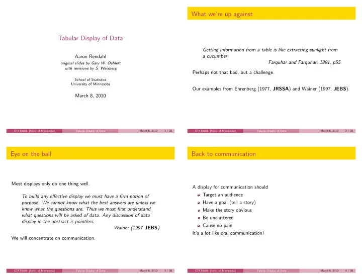
What were up against Tabular Display of Data Getting information from a table is like extracting sunlight from a cucumber. Aaron Rendahl Farquhar and Farquhar, 1891, p55 original slides by Gary W. Oehlert with revisions by S. Weisberg
What we’re up against Tabular Display of Data Getting information from a table is like extracting sunlight from a cucumber. Aaron Rendahl Farquhar and Farquhar, 1891, p55 original slides by Gary W. Oehlert with revisions by S. Weisberg Perhaps not that bad, but a challenge. School of Statistics University of Minnesota Our examples from Ehrenberg (1977, JRSSA ) and Wainer (1997, JEBS ). March 8, 2010 STAT8801 (Univ. of Minnesota) Tabular Display of Data March 8, 2010 1 / 26 STAT8801 (Univ. of Minnesota) Tabular Display of Data March 8, 2010 2 / 26 Eye on the ball Back to communication Most displays only do one thing well. A display for communication should Target an audience To build any effective display we must have a firm notion of Have a goal (tell a story) purpose. We cannot know what the best answers are unless we know what the questions are. Thus we must first understand Make the story obvious what questions will be asked of data. Any discussion of data Be uncluttered display in the abstract is pointless. Cause no pain Wainer (1997 JEBS ) It’s a lot like oral communication! We will concentrate on communication. STAT8801 (Univ. of Minnesota) Tabular Display of Data March 8, 2010 3 / 26 STAT8801 (Univ. of Minnesota) Tabular Display of Data March 8, 2010 4 / 26
Rules for Communication Ehrenberg’s Criteria Ehrenberg, Wainer, and many others give rules/advice. Strong Criterion for Good Table We illustrate with examples from their papers. The patterns and exceptions in a table should be obvious at a glance. Remember, we want to communicate, to show a story, which could be Big picture Weak Criterion for Good Table The patterns and exceptions in a table should be obvious at a glance once Trends one has been told what they are. Comparisons Typical values Always meet the weak criterion. Atypical values STAT8801 (Univ. of Minnesota) Tabular Display of Data March 8, 2010 5 / 26 STAT8801 (Univ. of Minnesota) Tabular Display of Data March 8, 2010 6 / 26 UK Vessels (Ehrenberg, 1977) UK Vessels – After UK Merchant Vessels in Service UK Merchant Vessels over 500 tons in Service Vessels over 500 tons 1962 1967 1973 1962 1967 1973 Number Number of vessels Passenger 240 170 120 All vessels 2,689 2,181 1,776 Tankers 600 480 490 Passenger 242 173 122 Dry cargo 1,800 1,500 1,200 Dry cargo 1,847 1,527 1,165 Tankers 600 481 489 All vessels 2,700 2,200 1,800 Deadweight in thousands of tons Deadweight tons (thousands) All vessels 26,577 27,488 46,763 Passenger 1,500 920 350 Passenger 1,467 919 349 Tankers 11,000 12,000 26,000 Dry cargo 13,990 14,362 20,115 Dry cargo 14,000 14,000 20,000 Tankers 11,120 12,167 26,299 All vessels 26,000 27,000 47,000 STAT8801 (Univ. of Minnesota) Tabular Display of Data March 8, 2010 7 / 26 STAT8801 (Univ. of Minnesota) Tabular Display of Data March 8, 2010 8 / 26
TV Correlations (Ehrenberg) TV Correlations – After Correlation among TV audiences Programmes WoS MoD GrS PrB RgS 24H Pan ThW Tod LnU World of Sport ITV .6 .6 .5 .3 .1 .2 .1 .1 .1 Match of the Day BBC .6 .6 .5 .3 .1 .1 .1 .0 .0 Grandstand BBC .6 .6 .5 .3 .1 .2 .1 .1 .1 Prof. Boxing ITV .5 .5 .5 .3 .1 .2 .1 .1 .1 Correlation among TV audiences Rugby Special BBC .3 .3 .3 .3 .1 .1 .1 .1 .1 PrB ThW Tod WoS GrS LnU MoD Pan RgS 24H ITV PrB 1.000 0.106 0.065 0.505 0.474 0.092 0.473 0.168 0.309 0.124 24 Hours BBC .1 .1 .1 .1 .1 .5 .4 .2 .2 ” ThW 0.106 1.000 0.270 0.142 0.132 0.189 0.082 0.352 0.064 0.395 Panorama BBC .2 .1 .2 .2 .1 .5 .4 .2 .2 ” Tod 0.065 0.270 1.000 0.093 0.070 0.155 0.038 0.200 0.051 0.244 ” WoS 0.505 0.147 0.093 1.000 0.622 0.079 0.581 0.187 0.297 0.140 This Week ITV .1 .1 .1 .1 .1 .4 .4 .3 .2 BBC GrS 0.474 0.132 0.070 0.622 1.000 0.085 0.593 0.181 0.341 0.142 Today ITV .1 .0 .1 .1 .1 .2 .2 .3 .2 ” LnU 0.092 0.189 0.155 0.079 0.085 1.000 0.049 0.197 0.097 0.266 Line Up BBC .1 .0 .1 .1 .1 .2 .2 .2 .2 ” MoD 0.473 0.082 0.039 0.581 0.593 0.049 1.000 0.131 0.327 0.122 ” Pan 0.168 0.352 0.200 0.187 0.181 0.197 0.131 1.000 0.147 0.524 ” RgS 0.309 0.064 0.051 0.296 0.341 0.097 0.326 0.147 1.000 0.121 ” 24H 0.124 0.395 0.244 0.140 0.142 0.266 0.122 0.524 0.121 1.000 STAT8801 (Univ. of Minnesota) Tabular Display of Data March 8, 2010 9 / 26 STAT8801 (Univ. of Minnesota) Tabular Display of Data March 8, 2010 10 / 26 Unemployment (Ehrenberg) Unemployment – After Unemployment in Great Britain (thousands) Unemployment in Great Britain (thousands) Year Male Female Total 1966 1968 1970 1973 1966 260 71 330 Total unemployed 330 . 9 549 . 4 582 . 2 597 . 9 1968 460 89 550 Males 259 . 6 460 . 7 495 . 3 499 . 4 1970 500 87 580 Females 71 . 3 88 . 8 86 . 9 98 . 5 1973 500 99 600 Average 430 86 520 STAT8801 (Univ. of Minnesota) Tabular Display of Data March 8, 2010 11 / 26 STAT8801 (Univ. of Minnesota) Tabular Display of Data March 8, 2010 12 / 26
Battery Life (Wainer) Battery Life – After Battery Life in Hours Battery Cass. Port. Brand Battery Life in Hours Brand Radio Flash. Player Comp. Averages Battery Cassette Portable Never Die 28 16 8 6 15 Brand Player Radio Flashlight Computer Electro-Blaster 26 15 10 4 14 Constant Charge 5 19 10 3 Electro-Blaster 10 26 15 4 PowerBat 24 13 7 5 12 Never Die 8 28 16 6 PowerBat 7 24 13 5 Servo-Cell 21 12 4 2 10 Servo-Cell 4 21 12 2 Constant Charge 19 10 5 3 9 Usage averages 24 13 7 4 12 STAT8801 (Univ. of Minnesota) Tabular Display of Data March 8, 2010 13 / 26 STAT8801 (Univ. of Minnesota) Tabular Display of Data March 8, 2010 14 / 26 Multivariate (Wainer, 1997) Foods (Ehrenberg, 1978) Hard to see anything! . . . hard to interpret without a verbal description But perhaps useful for archival purposes. perhaps “Consumers and retailers agree quite well on nutritional ratings, but economic ratings differ from each other and from the nutritional ones.” STAT8801 (Univ. of Minnesota) Tabular Display of Data March 8, 2010 15 / 26 STAT8801 (Univ. of Minnesota) Tabular Display of Data March 8, 2010 16 / 26
Computer files Exceptions Computer files also need explanation. Point out unusual values # Number of hawks responding to the "alarm" call # Variables are year (1999 or 2000), season (courtship, # nestling, fledgling), distance in meters between the # alarm call and the nest, number of hawks responding, # and number of. year season distance respond trials 1 1 100 1 4 1 1 150 2 4 1 1 225 1 4 1 1 325 2 2 2 1 100 6 8 ... Should be labeled and annotated. STAT8801 (Univ. of Minnesota) Tabular Display of Data March 8, 2010 17 / 26 STAT8801 (Univ. of Minnesota) Tabular Display of Data March 8, 2010 18 / 26 Round Drastically Order Rows/Columns Sensibly Use two significant figures where ever possible. Helps organize and facilitate comparison Don’t usually understand more than two digits Budget is $27,329,681 versus budget is 27 million dollars. Alphabetical (Alabama first!) almost never correct Rarely justify more than two digits statistically Could be by size God gave us 1 / √ n , but how big must n be for that third digit? Could be a natural order, such as time We rarely care By interest (rows or columns to compare should be adjacent) Life expectancy 67.14 years; .01 year is about 4 days. Not for archival tables. STAT8801 (Univ. of Minnesota) Tabular Display of Data March 8, 2010 19 / 26 STAT8801 (Univ. of Minnesota) Tabular Display of Data March 8, 2010 20 / 26
Row/Column Summaries Transpose Give a standard for comparison Could be mean/median/total/etc It’s easier to compare numbers down columns. Give a visual focus Numbers are closer Provide a standard of “usual” Digits line up An overall summary can also help Can highlight for emphasis STAT8801 (Univ. of Minnesota) Tabular Display of Data March 8, 2010 21 / 26 STAT8801 (Univ. of Minnesota) Tabular Display of Data March 8, 2010 22 / 26 Layout/Spacing Avoid if you can Remove excess lines/boxing Multidimensional tables Use space to emphasize groups/gaps Multivariate tables Excess space breaks adjacency Too many rows or columns What is a stem and leaf plot, but a severely rounded table with meaningful spacing? STAT8801 (Univ. of Minnesota) Tabular Display of Data March 8, 2010 23 / 26 STAT8801 (Univ. of Minnesota) Tabular Display of Data March 8, 2010 24 / 26
Add Summary Design for purpose and audience Labels Round! Good titles and explanatory text Organize The table with its labels, title, and accompanying text should stand alone Simplify and be comprehensible. Add summaries Good title/labels Also add emphasis to unusual values. Clean layout/proper spacing STAT8801 (Univ. of Minnesota) Tabular Display of Data March 8, 2010 25 / 26 STAT8801 (Univ. of Minnesota) Tabular Display of Data March 8, 2010 26 / 26
Recommend
More recommend
Explore More Topics
Stay informed with curated content and fresh updates.


