Visual Analytics Framework Towards Enhancing Presentation of - PDF document
Visual Analytics Framework Towards Enhancing Presentation of Official Statistics Haitham Zeidan Palestinian Central Bureau of Statistics (PCBS) Jerusalem, Palestine Haitham@pcbs.gov.ps Abstract Statistical data has gained many interests from
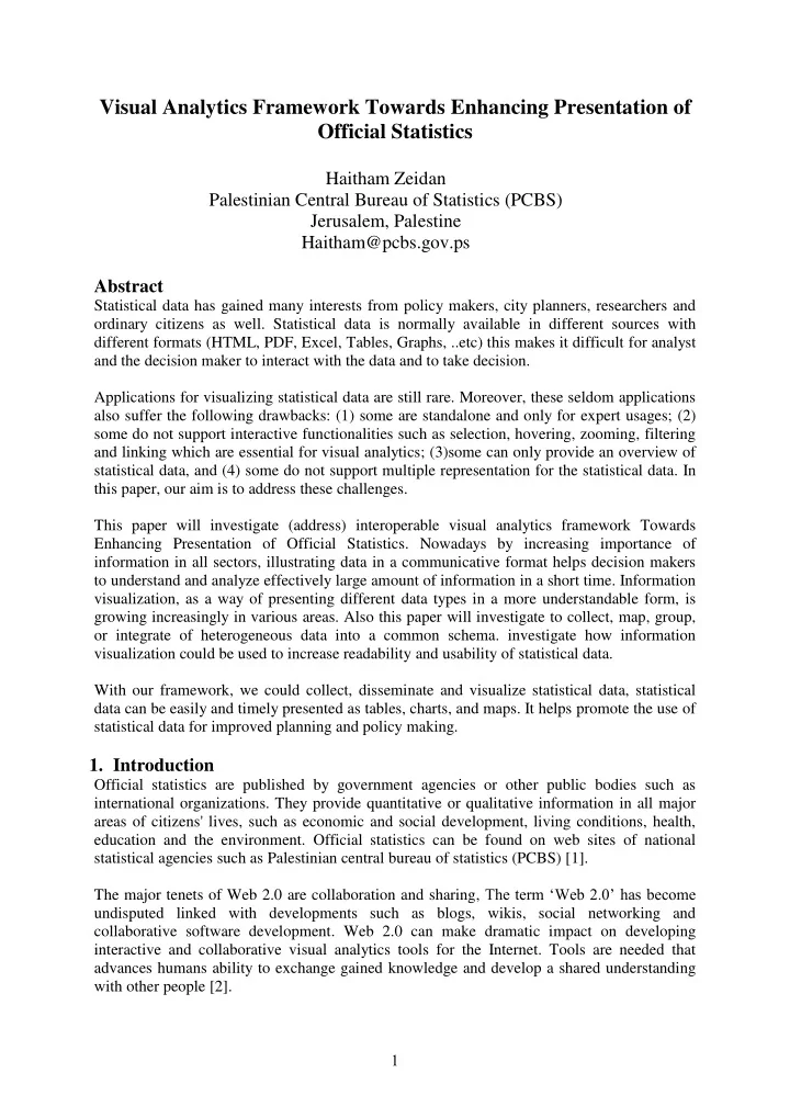
Visual Analytics Framework Towards Enhancing Presentation of Official Statistics Haitham Zeidan Palestinian Central Bureau of Statistics (PCBS) Jerusalem, Palestine Haitham@pcbs.gov.ps Abstract Statistical data has gained many interests from policy makers, city planners, researchers and ordinary citizens as well. Statistical data is normally available in different sources with different formats (HTML, PDF, Excel, Tables, Graphs, ..etc) this makes it difficult for analyst and the decision maker to interact with the data and to take decision. Applications for visualizing statistical data are still rare. Moreover, these seldom applications also suffer the following drawbacks: (1) some are standalone and only for expert usages; (2) some do not support interactive functionalities such as selection, hovering, zooming, filtering and linking which are essential for visual analytics; (3)some can only provide an overview of statistical data, and (4) some do not support multiple representation for the statistical data. In this paper, our aim is to address these challenges. This paper will investigate (address) interoperable visual analytics framework Towards Enhancing Presentation of Official Statistics. Nowadays by increasing importance of information in all sectors, illustrating data in a communicative format helps decision makers to understand and analyze effectively large amount of information in a short time. Information visualization, as a way of presenting different data types in a more understandable form, is growing increasingly in various areas. Also this paper will investigate to collect, map, group, or integrate of heterogeneous data into a common schema. investigate how information visualization could be used to increase readability and usability of statistical data. With our framework, we could collect, disseminate and visualize statistical data, statistical data can be easily and timely presented as tables, charts, and maps. It helps promote the use of statistical data for improved planning and policy making. 1. Introduction Official statistics are published by government agencies or other public bodies such as international organizations. They provide quantitative or qualitative information in all major areas of citizens' lives, such as economic and social development, living conditions, health, education and the environment. Official statistics can be found on web sites of national statistical agencies such as Palestinian central bureau of statistics (PCBS) [1]. The major tenets of Web 2.0 are collaboration and sharing, The term ‘Web 2.0’ has become undisputed linked with developments such as blogs, wikis, social networking and collaborative software development. Web 2.0 can make dramatic impact on developing interactive and collaborative visual analytics tools for the Internet. Tools are needed that advances humans ability to exchange gained knowledge and develop a shared understanding with other people [2]. 1
The “participative web” [3] is increasingly utilized by intelligent web services which empower developers to customize web-enabled visualization applications that contribute to collaboration and communicate visual content Figure 1. Figure 1: Web-enabled 3D view of the world animating statistical indicators from the World Databank simultaneously in two linked views for 1960-2010.The map and histogram color representing Life expectancy is displayed in the choropleth map; the height of the 3D bars shows percentage of age group 65+ and bar width represents the total population. In this study we introduce a new interoperable visual analytics framework to enhance dissemination and presentation of official statistics based on dynamic data analytics. Our visual analytics framework aims to provide techniques that make humans capable of analyzing data by presenting results in a meaningful and intuitive way while allowing to interact with the data. 2. Objectives The objective of this study is to introduce a new interoperable visual analytics framework towards: Enhancing presentation of official statistics based on visual analytical approach that combines both data analysis and interactive visualization. Collecting, mapping, grouping, or integrating of heterogeneous data into a common schema. Exchanging statistical data between ministries and agencies based on the framework and the common schema. 3. Related Work Many studies have been done across countries on data Visualization. Applications of data Visualization were used in a large number of fields, especially for transportation, statistics, Scientific research, Digital libraries and Financial data analysis, market studies. Patrik Lundblad et al. 2012 study [4]. A framework and class library (GAV Flash) implemented in Adobe ActionScript, import data through Excel – data model, create a story and visualization using analytic tools (dynamic query, filter, regional categorization, profiles, highlight), and dynamic color scale, then share the story. The result was a statistics geovisual 2
analytics application for exploring and publishing statistical data on the web and developed with the GAV Flash toolkit. based on a recommendation from the visual analytics (VA) research program. Mikael Jern 2010 [5], build web-enabled application platform that is emerging as a de facto standard in the statistics community for exploring and communicating statistics data. Web- enabled application for exploring and communicating statistics data using storytelling mechanism. Mikael Jern, et al. 2008 [6], Tools for interactively analyzing and communicating gained insights and discoveries about spatial-temporal and multivariate OECD regional data. GeoAnalytics Visualization (GAV) component toolkit is based on the principles behind the Visual Analytics re-search program, using Adobes Flash basic graphics and Flex 3 for user interface design (a collection of high-performance interactive visualization web-enabled components based on common methods from the information and geovisualization research domain). Other toolkits focus more on one specific visualisation technique. The Tree- Map Java Library [7] and the HCIL Treemap 4.0 toolkit [8] both focus on visualisations of treemap algorithms. However the first one can visualise squarified cushion treemaps where the latter can visualise ordered and quantum treemaps [9]. The InfoVis Cyberinfrastructure is a central resource unit that provides access to a comprehensive set of software packages easing the exploration, modification, comparison, and extension of data mining and information visualisation algorithms. Its website is complemented with a series of learning modules about the different aspects of data mining and information visualisation, software, databases and the available computing resources [10]. But the above studies have limitations no integration and mapping of heterogeneous data into a common schema. Applications for visualizing statistical data are still rare. Moreover, these seldom applications also suffer the drawbacks that mentioned above. 4. Data Sources Palestinian Central Bureau of Statistics (PCBS), annually conducted surveys as (Demographic Survey, Demographic and Health Survey, Palestinian Family Health Survey, Transportation & Communication Statistics in the Palestinian Territory Survey, Gender Statistics Survey, Household Expenditure and Consumption Survey, Transportation & Communication Statistics in the Palestinian Territory Survey, Education Census Survey, National Accounts Statistics Survey, Computer, Internet and Mobile Phone Survey, Household Environment Survey, Households Culture Survey, Households Survey on Information and Communications Technology Survey, Housing and Housing Condition Survey, Labour Force Survey, Land Use Statistics in the Palestinian Territory Survey, Mass Media Survey, National Accounts Statistics Survey, Population, Housing and Establishment Census 1997, Population, Housing and Establishment Census 2007. The basic goal of these surveys is to provide a necessary indicators for formulating national policies at various levels, there are many goals of these indicators called Millennium Development Goals (MDGs) [11]: They consist of eight major goals: Eradicating poverty and hunger Achieving universal primary education 3
Recommend
More recommend
Explore More Topics
Stay informed with curated content and fresh updates.
