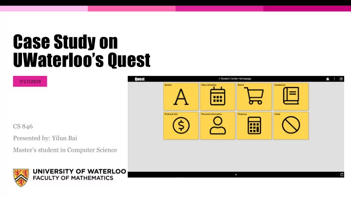

Case Study on UWaterloo’s Quest 7/17/2019 CS 846 Presented by: Yilun Bai Master’s student in Computer Science
Outline Motivation ▪ Goal ▪ About Quest ▪ Features ▪ “New” look ▪ Case study on Quest ▪ Email conversation with Quest people ▪ Navigation - Click testing (sort of) ▪ UI design – vision, free spacing ▪ Problems with Quest ▪ Suggestions & Solutions ▪ Conclusion ▪ PAGE 2
Motivation ▪ We’re all students at UWaterloo and we all have struggled with Quest more or less ▪ Undergrad -> Grad MyUW -> Quest Feels outdated ▪ Search “Quest” on Reddit – r/uwaterloo ▪ “… designed by a 6 year old …” ▪ “… annoying message upon log in…” ▪ “… being dumb…” ▪ ...... more ▪ Let’s make Quest better, shall we? PAGE 3
Goal of the case study ▪ Talk with the Quest people to see why things are they way they are ▪ Identifying the problems with Quest ▪ Suggest some solutions to address the problems ▪ Send feedback to the Quest people to help improve the system PAGE 4
About Quest – from official Quest page at https://uwaterloo.ca/quest/ ▪ Quest is the University of Waterloo’s student information system. ▪ User Groups: ▪ Undergrad/Grad Applicants; (Future Students) – I wonder how many applicants turned down the offer just because of the poor application experience on Quest. ▪ Undergrad/Grad students; (Current Students) ▪ Faculty and Staff; ▪ Access: Mobile devices/Desktop computer PAGE 5
About Quest – from official Quest page at https://uwaterloo.ca/quest/ ▪ Features: PAGE 6
About Quest – new look on Feb. 25, 2019 ▪ From now on, ▪ Old Quest – Quest before the update in Feb. 2019 ▪ New Quest – Quest after the update in Feb. 2019 PAGE 7
About Quest – new look on Feb. 25, 2019 Old – Student center page New – Student center page PAGE 8
About Quest – new look on Feb. 25, 2019 Mobile Quest Desktop Quest on Mobile PAGE 9
About Quest – new look on Feb. 25, 2019 Old – Add classes page New PAGE 10
Quest – Student Information System Program The University of Waterloo’s Student ▪ Information System Program manages our student data, and is called Quest. The team manages the maintenance ▪ and development of Quest as it relates to: Admissions processing ▪ Student course enrolment and grades ▪ Course builds and scheduling ▪ Awards and financial aid ▪ Tuition assessment ▪ Steering Committee ▪ PAGE 11
Begin my Case study – email to the Quest People ▪ Dear Quest people ▪ Doing a case study on Quest ▪ The new look starting in Feb. ▪ Any Software Requirement Specification(SRS) document for Quest? PAGE 12
Email Response from Daryl ▪ Quest – Oracle PeopleSoft Campus solutions ▪ Update in Feb. – Adopting the Fluid UI from Oracle ▪ Based on the agile nature, the University has no documentation detailed requirements for changes on the interface ▪ Consulted each user group to understand the optimal tile layout for the home screen ▪ Prototypes and changes were implemented based upon feedback PAGE 13
PeopleSoft Fluid UX Standards PAGE 14
Oracle – Peoplesoft UI: Fluid VS Quest Oracle – Fluid example UWaterloo – Quest homepage PAGE 15
Oracle – Peoplesoft UI: Fluid VS Quest Fluid – NavBar Quest – NavBar PAGE 16
Oracle – Peoplesoft UI: Fluid VS Quest Fluid – Personal Detail Quest – Personal Information PAGE 17
However… ▪ The updated Quest is more like a hybrid child birthed by Fluid UI and the previous version of Quest ▪ Only the Homepage and the navigation around the pages are changed ▪ There are no extra features or feature function improvements since the internal pages remains the same ▪ Does the update make Quest easier to use? ▪ Let’s test it… PAGE 18
Method – Click testing (sort of) ▪ Lesson learned from CS649 – HCI ▪ Given a task, count the # of clicks to perform certain task ▪ Tasks are selected based on the features listed on the official Quest website and commonly used PAGE 19
Task – Check Grade ▪ Old: ▪ New: 2 vs 2 Draw PAGE 20
Task – View Class Schedule ▪ Old: ▪ New: ? vs 1 New Win PAGE 21
Task – Check my unofficial transcript ▪ Old: ▪ New: 3/4 vs 2 New Win PAGE 22
Task – Change Phone Number ▪ Old: ▪ New: 1 vs 2 Old Win PAGE 23
Task – Check Tuitions ▪ Old: ▪ New: 1 vs 1 Draw PAGE 24
Task – Enroll – add courses ▪ Old: ▪ New: 2 vs 1 New Win PAGE 25
What if, switch between pages in different categories ▪ Suppose from tuition page, we want to go the class schedule page ▪ Old: PAGE 26
What if, switch between pages in different categories ▪ Suppose from tuition page, we want to go the class schedule page 4 vs 2 ▪ New: New Win
On the UI design side Lesson from CS649 – HCI – Types of vision PAGE 28
On the UI design side (Continued) Lesson from CS649 – HCI – Free Space PAGE 29
Another look at the Old Quest homepage Free Space Free Space Central Vision PAGE 30
Another look at the New Quest homepage Central Vision PAGE 31
Another look at the New Quest Enroll page Central Vision Free Space Sidebar moves the main content towards the middle of the screen PAGE 32
Results from the tests ▪ Click testing Issues discovered during the tests: ▪ New version of Quest wins 4 out of 7 tasks ▪ The page/section/tab hierarchy is a mess – e.g. Class Schedule can be viewed under ▪ Old version wins 1 out of 7 tasks Enroll, not My Academic ▪ Draw happen 2 out of 7 tasks ▪ The function of sidebar navigation and the original top bar page navigation are ▪ The new Quest puts important content more redundant; Some also not consistent towards the middle of the screen compare to the old version ▪ Limited information displayed on the Homepage ▪ But free spaces on the page are still massive ▪ Both versions couldn’t handle efficient transfer from subpage to another subpage without going back to the Homepage ▪ Large empty spaces on the right side of the Overall, the updated Quest performs slightly page are wasted on basically every page better than the old version PAGE 33
One big complaint – Class enrollment In the current Quest class Enroll process, users need to ▪ perform 3 steps: Select classes to add – put in the shopping cart 1. Confirm classes 2. Finish enrolling 3. Often times we encounter failures due to time conflict ▪ with other courses. Need to go back to change the shopping cart and try again Especially for undergrad students who takes a lot of ▪ courses which have different section offerings Need users to manually check every time period. ▪ No visualization on the schedule for selected potential ▪ courses PAGE 34
Things that are not working well on Quest The page/section hierarchy is a mess, e.g. Search for classes is on the same hierarchy with Enroll, but also can be performed under ▪ Add in Enroll… The function of sidebar navigation and the original top bar page navigation are redundant; Some also not consistent ▪ Limited information displayed on the Homepage ▪ Both versions couldn’t handle efficient transfer from subpage to another subpage without going back to the Homepage ▪ Large empty spaces on the right side of the page are wasted on basically every page ▪ Feature work flow is lengthy, i.e. class enrollment ▪ Overall UI lack of consistency – Black and Gold ▪ Toolbar & NavBar on top does basically nothing, e.g. Recent Places in NavBar ▪ The Sidebar and the top banner does not follow the changes of the pages if using the old “Go to” navigation instead of the SideBar ▪ ... ▪ PAGE 35
New features suggested ▪ Schedule builder – calendar views for each possible class arrangement ▪ Search functionality: search bar in the top banner for searching sites under UWaterloo ▪ Quick links widget on the right side of every page for easy changing between pages under different categories ▪ Automatic exam information update – Final exam schedule, date, location, seat… ▪ Critical information/Notification – important due date (tuition, class enrollment/drop), exam date approaching, etc. ▪ Customizable Homepage tiles, add/remove tiles ▪ Change password within Quest ▪ … PAGE 36
Conclusion ▪ There are requirement engineering documents & specifications for building Quest properly, i.e. the PeopleSoft Fluid UX Standards ▪ But the Quest people decide not to implement Quest based on it completely. Why? ▪ Because they want to keep the familiar original site for easier user adoption and migration Not at all, no feature improvement whatsoever ▪ And the “New” Quest becomes the “hybrid child” Sort of, but with issues of Fluid and the old Quest By a tiny bit Not by 2019 standard ▪ If it ain’t broke, don’t fix it. But Quest is “broke”. Don’t know what this means Not at all ▪ Bottom line, Quest actual site needs an overhaul either strictly following the PeopleSoft Fluid UX Standards, or building from ground up completely PAGE 37
Recommend
More recommend