
Redesign of the CAMHS Department... THE BIRCH CENTRE
The design and layout of the new building was largely chosen by young people Rachel and Emma engaged with from secondary schools, the ‘Listen Up’ group, the Youth Voice Conference and other local youth and community groups.
They met with the architect and designer to share their ideas about how they would like the waiting area, the parents and family room, and general decor style of the new CAMHS building.
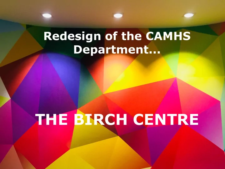
They chose a bright, colourful theme with a geometric style
They chose the new name!
There is an off-set parents and carers room as you walk through the entrance
Comfortable, modern furniture with a vibrant look
Well-lit, ambient waiting areas for two separate age groups
A private garden area still currently underway
A second waiting area filled with books, toys and comfy seating (0- 13 years)
A coloured floor was another specially-requested feature along with the colours, lighting and furniture
Jazzy prints on the doors (and more to come for the walls!)
Parents and family room ...
Comfortable therapy rooms which aren’t too large
The Listen Up group visited the Birch Centre for the first time last week. Their feedback was... “We’ve been listened to”
Recommend
More recommend