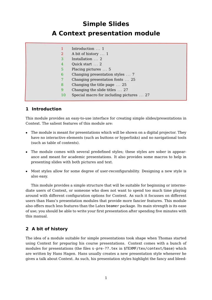
Simple Slides A Context presentation module 1 Introduction . . . 1 - PDF document
1 1 Simple Slides A Context presentation module 1 Introduction . . . 1 2 A bit of history . . . 1 3 Installation . . . 2 4 Quick start . . . 2 5 Placing pictures . . . 5 6 Changing presentation styles . . . 7 7 Changing presentation fonts
1 1 Simple Slides A Context presentation module 1 Introduction . . . 1 2 A bit of history . . . 1 3 Installation . . . 2 4 Quick start . . . 2 5 Placing pictures . . . 5 6 Changing presentation styles . . . 7 7 Changing presentation fonts . . . 25 8 Changing the title page . . . 25 9 Changing the slide titles . . . 27 10 Special macro for including pictures . . . 27 1 Introduction This module provides an easy-to-use interface for creating simple slides/presentations in Context. The salient features of this module are: The module is meant for presentations which will be shown on a digital projector. They • have no interactive elements (such as buttons or hyperlinks) and no navigational tools (such as table of contents). The module comes with several predefined styles; these styles are sober in appear- • ance and meant for academic presentations. It also provides some macros to help in presenting slides with both pictures and text. Most styles allow for some degree of user-reconfigurability. Designing a new style is • also easy. This module provides a simple structure that will be suitable for beginning or interme- diate users of Context, or someone who does not want to spend too much time playing around with different configuration options for Context. As such it focusses on different users than Hans's presentation modules that provide more fancier features. This module also offers much less features than the Latex beamer package. Its main strength is its ease of use; you should be able to write your first presentation after spending five minutes with this manual. 2 A bit of history The idea of a module suitable for simple presentations took shape when Thomas started using Context for preparing his course presentations. Context comes with a bunch of modules for presentations (the files s-pre-??.tex in $TEXMF/tex/context/base ) which are written by Hans Hagen. Hans usually creates a new presentation style whenever he gives a talk about Context. As such, his presentation styles highlight the fancy and bleed- 1 1 1
2 2 ing edge features of Context, and are not the most suitable starting point for academic presentations. Context does make creating your own presentation style relatively easy. So Thomas wrote some presentation related macros (see the PracTex article http://www.tug.org /pracjourn/2006-2/schmitz/ ). With time, he extended these macros into a collection of styles providing different visual effects, and later collected all of them in the taspresent module. He gave a talk about the taspresent module in in the second Context user meet- ing at Bohinj, and in the ensuing discussions, Aditya and Thomas decided to modularize and “Contextize” some of the internals of the module, giving rise to the current module. Most of the code in the current release has been contributed by Aditya. 3 Installation The module is installed in the usual way: simply unzip the archive t-simpleslides- <date>.zip into one of your $TEXMF trees, and from a terminal run mktexlsr (for MkII) and luatools –generate (for MkIV). To verify that everything was installed correctly, from a terminal run kpsewhich t-simpleslides.tex (for MkII) and luatools t-sim- pleslides.tex (for MkIV); these commands should return the complete path of the files that you just installed. A note about Tex-engines We have extensively tested this module with pdftex and Luatex (that is, with MkII and MkIV). In spite of our best efforts, we have not been able to get this module to work reliably with Xetex. If you are a Xetex guru, and know how to fix some of the errors with Xetex, we will appreciate the help. 4 Quick start First you must tell Context that you want to use this module. To do this simply write: \usemodule[simpleslides] This sets the paper size and font sizes to values that are suitable for presentations. Everything else is left like a default Context document. The module provides different styles that change the visual appearance of the presentation. The following styles are provided: BigNumber FramedTitle SideSquares • • • BottomSquares HorizontalStripes Split • • • Boxed NarrowStripes Sunrise • • • Ellipse RainbowStripe Swoosh • • • Embossed Rounded ThickStripes • • • Framed Shaded • • To use a style, say BigNumber , pass the style=BigNumber option to the simpleslides 2 2 2
3 3 module as follows. \usemodule[simpleslides] [style=BigNumber] Some of the styles have a few variants that can be chosen using color and alternative keys. These are explained in Section 6. By default, the Latin Modern Sans font is used. The module makes it easy to use other fonts that come with a typical Tex distribution. The following fonts are provided: LatinModern Chancery Palatino • • • LatinModernSans Gothic Schoolbook • • • Bookman Helvetica Times • • • To choose a font, say Helvetica , pass font=Helvetica option to the simpleslides module as follows. \usemodule[simpleslides] [style=BigNumber, font=Helvetica] By default, the chosen font is used at 17pt size. The font size can be changed using the size key. More details about the fonts, including information on how to use your own fonts is given in Section 7. The complete setup for using this module is 1 2 \usemodule [...] [..,.=.,..] OPTIONAL 1 simpleslides 2 style = BigNumber BottomSquares Boxed Ellipse Embossed Framed FramedTitle HorizontalStripes NarrowStripes RainbowStripe Rounded Shaded SideSquares Split Sunrise Swoosh ThickStripes size = DIMENSION font = LatinModern LatinModernSans Bookman Chancery Gothic Helvetica Palatino Schoolbook Times color = red blue green bluered alternative = square stripe Structure of a presentation The simpleslides module has a very simple model of a presentation. A presentation consists of a title followed by a series of slides; the module provides macros to help create a presentation title page and slides. 3 3 3
4 4 Presentation title page A presentation title page displays the title of the presentation, the names of the authors, and the date. These can be specified using \setupTitle as follows: \setupTitle [ title={Title of the presentation}, author={Name of authors}, date={Date of presentation}, ] The macro \placeTitle places the title page in the presentation. It is possible to change the look of \placeTitle using some additional arguments to \setupTitle . These are explained in Section 8. Presentation slide The simpleslides module provides a \SlideTitle macro, which starts a new slide (ba- sically a new page), and typesets its argument as the title of the slide. It also takes care of increasing the page counters and progress bars, and setting up the background. The content of the slides follows after this command. A slide is a normal Context page, so you can use any command or environment that you want. Each presentation style sets up a style for itemizations, and provides useful macros for placing pictures. These macros will be explained later. A minimal presentation A minimal presentation is shown below. The result is shown in Figure 1. \usemodule[simpleslides] [style=BigNumber] \setupTitle [ title={Title of the presentation}, author={Name of authors}, date={Date of presentation}, ] \starttext \placeTitle \SlideTitle {The first slide} Write whatever you want. \SlideTitle {The second slide} Continue writing. \stoptext 4 4 4
5 5 Title of the presentation Continue writing. The second slide 3 Write whatever you want. 2 Date of presentation Name of authors The first slide \usemodule[simpleslides] [style=BigNumber] \setupTitle[...] \starttext \SlideTitle{...} ... \SlideTitle{...} ... \stoptext A minimal example Title page First slide Second slide Figure 1 A minimal presentation 5 Placing pictures If you want to place pictures in your slides, you can always use Context's \externalfigure macro. This module also provides a macro, \IncludePicture , for preconfigured picture layouts. Two layouts are provided: horizontal : the picture is placed under the title of the slide, so that it fits in the avail- • able space. vertical : the slide is divided into two columns; the picture is placed on the left column • and text is placed on the right column. These layouts are shown in Figure 2. 5 5 5
6 6 of a green energy source. A Dutch Cow 10 10 The windmills are an example 3 \usemodule[simpleslides] [...] \starttext ... \IncludePicture [horizontal] [cow] {A Dutch Cow} ... \stoptext A horizontal picture A horizontal picture \usemodule[simpleslides] [...] \starttext ... \IncludePicture [vertical] [mill] {The windmills are an example of a green energy source} ... \stoptext A vertical picture A vertical picture Figure 2 Example of horizontal and vertical options for \IncludePicture macro A horizontal picture is placed as follows: \IncludePicture [horizontal] [filename] % Name of the file that contains the picture {Title of the slide} while a vertical picture is placed as follows: \IncludePicture [vertical] [filename] % Name of the file that contains the picture {Text that is placed on the right of the picture} It is possible to change the height and width of the pictures, or highlight them with circles and arrows. These details can be found in Section 10 6 6 6
Recommend
More recommend
Explore More Topics
Stay informed with curated content and fresh updates.





![MARKDOWN SLIDES [EN] MARKDOWN SLIDES [EN] MARKDOWN SLIDES [EN] MARKDOWN SLIDES [EN] MARKDOWN](https://c.sambuz.com/818511/markdown-slides-en-markdown-slides-en-markdown-slides-en-s.webp)

