RoboVis Alista ir Wic k E vo Arm Sma ll ro b o t a rm 3 de g - PowerPoint PPT Presentation
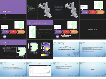
RoboVis Alista ir Wic k E vo Arm Sma ll ro b o t a rm 3 de g re e s o f fre e do m 3D printa b le Co ntro lle d with a Pytho n App whe re to g o fro m he re ? Custo miza tio n! E ve ry 3D-printe d a
Motivation Understanding the behaviour of distributed systems is hard ● Developers need tools for comprehending their systems ● ● Most distributed systems are designed around FSM FSM are often how developers think of their systems ● Can an FSM be generated from an execution so developers can check their mental ● models?
Concept Collect distributed snapshots (state from across the whole system) ● Calculate a distance between each snapshot (xor distance) ● ● Plot each snapshot at it’s relative distance using clustering Connect each snapshot with a time curve ●
etcd (distributed key value store) puts -> gets
Limitations States are not labeled meaningfully ● Semantics of state transitions are not clear ● ● FSM’s require both
Extensions to Project Improving Visualization
Interaction Extension FSM would provide a higher level on which users could zoom in on Current Proposed zoom
Filtering the Clusters - Partitioning: intrinsic meaning - Collect data invariants: filter to show aggregate data using existing tool set - Label: Represent clusters by their invariants - Visualize transitions: use the diff of cluster invariants
Research Questions - Scatterplots? Occlusion? Continuous scatterplots? - Interaction? - Spatial aggregation? Does it make sense? - Dimensionality reduction? Too much information? - Effective color coding? - Dimensional Ordering, Spacing, and Filtering Approach (DOSFA)? Similarities show patterns?
Why this project is neat - Stems from an existing body of work - Has practical applications for debugging distributed systems - No end of data to represent, can easily be extended after the course
Visualizing patient clusters Lovedeep Gondara
Problem Physician researchers are often interested in data exploration before committing to a project. Generally use descriptive statistics to see if there are any obvious signals. Is there any specific group of patients that have the worse outcome compared to the rest? Are there natural groupings in the dataset? Is there an underlying structure to the data?
Proposed solution Cluster visualization Use dimensionality reduction methods such as t-sne. Plot resulting clusters. Draw survival plots by cluster membership. Allow investigation of cluster membership.
Thanks
Spanner, Resurrected. CPSC 547 Project Pitch Madison Elliott February 16, 2017
Background • Project originated as an MA thesis in the CS department
Background • Project originated as an MA thesis in the CS department • New technique that applied low- stretch trees to network visualization
Background • Project originated as an MA thesis in the CS department • New technique that applied low- stretch trees to network visualization • Implemented novel edge-bundling technique
Background • Project originated as an MA thesis in the CS department • New technique that applied low- stretch trees to network visualization • Implemented novel edge-bundling technique • Does not rely on fixed vertices/fixed layout or explicit hierarchical data structure
Background • Two iterations submitted for publication: 1. Graph Drawing (technique focused) 2. Pacific Vis (more emphasis on motivation and visualization application)
Background • Two iterations submitted for publication: 1. Graph Drawing (technique focused) 2. Pacific Vis (more emphasis on motivation and visualization application) • Both rejected L
Background • Two iterations submitted for publication: 1. Graph Drawing (technique focused) 2. Pacific Vis (more emphasis on motivation and visualization application) • Both rejected L • Reviewer comments largely yearning for a deeper/more defined motivation
Resurrection Pitch • Find the motivation!
Resurrection Pitch • Find the motivation! • Develop and execute a user study
Resurrection Pitch • Find the motivation! • Develop and execute a user study • Revise and resubmit paper
Why? • Lots of potential!
Why? • De-hairball a cluttered network:
Why? • Novel, layout free network idioms:
Next Steps • Complete literature review of network idioms, tasks and taxonomies
Next Steps • Complete literature review of network idioms, tasks and taxonomies • Brainstorm new cases where “set” or intuitive network layout is not optimal or necessary for a given task
Questions?
Automatic Grading Service Dataset NICK BRADLEY NBRAD11@CS.UBC.CA
Background Continuous grading service 5.5 GB from 13K test result records (more coming everyday) Some data fields (don’t worry if these don’t mean anything to you) ◦ Grade for every commit each student made ◦ Test metrics: # tests pass/fail, coverage, duration ◦ Code metrics: LOC, build failures ◦ Grade requests: timestamp ◦ More data can be pulled from GitHub (diffs, history, branches,…)
Current Instructor Dashboard
Current Operational Dashboard
Idea + Impact Student facing dashboard ◦ Expanded to CS110, CS210, and CS310 + their corresponding MOOC offerings ◦ Vis will be used by 1000s of students in production system ◦ Challenge: make it engaging + promote ‘good’ behaviour ◦ Feedback: prototype can be made available to current students Instructor facing dashboard ◦ Design study with domain expert (current CPSC310 instructor) ◦ Challenge: needs to scale to 1000s of students Analysis tool ◦ Probably only if you are interested in software engineering ◦ Likely end up as a SE paper
nbrad11@cs.ubc.ca EMAIL
Visual Methods for Analyzing Motifs in Time-Oriented Data Soheil Kianzad PhD student CS
Stock technical analysis Yuan Li ,GrammarViz, 2012 www.aastocks.com/en/stock/detailchart.aspx?symbol=110000
-10% +12% https://nonb- 120 days abcc.ncifcrf.gov/apps/site/help_visualize
Vi ViS ccer ccer Visualizing European soccer players Yann Dubois
Recommend
More recommend
Explore More Topics
Stay informed with curated content and fresh updates.
