Review: Types of Summary Statistics Were often interested in - PowerPoint PPT Presentation
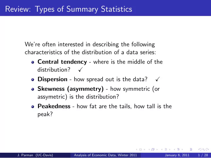
Review: Types of Summary Statistics Were often interested in describing the following characteristics of the distribution of a data series: Central tendency - where is the middle of the distribution? Dispersion - how spread out is the
Review: Types of Summary Statistics We’re often interested in describing the following characteristics of the distribution of a data series: Central tendency - where is the middle of the distribution? � Dispersion - how spread out is the data? � Skewness (asymmetry) - how symmetric (or assymetric) is the distribution? Peakedness - how fat are the tails, how tall is the peak? J. Parman (UC-Davis) Analysis of Economic Data, Winter 2011 January 6, 2011 1 / 28
Measuring Symmetry (or Asymmetry) Typically use skewness to measure symmetry Right-skewed: distribution has a long right tail and data are concentrated to the left Left-skewed: distribution has a long left tail and data are concentrated to the right One way to test for right- or left-skewed is to compare median to mean: Symmetric: ¯ x = median ( x ) Right-skewed: ¯ x > median ( x ) Left-skewed: ¯ x < median ( x ) J. Parman (UC-Davis) Analysis of Economic Data, Winter 2011 January 6, 2011 2 / 28
A Right-Skewed Distribution 250 July frequency y q y 200 250 Number of flights 200 150 150 100 100 100 July frequency July frequency 50 50 0 ‐ 30 ‐ 15 0 15 30 45 60 75 90 105 120 0 0 20 40 60 80 100 Arrival delay (minutes) ‐ 50 Distribution of arrival delays for Southwest flights into SMF, January 2010 Mean = 3.4 min , Median = -2 min , Skewness = 5.0 J. Parman (UC-Davis) Analysis of Economic Data, Winter 2011 January 6, 2011 3 / 28
A Left-Skewed Distribution 80 70 70 60 Frequency 50 40 30 20 10 0 9.58 9.6 9.62 9.64 9.66 9.68 9.7 9.72 9.74 9.76 9.78 9.8 9.82 9.84 9.86 9.88 9.9 9.92 9.94 9.96 9.98 10 100m time (seconds) Distribution of the 500 fastest 100m times as of December 2010 Mean = 9.93 sec , Median = 9.95 sec, Skewness = -1.6 J. Parman (UC-Davis) Analysis of Economic Data, Winter 2011 January 6, 2011 4 / 28
Quantifying Skewness The basic idea is to compare the mean with the median How we actually do it: n � 3 n � x i − ¯ x � ( n − 1)( n − 2) s i =1 Interpretation of statistic: 0 if symmetric, greater than 0 if right-skewed, less than zero if left skewed Excel: use SKEW() function J. Parman (UC-Davis) Analysis of Economic Data, Winter 2011 January 6, 2011 5 / 28
Measuring “Peakedness” Peakedness is a question of how fat the tails of a distribution are Formally, we use kurtosis: n � 4 3( n − 1) 2 n ( n + 1) � x i − ¯ x � − ( n − 1)( n − 2)( n − 3) s ( n − 2)( n − 3) i =1 Excel: use KURT() function J. Parman (UC-Davis) Analysis of Economic Data, Winter 2011 January 6, 2011 6 / 28
Interpreting Kurtosis Kurtosis has no units (because x i − ¯ x is divided by s ) If kurtosis is equal to 0, the distribution has the shape of the normal distribution If kurtosis is greater than 0, the distribution is peaked relative to the normal distribution and has fat tails If kurtosis is less than 0, the distribution is less peaked relative to the normal distribution and has skinny tails J. Parman (UC-Davis) Analysis of Economic Data, Winter 2011 January 6, 2011 7 / 28
Interpreting Kurtosis J. Parman (UC-Davis) Analysis of Economic Data, Winter 2011 January 6, 2011 8 / 28
Excel Demonstration To practice generating and interpreting summary statistics, we’ll use some flight delay data from SMF: Data are for all Southwest flights departing SMF in January and July of 2010 These are panel data (multiple observations for each flight) Data are available on Smartsite (southwest-flights-2010.xlsx) J. Parman (UC-Davis) Analysis of Economic Data, Winter 2011 January 6, 2011 9 / 28
Excel Demonstration Before we switch over to Excel, a couple of quick notes: Make certain that you have installed the data analysis toolpack for Excel (while not necessary for the summary statistics, it will be necessary later in the course) I’ll show you how to add it when we switch over to Excel You can calculate summary statistics three ways: Enter the formula as a function Use the predefined function (AVERAGE, SKEW, etc.) Use the descriptive statistics function under data analysis Now to Excel ... J. Parman (UC-Davis) Analysis of Economic Data, Winter 2011 January 6, 2011 10 / 28
Graphical Representations of Univariate Data J. Parman (UC-Davis) Analysis of Economic Data, Winter 2011 January 6, 2011 11 / 28
Graphical Representations of Univariate Data With univariate data, we have a few different options for graphing the data. The most common are: Histograms - graphs showing the frequency of occurrence of different values Pie charts, bar charts, column charts - various ways to present observations that are measured in different categories Line charts - plots of the variable value against the observation number J. Parman (UC-Davis) Analysis of Economic Data, Winter 2011 January 6, 2011 12 / 28
A Histogram Example Using Absolute Frequencies Data are from the 2008 American Community Survey downloaded from usa.ipums.org J. Parman (UC-Davis) Analysis of Economic Data, Winter 2011 January 6, 2011 13 / 28
A Histogram Example Using Relative Frequencies Data are from the 2008 American Community Survey downloaded from usa.ipums.org J. Parman (UC-Davis) Analysis of Economic Data, Winter 2011 January 6, 2011 14 / 28
Histograms There are a few choices to make when constructing a histogram. Whether to use absolute frequency or relative frequency for the vertical axis Absolute frequency - just the number of times a particular value is observed in the data Relative frequency - the number of times a value is observed as a percentage of all observations Either choice will lead to the same shape for the histogram How large to make the bin sizes If the data take on many different values, you’ll want to group data into bins In general, the more observations you have, the more bins you use J. Parman (UC-Davis) Analysis of Economic Data, Winter 2011 January 6, 2011 15 / 28
Constructing a Histogram in Excel Choose ‘Data Analysis’ and then select ‘Histogram’ For input range, select the values you want to plot a histogram of Leave‘bin range’ blank to get automatic bins, or specify your own bin range Select a cell with space below and to the right of it as the ‘output range’ Click on ‘chart output’ and optionally ‘cumulative percentage’ Now back to our flight data Excel... J. Parman (UC-Davis) Analysis of Economic Data, Winter 2011 January 6, 2011 16 / 28
Pie and Bar/Column Charts Histograms are good for representing numerical univariate data. For categorical univariate data, we typically use pie charts or bar/column charts. Pie charts are perhaps the easiest way for people to visualize percentages Bar/column charts have the advantage of being able to show both relative and absolute frequencies Bar/column charts will become more useful as we start adding more variables J. Parman (UC-Davis) Analysis of Economic Data, Winter 2011 January 6, 2011 17 / 28
Creating Pie Charts in Excel The first step is to get frequencies for the different categories You can do this using the FREQUENCY() function in Excel (remember that this is an array function) Once you have a column of category names and a column of frequencies, highlight the values then select ‘Inset’, then ‘Pie Chart’ and choose your preferred options It’s the same method for bar/column charts, just specificy the appropriate chart type Back to Excel and American Community Survey data on travel to work (travel-to-work.csv)... J. Parman (UC-Davis) Analysis of Economic Data, Winter 2011 January 6, 2011 18 / 28
Line Charts When the observations in a univariate dataset have a natural order, it often makes sense to use a line chart A line chart plots successive values of the data against the successive index values This offers an easy way to visualize whether values are getting larger or smaller Line charts are most common with tme series data J. Parman (UC-Davis) Analysis of Economic Data, Winter 2011 January 6, 2011 19 / 28
Constructing a Line Chart in Excel To practice constructing a line chart, we’ll use time series data on employment in California. The data are available on Smartsite (ca-urate-2000-2010.csv) They are monthly time series data from January of 2000 to November of 2010 The data were downloaded from the Bureau of Labor Statistics (www.bls.gov) To Excel... J. Parman (UC-Davis) Analysis of Economic Data, Winter 2011 January 6, 2011 20 / 28
Constructing a Line Chart in Excel Begin by selecting the data values that you want to graph Select ‘Insert’ and then ‘Line’ and then whichever type of line chart you prefer To get the x-axis values you want, right click on the chart and choose ‘Select data...’ Click on the ‘Edit’ box under ‘Horizontal (category) Axis Label’ and select the cells containing your labels If you have graphed multiple data series on the same graph, be certain to include a legend J. Parman (UC-Davis) Analysis of Economic Data, Winter 2011 January 6, 2011 21 / 28
Summary Statistics as a Graph: The Box Plot Box plot of income by form of transportation used, 2008 American Community Survey J. Parman (UC-Davis) Analysis of Economic Data, Winter 2011 January 6, 2011 22 / 28
Some Other Examples of Visual Representations of Data Google Trends data for the phrase “ice cream” (blue line) and the word “Santa” (red line). J. Parman (UC-Davis) Analysis of Economic Data, Winter 2011 January 6, 2011 23 / 28
Recommend
More recommend
Explore More Topics
Stay informed with curated content and fresh updates.

