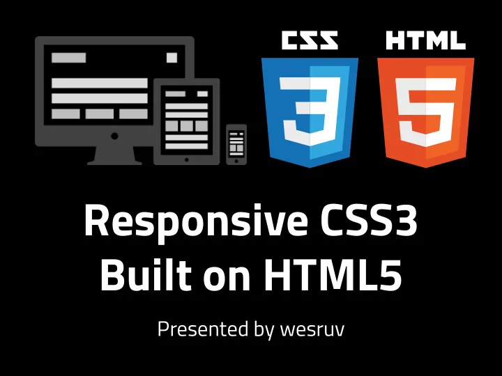
Responsive CSS3 Built on HTML5 Presented by wesruv MY BIAS UI/UX - PowerPoint PPT Presentation
Responsive CSS3 Built on HTML5 Presented by wesruv MY BIAS UI/UX Designer and Front End Dev Degree in Illustration (not Computer Science) Started using HTML 16 years ago, CSS for 12 I know just enough Javascript (JS) to be
Responsive CSS3 Built on HTML5 Presented by wesruv
MY BIAS • UI/UX Designer and Front End Dev • Degree in Illustration (not Computer Science) • Started using HTML 16 years ago, CSS for 12 • I know just enough Javascript (JS) to be dangerous
OUTLINE • What is Responsive Design • Basic Concepts of Responsive Design • HTML Meta Tags • @Media • CSS(3) Helpers • Layout Tricks • Image Tricks • Troubleshooting
THE BIG PROBLEM • Web is a fluid medium • It’s become more fluid with the amount of internet enabled devices • Standards are slow, the world hasn’t been (checkout FutureFriendlyWeb.com for more)
Two main Front-End approaches • Responsive Layout page based on screen-size • Adaptive Change content & layout based on client/device/ screen detection (Requires JS or Server-side language) Adaptive is more involved, and great for special use cases, but not part of this presentation.
What can be solved in a responsive design web site? • Differing screen sizes • Differing pixel densities • Mouse vs. Touch (with some JavaScript love) • Fluid elements with rigid ratios (3x4, 6x8, 9x12, etc) • Standard and Retina images
BASIC CONCEPTS • Using the same HTML content, a good experience can be offered for different device/screen/ interaction types • @media screen size detection & fluid web site layout and are the most-used tools in responsive development • Some device detection (using server-side language or JS) can inform functionality, layout and help solve bugs
MOUSE & TOUCH • There is no hover on touch-only devices • Often, mobile users will end up downloading more content than they need in a responsive site • There are now touch laptops that also have mice • Fingers aren’t small, hit areas shouldn’t be either • For e-commerce, web apps or highly interactive sites, negotiations will be made to make an experience better for one device type and less good for another
WHEN WRITING CSS • Avoid setting sizes in px …except maybe an outer-most <div> • As always, avoid writing overly-authoratative selectors. It bites harder in responsive. • D.R.Y. @media is best @media • Avoid overriding CSS in different @media rules • Test. Test. Test! On actual devices when possible
MOBILE META TAGS • Viewport Can enforce a site width Can enforce a zoom level (usually set to 1) Can set min-max zoom levels Can set site width to device width • HandheldFriendly The older, simpler viewport tag, can be set to true!
Other meta tags to check out... • MobileOptimized Mobile IE Standard for mobile page size • apple-mobile-web-app-capable apple-mobile-web-app-status-bar-style apple-touch-icon & apple-touch-icon-precomposed Make your site prettier in iOS
@MEDIA QUERIES CSS that sets when certain styles should apply. Rules can be based on: • Media type (screen, print, aural, braille, handheld, projection, tty, tv & 3d-glasses) • Viewport size (min and max sizes can be set) • Pixel Density • Orientation • Aspect Ratio
Simple Screen & Print Example: @media screen { body { width: 980px; } a { text-decoration: none; } } @media print { body { width: 100%; } a { text-decoration: underline; } }
Some more examples… @media (min-width: 901px) { @media (max-width: 900px) { // Larger than 901px styles // Smaller than 900px styles } } @media (min-width: 401px) and (max-width: 900px) { // Inbetween 401 and 900px wide } @media (-webkit-min-device-pixel-ratio: 1.25), (min-resolution: 120dpi) { // 1.25 dpr styles }
@media Guidelines • Plageurize CSS frameworks for good guidelines! Bootstrap is currently using: < 480px, 768px, 992px, 1200px Customize as needed • To cover retina, make @media rules that set body font-size based on pixel density, make sure all other font-sizes inherit • Inevitably there will be a few @media rules, keep that number low
CSS HELPERS The tried, but true • % Good ole’ fashioned fluid % sizing! It’s based on parent elements sizing • em Based on font size of the current element, if it’s put in font-size, it bases it on parent font-size If font-size is 12px: 1em is 12px, 2em is 24px and .5em is 6px
CSS3 HELPERS The new! • rem (unit of measure) Root EM, bases it’s size in EM’s on the EM of the <body> tag, not the parent element • fmexbox vw , vh , vmin , vmax Look these up (respectively), they’re going to be game changers when they see better adoption and less bugs
CSS3 HELPERS • box-sizing: border-box ; Remember how IE didn’t add padding to width, but everyone else did? Well now it’s a good thing, because you can make everyone* do it!
DEMO O’CLOCK • Basic page layout demo: http:/ /codepen.io/wesruv/pen/KukAh • Scaling on an aspect ratio: http:/ /codepen.io/wesruv/pen/hindu
SOURCES FutureFriendlyWeb.com Responsive design vs. adaptive delivery: Which one’s right for you? CSS-Tricks.com by Chris Coyer http:/ /venturebeat.com/2013/11/19/ CSS Media Queries & Using Available responsive-design-adaptive Space /css-media-queries “Mobifying” Your HTML5 Site http:/ /www.html5rocks.com/en/mobile/ Retina Display Media Query mobifying/#toc-meta /snippets/css/retina-display-media- query Creating Intrinsic Ratios for Video http:/ /alistapart.com/article/creating- Responsive Web Design by Shay Howe intrinsic-ratios-for-video learn.shayhowe.com/advanced-html- css/responsive-web-design A Comparison of Methods for Building Mobile-Optimized Websites http:/ /sixrevisions.com/mobile/ methods-mobile-websites
Recommend
More recommend
Explore More Topics
Stay informed with curated content and fresh updates.
