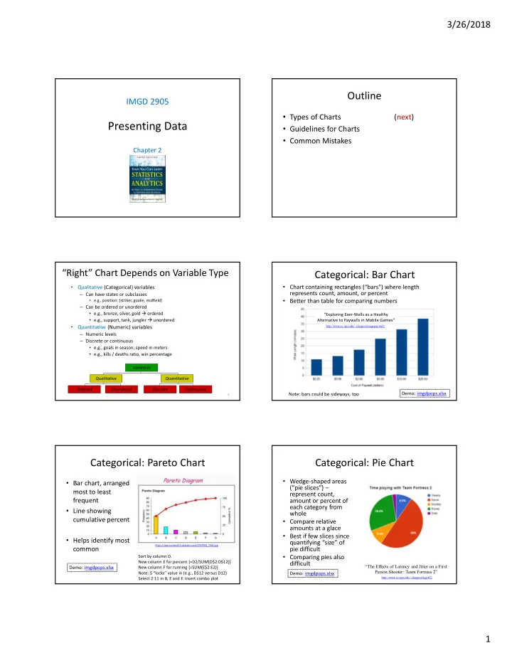

3/26/2018 Outline IMGD 2905 • Types of Charts (next) Presenting Data • Guidelines for Charts • Common Mistakes Chapter 2 “Right” Chart Depends on Variable Type Categorical: Bar Chart • Chart containing rectangles (“bars”) where length • Qualitative (Categorical) variables represents count, amount, or percent – Can have states or subclasses • Better than table for comparing numbers • e.g., position: [striker, goalie, midfield] – Can be ordered or unordered • e.g., bronze, silver, gold ordered “Exploring Exer-Walls as a Healthy • e.g., support, tank, jungler unordered Alternative to Paywalls in Mobile Games” • Quantitative (Numeric) variables http://www.cs.wpi.edu/~claypool/mqp/paywall/ – Numeric levels – Discrete or continuous • e.g., goals in season, speed in meters • e.g., kills / deaths ratio, win percentage Variables Qualitative Quantitative Ordered Unordered Discrete Continuous Demo: imgdpops.xlsx Note: bars could be sideways, too 3 Categorical: Pareto Chart Categorical: Pie Chart • Wedge-shaped areas • Bar chart, arranged (“pie slices”) – most to least represent count, frequent amount or percent of each category from • Line showing whole cumulative percent • Compare relative amounts at a glace • Best if few slices since • Helps identify most quantifying “size” of https://usercontent2.hubstatic.com/3767965_f520.jpg common pie difficult • Comparing pies also Sort by column D. New column E for percent [=D2/SUM(D$2:D$12)] difficult “The Effects of Latency and Jitter on a First Demo: imgdpops.xlsx New column F for running [=SUM(E$2:E2)] Person Shooter: Team Fortress 2” Note: $ “locks” value in (e.g., D$12 versus D12) Demo: imgdpops.xlsx http://www.cs.wpi.edu/~claypool/iqp/tf2/ Select 2:11 in B, E and F. Insert combo plot 1
3/26/2018 Numeric: Frequency Distribution Categorical: Cross-Classification Table • Multi-column table that presents count or percent for 2+ • Groups of numeric values • May include percentage categorical variables and frequency – Good for comparison across multi-categorical data • Typically equal size • e.g., Survey of Champion – Sometimes ends are open “skins” bought with RP (for extremes) • Bin size/number variable – 1, 2, 1, 0, 3, 4, 0, 1, 1, 1, 2, 2, 3, 2, 3, 2, 1, 4, 0, 0 – Too many and not readable – Cluster into groups – Guide: given data points – Report frequency per group • 100 or fewer 7-10 • 101-200 11-15 Skins Freq. Percent • 200+ 13-20 0 4 20% Insert Pivot Chart 1 6 30% Select Major through Grade 2 5 25% Demo: grades.xlsx Drag Majors to Axis 3 3 15% Drag Grade to Axis 4 2 10% Drag Grade to Values Histogram Cumulative Distribution • Bar chart for grouped numerical data – No (or small) gaps btwn adjacent bars • Cumulative amount of Ages of professional data with value or less League players • Easy to see min, max, median • Compare shapes of distributions https://www.mathsisfun.com/data/images/bar-chart-vs-histogram.gif Demo: lol-patches.xlsx https://www.reddit.com/r/leagueoflegends/comme Select column R (Bug Fixes) nts/4x5s9m/analysis_of_age_in_league_of_legends/ Sort low to high New column S for percent [=ROW()/164] Demo: grades.xlsx Select column paste down all Select both column R and S Select GPA data “Nerfs, Buffs and Bugs - Analysis of the Insert Scatter plot with lines http://www.leaguemath.com/e Insert Statistics Chart Histogram arly-vs-late-game-champions/ Impact of Patching on League of Legends” Can adjust bins, overflow/underflow http://www.cs.wpi.edu/~claypool/papers/lol-crawler/ Time Series Plot Stem and Leaf Display • Associate data • “Histogram-lite” for analysis w/out software with date – e.g., exam scores: 34, 81, 75, 51, 82, 96, 55, 66, • Line graph with 95, 87, 82, 88, 99, 50, 85, 72 dates (proportionally 9| 6 5 9 spaced!) 8| 1 2 7 2 8 5 http://www.soundandvision.com/content/violence-and-video-games 7| 5 2 http://www.polygon.com/2014/9/12/6141515/do- violent-video-games-actually-reduce-real-world-crime 6| 6 Demo: majors.xlsx 5| 1 5 0 Sel. year and majors Insert Line Chart 4| More Line Charts 3| 4 11 2
3/26/2018 Radar Plot Gold compared to average, LoL NA teams, by role Scatter Plot • Also called • Two numerical variables, one on each axis “star charts” • Reveal patterns in relationship or “kiviat • Setup “right” models (later) plots” • Good for quick visual “Intelligent Simulation of comparison, Worldwide Application Distribution especially for OnLive's Server Network” when axes http://www.cs.wpi.edu/~claypool/mqp/onlive/ unequal Demo: lol-rates.xlsx Demo: lol-rates.xlsx Select top line {win, Select two of {win, pick, ban} + 1 row pick, ban} num Insert scatter plot Insert Other Radar scatter plot http://www.thescoreesports.com/lol/news/2561-using-gold-distribution-to-understand-team-dynamic-global-na-lcs-and-lpl 14 Many More Charts! Game Analytics Charts https://en.wikipedia.org/wiki/Chart Gunter Wallner and Simone Kriglstein. “An Introduction to • Bubble • Gantt Gameplay Data Visualization”, Game Research Methods , pages • Waterfall • Nolan 231-250, ETC Press, ISBN: 978-1-312-88473-1, 2015. • Tree • Pert http://dl.acm.org/citation.cfm?id=2812792 • Gap • Smith • Polar • Skyline • Player choices (e.g., build units) • Violin • Vowel • Density of activities (e.g., where spend time on map) • Candlestick • Nomogram • Movement through levels • Kagi • Natal • If common chart effective for message, use • Learn/use other charts as needed Player Choices – Pie-Chart Player Location – Heat Map (1 of 2) (Custom game, comparative study) 3
3/26/2018 Player Location – Heat Map (2 of 2) Note, Heat Map for Tables, Too! Assassin’s Creed Red means sales are Where play low testers failed Result: Make red areas easier Excel tutorial at: https://trumpexcel.com/heat-map-excel/ http://www.gamasutra.com/blogs/JonathanDankoff/20140320/213624 /Game_Telemetry_with_DNA_Tracking_on_Assassins_Creed.php Movement (2 of 2) Movement (1 of 2) (game: Infinite Mario , clone of Super Mario Bros.) Game: DOGeometry - build road to veterinary house Outline Player Behavior - Node-link Shows exploration, where stuck • Types of Charts (done) • Guidelines for Charts (next) – Again, “art” not “rules”. Learn with experience. Recognize good/bad when see it. • Common Mistakes https://xkcd.com/833 4
3/26/2018 Guidelines for Good Charts (1 of 5) Guidelines for Good Charts (2 of 5) • Maximize information • Require minimum effort from reader – Make self-sufficient – Perhaps most important metric – Key words in place of symbols – Given two, can pick one that takes less reader • e.g., “Gold IV” and not “Player A” effort • e.g., “Daily Games Played” not “Games Played” – Axis labels as informative as a a possible b c b • e.g., “Game Time (seconds)” e.g., not “Game Time” c – Help by using captions (or http://www.phplot.com/phplotdocs/conc-labels.html title, if stand-alone) • e.g., “Game time in seconds versus player skill in total Direct Labeling Legend Box hours played” 25 26 Guidelines for Good Charts (3 of 5) Guidelines for Good Charts (3 of 5) • Minimize ink (2 of 2) • Minimize ink (1 of 2) – Maximize information-to-ink ratio – Too much unnecessary ink makes chart cluttered, hard to read • e.g., no gridlines unless needed to help read – Chart that gives easier-to-read for same data is preferred .1 1 • Same data • Downtime = 1 – uptime • Right “better” https://www.slideshare.net/NicoleMarinsek/darkhorse-line-chart Uptime Downtime 27 Guidelines for Good Charts (4 of 5) Guidelines for Good Charts (5 of 5) • Use commonly accepted • Avoid ambiguity practices – Show coordinate axes – Present what people expect – e.g., origin at (0,0) vs. • at right angles – e.g., independent (cause) on – Show origin x-axis, dependent (effect) on vs. y-axis • usually at (0,0) – e.g., x-axis scale is linear – Identify individual curves – e.g., increase left to right, and bars bottom to top – e.g., scale divisions equal • With key/legend or label • Departures are permitted, http://www.carltonassociatesinc.com/images/confusion-new.jpg – Do not plot multiple but require extra effort variables on same chart from reader so use sparingly! • Single y-axis 29 30 5
Recommend
More recommend