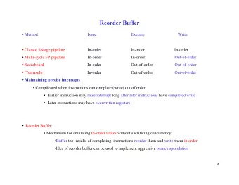
Order of Magnitude Markers: An Empirical Study on Large Magnitude - PowerPoint PPT Presentation
Order of Magnitude Markers: An Empirical Study on Large Magnitude Number Detection Rita Borgo, Joel Dearden, Mark W. Jones Swansea University, Visual Computing Group Problem Compare Vietnam and Venezuela Problem Compare Vietnam and
Order of Magnitude Markers: An Empirical Study on Large Magnitude Number Detection Rita Borgo, Joel Dearden, Mark W. Jones Swansea University, Visual Computing Group
Problem – Compare Vietnam and Venezuela
Problem – Compare Vietnam and Venezuela Linear Logarithmic Text Scale-stack Color Ours bar charts [1]
Research • Designed a new type of visual encoding • Has 10x increase in numerical resolving power • Compared against various encodings • User study
Possible approaches Tukey’s ladder of powers (re-expression) [2] Isenberg et al. [3] Dual scale charts and transformations
Possible approaches Scale-stack bar charts, Hlawatsch et al Panel charts Broken axis charts
Our design aims • Flexible encoding – working together within a chart (e.g. malaria data), or separately (e.g. across a map – tested in user study). • View all data regardless of magnitude (broken axis and panel charts break this). • Visualize positive and negative quantities. • Greater resolving power compared to existing techniques.
Final design Height of the thin grey bar indicates the • Normalized scientific significand on a 0 to 10 scale notation A × 10 B where 1≤A≤10 and B ∈ Z . In this case 5.2 • A Significand, B Exponent Number of blue lines • Big/small effect – stacked vertically exponent (largest effect on indicates the number) represented with exponent the biggest visual In this case 8 component. Value � 5.2E+8
Final design
Other tested markers • Design evolution. • Other markers tested in user study. • For the purposes of the user study, negative numbers were omitted to simplify things (logarithmic scale and ratio tests would be a problem).
User study: Task A, Magnitude Estimation Number of black / red segments across (can be fractions) indicates the significand In this case 8.8 Number of blue lines stacked vertically MINUS 1 indicates the order of magnitude In this case 8 Value � 8.8E+8
Magnitude estimate Each space between the lines represents the number range indicated on a LINEAR scale, e.g. 0 to 10 4 The number value is illustrated by a coloured bar in every space that it is smaller than. A vertical line through a space indicates that the value is larger than that space and cannot be shown there. Value≈7.6E+3
Remaining stimuli examples
Stimuli design • Significand and exponent generated randomly. • Non-integers discarded to make fair comparisons with text marker. i.e., remove floating point numbers. • 0 and 1 not used to make log(A × 10 B )>0 and defined. • Answers accepted as correct if within 10% of the target value. • All stimuli are stored so a specific experiment can be reconstructed.
Results: Magnitude Estimation Task A • OOMMs significantly more accurate than logarithm (p ≪ 0.002) • OOMM3 and 4 significantly more accurate than SSB (p ≪ 0.002) • See paper for response time analysis
User study: Target Identification Task B • Motivation: Can we compare values using the designs across the screen with many (potentially similar) Marker distractors? grid Click on the LARGEST and SECOND LARGEST values
Stimuli design • Same as A with additional requirement for target selection: • Largest number forced to be an outstanding outlier. • The second largest number and all the distractors are within two exponent levels.
Results: Target Identification Task B • OOMMs significantly more accurate than logarithm, linear and SSB (p ≪ 0.002)
User study: Ratio Estimation Task C Pair of markers to compare Divide A by B = 80,000 / 40,000 = 2 Enter A is 2 times larger than B Click NEXT to ratio here move on to the next task
User study: Ratio Estimation Task C Divide A by B = 100,000 / 500 = 200 A is 200 times larger than B
User study: Ratio Estimation Task C How to compare two scale-stack bar markers Choose to view A in the space from 0 to 10 6 because it is easy to see Choose to view there… B in the space It is about 10% from 0 to 10 3 of this space because it is easy to see A is 3 orders of there… magnitude It is about 50% larger than B of this space because it is 3 rows up from B 1000 times larger and 5 times smaller = 1000 * 0.2 = 200 A is 200 times larger than B
User study: Ratio Estimation Task C A has 3 more blue bars A has a grey bar 5 than B times smaller than B = = A is 3 orders of A has a significand 5 magnitude larger than times smaller than B B 1000 times larger and 5 times smaller = 1000 * 0.2 = 200 A is 200 times larger than B
Results: Ratio Estimation Task C • OOMMs significantly more accurate than linear and logarithm (p ≪ 0.002) • OOMM5 significantly more accurate than SSB (p ≪ 0.002)
User study: Trends Analysis Task D • Motivation: Analyse and quantify trends One company’s profits for four years Click on the company whose profit has increased the most over four years in PERCENTAGE terms
Results: Trends Analysis Task D • OOMM1 and 3 significantly less accurate than linear (p ≪ 0.002)
Conclusion • Increased expressive power • Good response time in user study • Suggestive that usability outweighs novelty • Confirms Hlawatsch et al - new designs that increase the space of representable numbers can increase task accuracy and speed Work funded by: Leverhulme and RIVIC
Prepared answers • Remaining slides are answers to anticipated questions or omitted slides.
Analysis (A and C) • A and C – magnitude estimation and ratio estimation – answers not exact. • Use error threshold. • Graphs show trend of accuracy against increasing error tolerance.
Text: small magnitude second largest smallest • Only integers were used in the user study. • Identify the largest and second largest in this random data (apart from outstanding outlier).
Resolving power • Assume marker height of 150 pixels. • Assume b bit colour display (usually 8 bit). • Linear, logarithmic and scale-stack bars achieve 150 unique numerical representations. • Text – 23 digits possible (in 150px): Colour – 2 b unique numerical representations, although fewer are • perceived. • Ours – 1500 representations possible. (10 × increase in resolving power)
Related literature Cleveland and McGill [4], extracting quantitative information from graphs
Final user study • 21 participants, 2 females, 19 males. • Basic knowledge required, graphs, logarithmic scale…, therefore • Maths, Physics, Engineering and Computer Science graduates and undergraduates.
Design history • Designs that favoured pre-attentive processing. • Minimum of colours – 2-3. • Associating different colours to different shapes. • Low visual complexity (defined as detail, intricacy, number of geometric features, etc.) • Software written to allow us to experiment with marker design. • Big/small effect – exponent (largest effect on number) represented with the biggest visual component.
Recommend
More recommend
Explore More Topics
Stay informed with curated content and fresh updates.
