Most of the diagrams and maps are taken from the IPCC reports, which - PDF document
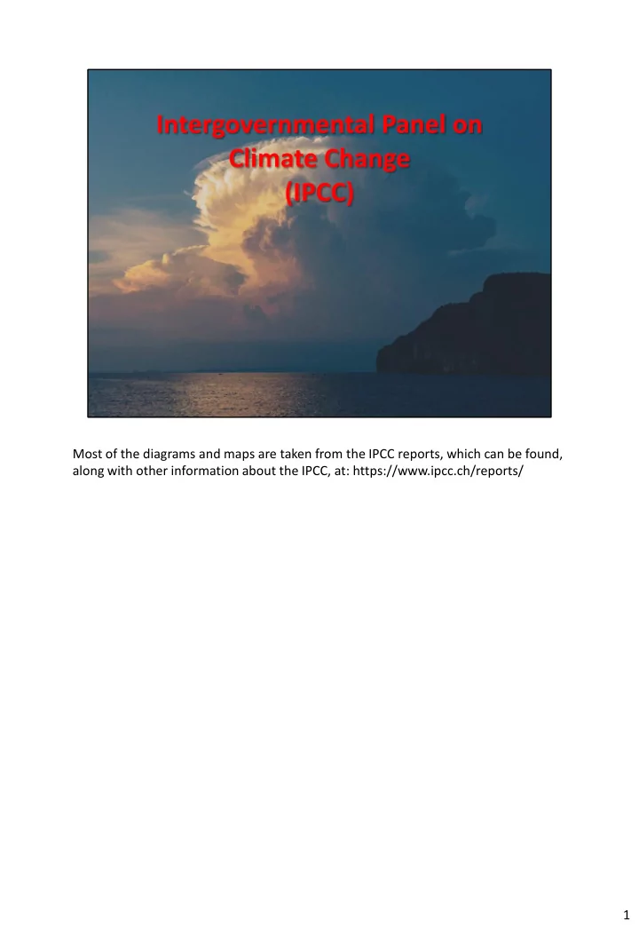
Most of the diagrams and maps are taken from the IPCC reports, which can be found, along with other information about the IPCC, at: https://www.ipcc.ch/reports/ 1 The IPCC doesnt do scientific research itself, it extracts relevant information
Most of the diagrams and maps are taken from the IPCC reports, which can be found, along with other information about the IPCC, at: https://www.ipcc.ch/reports/ 1
The IPCC doesn’t do scientific research itself, it extracts relevant information from published research and puts it into reports for non-specialists. The target audience is policy makers. 2
WG1: e.g. CO 2 levels in the atmosphere, ocean temperatures, etc. Also the computer models used to make forecasts. WGll: e.g. human impacts (economic, flooding of low lying cities near the sea, etc.) and natural ones (habitat changes, biodiversity, etc.) WGlll: e.g. Moving from fossil fuels to renewables, carbon capture technologies, emissions trading schemes. 3
The 5 th Synthesis Report was the main scientific input into the Paris Climate conference of 2015. The 6 th Synthesis Reports is due out in 2022. 4
The Paris Climate Conference Committee asked the IPCC to provide more data on the 2 C figure 5
The IPCC decided 2 C was too optimistic, we should be limiting warming to 1 C above pre-industrial temperatures. Most of the report is about justifying this figure. 6
7
TOA=Top of the Atmosphere. The numbers are energy densities (in Watts per square metre). Sensible heat is heat conducted from the Earth’s surface. Greenhouse gases are essential for life. If there weren’t any the earth’s surface temperature would be - 18 C. But we can have too much of a good thing. 8
The ‘upper ocean’ is the top 700m. 9
FOLU = forestry and other land uses. Methane (CH 4 ) comes mainly from cattle, some comes from rice paddy fields. Nitrous oxide (N 2 O) comes from fertilisers and manure, fossil fuel combustion and industrial processes. The scale (gigatonnes CO 2 equivalents per year) is used to account for the fact that different gases have different greenhouse effects – methane is 25 times as potent as CO 2 , nitrous oxide is 300 times as potent. 10
11
12
‘Pre -industrial levels’ is the average temperature from 1850 to 1900, and this is the zero in the chart. We are already 2/3 of the way to the 1.5 C maximum. The actual temperatures are erratic because of natural phenomena, such as volcanic eruptions (that emit dust and ash into the upper atmosphere, which reflects sunlight and lowers global temperatures) and cyclical effects such as El Nino. The blue line is a 30 year average. 13
RCPs can be thought of as emissions scenarios. The shaded areas are the margins of error in the modelling. 14
The polar regions are the worst affected. The Antarctic isn’t so badly affected as the Arctic because most of the world’s population and heavy industry is in the northern hemisphere and weather systems tend to stay in their own hemisphere. Also, the Southern Ocean acts as a (partial) barrier. 15
16
It is often complicated separating the different causes of species decline. 17
There are of course many other impacts. 18
19
September is chosen because it has the minimum coverage of ice, following the summer thaw. 20
The chart is confusing, but the red line shows the ice extent hits zero around 2075, with RCP8.5 21
There are of course other species that are affected. 22
23
24
25
Melting of the sea ice does not cause sea levels to rise. Sea level rise is caused by expansion of water as its temperature rises, and melting of land covered ice (glaciers), almost entirely in Greenland and Antartica. Some of the sea ice around Antarctica acts as a plug, holding the glaciers in 26
27
28
CO 2 is very soluble in water, and the solution is mildly acidic. Ph can be misleading, as it is a logarithmic scale, meaning that a reduction of 1 Ph unit means a 10-fold increase in acidity. 29
Acid dissolves calcium carbonate, so shells (which are made of calcium carbonate, CaCO 3 ) are vulnerable to acidification. 30
31
32
Cold water corals are largely unaffected by acidification so far, but experiments show that under RCP8.5 they will be severely affected by the end of the century. 33
This refers to terrestrial habitats 34
35
This is an example of why the IPCC changed its warning from 2 C to 1.5 C 36
37
The figure of 17km is a global average – for large flat areas it is much higher 38
If the speed at which a species can move fails to exceed the climate velocity, the species cannot avoid the changes by moving. 39
Some species are OK with the new warmer conditions, but find their habitat is invaded by predators or competitors for resources. 40
The circles represent scientific studies of the timings of critical events. For plants these are the flowering times, for arthropods they are the time of emergence, and for birds they are the time of clutch initiation. Changes in the complex web of interactions between species can result in species’ behaviour getting out of sync, e.g. insects haven’t emerged when the plants they pollinate are flowering. 41
42
The pika can’t move north in response to a warming habitat because that would take it to the Yukon or Alaska, where the winters are too cold. So it has to adapt to survive. 43
It was thought the pika was suffering due to climate change, but recent research (around 2017) has shown it is able to adapt, and numbers are recovering. 44
45
46
Alan Rusbridger is a former editor of the Guardian, one of the few newspapers to cover the ‘Global Warming of 1.5 C’ Report adequately. 47
48
Canada’s carbon emissions problem is the exploitation of the Alberta tar sands, one of the dirties forms of fossil fuel. 49
Australia has a large coal mining industry, and the coal lobby is very powerful. Climate change denier Scott Morrison was recently re-elected Prime Minister 50
Climate change denier Donald Trump withdrew the USA from the Paris Climate Accord in 2017. He continues to actively undermine attempts to combat climate change. 51
The ‘Global Warming of 1.5 C’ report was the major scientific input into the COP24 conference. The purpose of the COP24 conference was to agree legally binding protocols to implement the aspirations of the Paris Climate Accord. It was only partially successful in this. 52
53
54
Recommend
More recommend
Explore More Topics
Stay informed with curated content and fresh updates.

