Microinteractions users have with interfaces that can inform, - PowerPoint PPT Presentation
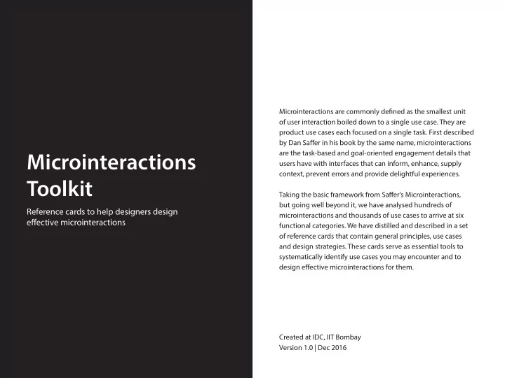
Microinteractions are commonly defjned as the smallest unit of user interaction boiled down to a single use case. They are product use cases each focused on a single task. First described by Dan Safger in his book by the same name,
Microinteractions are commonly defjned as the smallest unit of user interaction boiled down to a single use case. They are product use cases each focused on a single task. First described by Dan Safger in his book by the same name, microinteractions are the task-based and goal-oriented engagement details that Microinteractions users have with interfaces that can inform, enhance, supply context, prevent errors and provide delightful experiences. Toolkit Taking the basic framework from Safger’s Microinteractions, but going well beyond it, we have analysed hundreds of Reference cards to help designers design microinteractions and thousands of use cases to arrive at six efgective microinteractions functional categories. We have distilled and described in a set of reference cards that contain general principles, use cases and design strategies. These cards serve as essential tools to systematically identify use cases you may encounter and to design efgective microinteractions for them. Created at IDC, IIT Bombay Version 1.0 | Dec 2016
GENERAL PRINCIPLES 1. Visualize Quantitative Information 2. Use Notifjcation as a Nudge 3. Enable Appropriate Medium of Interaction 4. Maintain Functional Continuity 1. Notifjcations and alerts Provide short, timely and relevant information update when a particular feature/service is not in use.
1. Notifjcations and alerts USE CASES 1. Notifying about the ongoing progress of an event or the status of a quantity which fmuctuates dynamically from zero to maximum. 2. Giving an overview of data updates for a set of user activities to inform users about all inofrmation and how they relate to each other. 3. Giving information on a real time basis about location, contact, current activity etc. STRATEGIES 1. Indicate clearly the minimum and maximum points in a range of user inputs or system generated values to enable users to estimate quantities. 2. Reduce complexity by converting continuous data into discrete units. Visualize quantitative information 3. Color code difgerent elements on the screen based on the progress If a notifjcation contains data from which intervals and ratios can status or functionality of each element. be calculated, provide a visual representation that helps compare, contrast, predict or preempt actions easily. 4. Use the best suited means of visualization (graph, piechart, The status bar shows live feed activity The notifjcation strip shows the knob, slider, timeline) based on the number of elements and the status of signal strength, wifj strength, progress of downloading, uploading, information to be highlighted. download, upload, installation installation of fjles, apps, updates etc. completions, battery charge remaining, state of on and ofg of hotspot, 5. In case of multiple data points in a single screen, make appropriate bluetooth, airplane mode, charging and use of forms and shapes to prioritize the data to enable better time. understanding.
1. Notifjcations and alerts USE CASES 1. Notifying about the ongoing progress of an event or the status of a quantity which fmuctuates dynamically from zero to maximum. 2. Giving an overview of data updates for a set of user activities to inform users about all information and how they relate to each other. 3. Giving information on a real time basis about location, contact, current activity etc. STRATEGIES 1. Indicate clearly the minimum and maximum points in a range of user inputs or system generated values to prevent users from seeking to go above or below the range. 2. Reduce complexity by converting continuous data into discreet units. Visualize quantitative information 3. Color code difgerent elements on the screen based on the progress If a notifjcation contains data from which intervals and ratios can status or functionality of each element. be calculated, provide a visual representation that helps compare, contrast, predict or preempt actions easily. 4. Use the best suited means of visualization (graph, piechart, Google Fit is a service that tracks health as per the user preference. The interface knob, slider, timeline) based on the number of elements and the metrics like step count and real-time keeps the user motivated. information to be highlighted. stats of runs, walks and rides in terms of speed, pace, route, elevation and the calories burnt. The data collected is 5. In case of multiple data points in a single screen, make appropriate aggregated or broken down and shown use of forms and shapes to prioritize the data to enable better understanding.
1. Notifjcations and alerts USE CASES 1. Notifying about the ongoing progress of an event or the status of a quantity which fmuctuates dynamically from zero to maximum. 2. Giving a simple overview of data updates for a set of user activities to inform users about all inofrmation and how they relate to each other. 3. Giving information on a real time basis about location, contact, current activity etc. STRATEGIES 1. Indicate clearly the minimum and maximum points in a range of user inputs or system generated values to prevent users from seeking to go above or below the range. 2. Reduce complexity by converting continuous data into discreet units. Visualize quantitative information 3. Color code difgerent elements on the screen based on the progress If a notifjcation contains data from which intervals and ratios can status or functionality of each element. be calculated, provide a visual representation that helps compare, contrast, predict or preempt actions easily. 4. Use the best suited means of visualization (graph, piechart, School bus tracker feature on Educhat speeding, unscheduled bus stops or knob, slider, timeline) based on the number of elements and the app notifes real time updates on other emergencies. information to be highlighted. school bus locations. The notifjcations displays the bus number and driver’s details and help the user analyze the 5. In case of multiple data points in a single screen, make appropriate driver’s performance, bus delays, over use of forms and shapes to prioritize the data to enable better understanding.
1. Notifjcations and alerts USE CASES 1. Sending notifjcations that are both informative and motivating for the user to want to continue a particular task. 2. Keeping the user updated and reminding enough number of times to get an action completed. 3. Feeding relevant information when users are more positively disposed to consider acting upon it. STRATEGIES 1. User statistics are helpful when it comes to gathering data relevant to the particular service function. 2. Introduce visually appealing characters/mascots with various levels Use notifjcation as a nudge of customization that keep the user engaged . When the notifjcation is a reminder or a suggestion that hopes to 3. Add a human touch to the text in the action points of the invoke a user response, make it a well calculated nudge (based on notifjcations with which the user interacts. time and frequency) to ensure service/app stickiness. Fitbit sends notifjcations to let the user the page that contains detailed data of 4. Give smart reasoning/back the information with competitive data know the number of steps required the user’s activities. for the user to want to react to it on a regular basis. to complete a goal. By constantly reminding the user that he/she is nearing the goal, the notifjcation motivates the user to fjnish the task. Slide to view option takes the user to
1. Notifjcations and alerts USE CASES 1. Sending notifjcations that are both informative and motivating for the user to want to continue a particular task. 2. Keeping the user updated and reminding enough number of times to get an action completed. 3. Feeding relevant information when users are more positively disposed to consider acting upon it. STRATEGIES 1. Give smart reasoning/back the information with competitive data for the user to want to react to it on a regular basis. 2. Introduce visually appealing characters/mascots with various levels Use notifjcation as a nudge of customization that keep the user engaged. When the notifjcation is a reminder or a suggestion that hopes to 3. Add a human touch to the text in the action points of the invoke a user response, make it a well calculated nudge (based on notifjcations using user generated content. time and frequency) to ensure service/app stickiness. Duolingo keeps track of the user’s In this way the user gets motivated practice sessions and frequency of to schedule a time for the learning practice. It gives daily notifjcations session. The motto is to keep the owl, a and gives credit points for daily character of duolingo, happy. practice session consistency. It gives notifjcations on a timely interval, if the user does not practice for several days.
Recommend
More recommend
Explore More Topics
Stay informed with curated content and fresh updates.
