Economics Class - XI Presentation of Data - Notes The presentation - PDF document
Economics Class - XI Presentation of Data - Notes The presentation of data means exhibition of data in a clear and attractive manner so that the data can be easily understood and analysed. Forms of presentation of data 1. Textual or
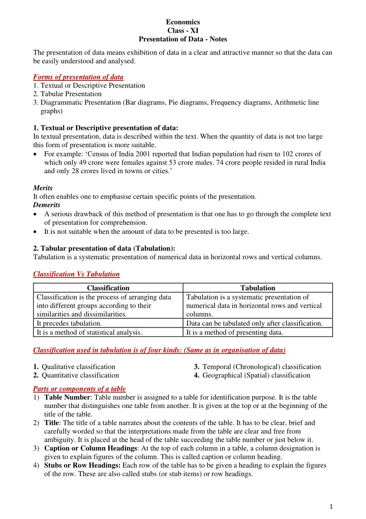
Economics Class - XI Presentation of Data - Notes The presentation of data means exhibition of data in a clear and attractive manner so that the data can be easily understood and analysed. Forms of presentation of data 1. Textual or Descriptive Presentation 2. Tabular Presentation 3. Diagrammatic Presentation (Bar diagrams, Pie diagrams, Frequency diagrams, Arithmetic line graphs) 1. Textual or Descriptive presentation of data: In textual presentation, data is described within the text. When the quantity of data is not too large this form of presentation is more suitable. • For example: ‘Census of India 2001 reported that Indian population had risen to 102 crores of which only 49 crore were females against 53 crore males. 74 crore people resided in rural India and only 28 crores lived in towns or cities.’ Merits It often enables one to emphasise certain specific points of the presentation. Demerits • A serious drawback of this method of presentation is that one has to go through the complete text of presentation for comprehension. • It is not suitable when the amount of data to be presented is too large. 2. Tabular presentation of data (Tabulation): Tabulation is a systematic presentation of numerical data in horizontal rows and vertical columns. Classification Vs Tabulation Classification Tabulation Classification is the process of arranging data Tabulation is a systematic presentation of into different groups according to their numerical data in horizontal rows and vertical similarities and dissimilarities. columns. It precedes tabulation. Data can be tabulated only after classification. It is a method of statistical analysis. It is a method of presenting data. Classification used in tabulation is of four kinds: (Same as in organisation of data) 1. Qualitative classification 3. Temporal (Chronological) classification 2. Quantitative classification 4. Geographical (Spatial) classification Parts or components of a table 1) Table Number : Table number is assigned to a table for identification purpose. It is the table number that distinguishes one table from another. It is given at the top or at the beginning of the title of the table. 2) Title : The title of a table narrates about the contents of the table. It has to be clear, brief and carefully worded so that the interpretations made from the table are clear and free from ambiguity. It is placed at the head of the table succeeding the table number or just below it. 3) Caption or Column Headings : At the top of each column in a table, a column designation is given to explain figures of the column. This is called caption or column heading. 4) Stubs or Row Headings: Each row of the table has to be given a heading to explain the figures of the row. These are also called stubs (or stub items) or row headings. 1
5) Body of the Table : It is the main part of the table and it contains the actual numerical data. Location of any one figure/data in the table is fixed and determined by the row and column of the table. 6) Unit of Measurement : The unit of measurement of the figures in the table (actual data) should always be stated along with the title. If different units are there for rows or columns of the table, these units must be stated along with stubs or captions. 7) Source : It is a brief statement or phrase indicating the source of data presented in the table. If more than one source is there, all the sources are to be written in the ‘ source ’ . Source is generally written at the bottom of the table. 8) Note (or Footnote) : Note is the last part of the table. It explains the specific feature of the data content of the table which is not self-explanatory and has not been explained earlier. For example: Tabulate the given data. Table No.1 Advantages of tabular presentation of data: • The most important advantage of tabulation is that it organises data for further statistical treatment and decision making. • It makes comparison of data easier. • It is economical and easy to understand. 2
3. Diagrammatic presentation of data : Diagrammatic presentation is a technique of presenting numerical data using diagrams such as bar diagrams, pie diagrams or frequency diagrams etc. It is the most attractive and appealing way to represent statistical data. Diagrammatic presentation of data Arithmetic Frequency Bar Diagrams Pie Chart Line Graph Diagrams Simple Bar Diagram Histogram Multiple Bar Diagram Frequency Polygon/ Curve Component or Ogive Sub-divided Bar Diagram Percentage Bar Diagram • Bar Diagram A bar diagram is one dimensional . It is only the height (or length) and not the width of the bar that matters. ➢ In case of bar diagrams, the magnitude of the characteristic is shown by the height or length of the bar. ➢ Bar diagram comprises of a group of equi-spaced and equi-width rectangular bars for each category of data. ➢ Bar diagram can be drawn both for discrete and continuous variables. Types of bar diagrams i. Simple Bar Diagram It is a bar diagram which represents only one characteristic and is the simplest form of bar diagram. For example: The bar diagram given below shows the number of students in class XI in different streams in the year 2018. No of students in class XI in 2018 Year Humanities Commerce Science 2018 550 350 200 3
Number of students in class XI in 2018 Scale: y-axis: 1cm = 100 students 600 Number of Students 500 400 300 200 100 0 Humanities Commerce Science Streams ii. Multiple Bar Diagram It is a diagram depicting two or more characteristics in the form of adjacently placed bars of height proportional to the magnitude of the characteristics. For example, a chart comparing the number of students in Humanities, Commerce and Sciences may be represented with 3 bars for each stream, drawn side by side (adjacent to each other) for each year. Year Humanities Commerce Science 2018 550 350 200 2019 650 450 300 2020 400 500 400 Multiple Bar Diagram Scale: y-axis: 1cm = 100 students 700 600 Number of students 500 400 Humanities 300 Commerce 200 Science 100 0 2018 2019 2020 YEARS iii. Component Bar Diagram (or Sub-Divided Bar Diagram) A component bar diagram shows the bar and its sub-divisions into two or more components. Component bar diagrams is also called sub-divided bar diagrams . To construct a component bar diagram, first of all, a bar is constructed on the x -axis with its height 4
equivalent to the total value of the bar and the respective components are then marked. It can also be constructed by drawing each component one by one, each on top of the previous one in the given order. For example: Draw a sub-divided bar diagram for the given data. Year Humanities Commerce Science Total 2018 1100 550 350 200 2019 650 450 300 1400 2020 400 500 400 1300 Sub-divided Bar Diagram Scale: y-axis: 1cm = 200 students 1600 1400 Number of Students 300 1200 400 1000 200 450 800 350 500 Humanities 600 Commerce 400 650 Science 550 200 400 0 2018 2019 2020 Years iv. Percentage Bar Diagram When the components are represented as percentages of the whole, it is known as a percentage bar diagram. The main feature of this component diagram is that all bars are of the same height since it represents 100%. For example: Represent the following data using a percentage bar diagram. Total Year Humanities Commerce Science 2018 550 350 100 1000 2019 700 800 500 2000 2020 800 900 300 2000 The first step, hence, is to calculate the component percentages and then plot the bar diagram with percentages on y -axis. Year Humanities (%) Commerce (%) Science (%) Total (%) 2018 55 35 10 100 2019 35 40 25 100 2020 40 45 15 100 5
Scale: Percentage Bar Diagram y-axis: 1cm = 10% 100% 10 15 90% 25 80% 35 70% % of Students 45 60% 40 50% 40% Humanities 30% 55 Commerce 20% 40 35 Science 10% 0% 2018 2019 2020 Years • Pie Diagram or Pie Chart A pie diagram is also a component diagram, but it is a circle whose area is proportionally divided among the components it represents. Steps in the construction of a pie diagram Step 1: The value of each component is first expressed as a percentage of the total value of all the components: Step 2: Conversion of percentages of components into angular components of the circle: A circle in a pie chart, irrespective of its value of radius, is thought of having 100 equal parts of 3.6° (360°/100) each. To find out the angle, which the component shall subtend at the centre of the circle, each percentage figure of every component is multiplied by 3.6°. Note: To find out the angle or degree of the component without using percentages : Degree of the component = Value of the component X 360 ◦ Total value of all the components For example: Construct a pie chart for the following data. Items Cost Percentage Degrees 144 ◦ Wages 16000 40 % 72 ◦ Interest 8000 20 % 108 ◦ Rent 12000 30 % 36 ◦ Miscellaneous 4000 10 % 360 ◦ Total Cost 40000 100 % 6
Recommend
More recommend
Explore More Topics
Stay informed with curated content and fresh updates.


