Declining Birth-to-K ratios: A case study of five elementary - PowerPoint PPT Presentation
Declining Birth-to-K ratios: A case study of five elementary attendance areas in South Seattle Rebekah Ogimachi, Enrollment Planning Intern Summer 2019 TOPIC | Why study birth-to-K? Birth-to-K ratio refers to the ratio of Kindergarten
Declining Birth-to-K ratios: A case study of five elementary attendance areas in South Seattle Rebekah Ogimachi, Enrollment Planning Intern Summer 2019
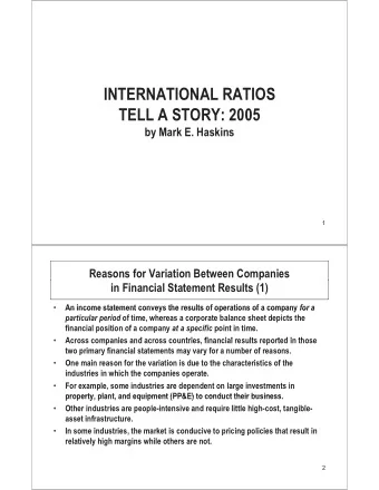
TOPIC | Why study birth-to-K? • Birth-to-K ratio refers to the ratio of Kindergarten enrollments to births SPS Birth-to-K (2010-2018) from five years previous, in a given 0.74 area. 0.72 • One factor used to project K enrollment 0.7 0.68 • Interest for this project started with observing a negative trend in birth-to- 0.66 K on a district level 0.64 0.62 • District rate is declining, the overall change is still relatively minor. 0.6 2010 2011 2012 2013 2014 2015 2016 2017 2018 • In “outlier” attendance areas, what are trends in birth-to-K rates indicative of?
ATTENDANCE AREAS | Criteria • This case study focuses on the Elementary AAs with Greatest Decline in five elementary attendance Birth-to-K Ratios areas whose birth-to-K ratios (2014-2018) decreased the most from 2014- Attendance Area 5-year change 2018: Dunlap -42.8% • Dunlap Concord Int'l -35.6% Martin Luther King Jr -28.7% • Concord Int’l Roxhill -28.5% • MLK Jr John Muir -28.2% • Roxhill Genesee Hill -20.7% West Seattle -20.7% • John Muir. Sand Point -19.5% Laurelhurst -19.4% Highland Park -18.0%
ATTENDANCE AREAS | Regional Placement • Southeast • John Muir • MLK Jr. • Dunlap • Southwest • Roxhill • Concord Int’l
ATTENDANCE AREAS | Initial Comparison ATTENDANCE AREAS COMPARED TO • Attendance areas range from AVERAGE K-5 AA (2014) 346 to 531 students Asian Black Hispanic Multi-Race Native American Pac Island White • SPS elementary attendance areas have 458 students on average 32 10 104 17 3 4 32 33 3 7 • Attendance areas are less White 72 48 49 117 4 9 219 16 45 than SPS elementary students 79 192 5 2 31 2 2 overall. 232 47 205 243 117 57 • Hispanic is largest proportion: 69 181 56 78 Concord, Roxhill 108 80 61 53 33 • Black is largest proportion: AV ER AG E DUNL AP C O NC O R D ML K R O XH IL L MUIR Dunlap, MLK, Muir
QUESTION | What does declining birth-to-K tell us? • All have significantly declining birth-to-K rates, but what are these rates telling us? • Looked at: • Enrollment numbers over time • Trends in birth-to-K retention versus family movement in and out • Shifting racial demographics
5-YEAR COMPARISON | Enrollment over time • Dunlap and MLK: • Sharp decline in 2015, haven’t bounced back • Both in SE • Muir: • Gradual decline • Concord and Roxhill: • No obvious trend upward or downward • Both in SW
Three Subgroups | Matching Births and Kindergarten Enrollments by Address Three groups were identified within each focus area: A. Births without Kindergarten enrollments C B A B. Births with Kindergarten enrollments C. Kindergarten enrollments without corresponding birth records Births Kindergarteners Orange : Blue = birth-to-K rate 50K : 100B = .5 = 50%
5-YEAR COMPARISON | Births without K Enrollment A # OF BIRTHS WITHOUT K ENROLL 90 80 • Increased by an average of 6 70 60 50 students 40 30 • Increased by an average of 4% 20 10 0 • Suggests that movement out or 2014 2015 2016 2017 2018 Dunlap Concord MLK Roxhill Muir opting out may be slightly % OF BIRTHS WITHOUT K ENROLL increasing, but not true for Muir and 80% 70% Roxhill. 60% 50% 40% 30% 20% 10% 0% 2014 2015 2016 2017 2018 Dunlap Concord MLK Roxhill Muir
5-YEAR COMPARISON | Births with K Enrollments B % OF ACTUAL BIRTHS RESULTING IN K ENROLL 70% • Decreased by an average of 2 students 60% 50% • Decreased by an average of 6% 40% 30% • MLK and Dunlap make up most of this 20% 10% 0% 2014 2015 2016 2017 2018 Dunlap Concord MLK Roxhill Muir % of Births with a 5-year K Enrollment Change Dunlap -14% Concord -5% MLK -12% Roxhill -2% Muir 1%
5-YEAR COMPARISON | Kindergarteners without Births C # OF K ENROLL WITHOUT BIRTH 70 60 • Decreased by an average of 11% 50 40 • Every area saw a decrease 30 • Decreased by an average of 20 20 10 students 0 2014 2015 2016 2017 2018 • Change in this group (C) is contributing Dunlap Concord MLK Roxhill Muir % OF K ENROLL WITHOUT BIRTHS the most to declining Birth-to-K rates 80% 70% of the three 60% 50% 40% 30% 20% 10% 0% 2014 2015 2016 2017 2018 Dunlap Concord MLK Roxhill Muir
5-YEAR COMPARISON | Demographic Shifts (Proportions) • MLK, Dunlap, and Roxhill CHANGE IN PERCENTAGE OF ENROLLMENT (2014-2018) all see at least one Asian Black Hispanic Multi-Race Native American Pac Island White demographic shift 12% 12% 11% exceeding 10% 7% • Roxhill’s significant shifts 5% 4% 4% 3% 3% 3% come despite fairly 2% 2% 2% 1% 1% 0% 0% 0% steady enrollment 0% 0% 0% 0% 0% 0% -1% -1% -1% -1% -1% -2% -2% • Only Roxhill increases in -2% -2% -2% -3% -4% -4% its proportion of White -8% -8% -8% students -10% -13% DUNL AP C O NC O R D ML K R O XH IL L MUIR SPS
5-YEAR COMPARISON | Demographic Shifts (Student Numbers) CHANGE IN NUMBER OF STUDENTS (2014-2018) • Across the five attendance areas in Asian Black Hispanic Multi-Race Native American Pac Island White 60 total, 534 fewer Asian, Black, or 40 Hispanic students were enrolled in 20 0 2018 than in 2014. -20 -40 • The only groups whose numbers -60 increased over the five areas as a -80 -100 whole are White and Multi-race -120 Dunlap Concord MLK Roxhill Muir • Though Dunlap’s proportion of Asian Total change students and MLK’s proportion of Asian -165 Black -181 Black students increased, actual Hispanic -188 numbers of these students in these Multi-Race 41 areas decreased. Native American -12 Pac Island -2 White 22 Net total -485
5-YEAR COMPARISON | 5 Attendance Areas vs. SPS Average (2018) • At the end of the five-year period, ATTENDANCE AREAS COMPARED TO AVERAGE K-5 SPS AA (2018) how do our five areas now stack up Asian Black Hispanic Multi-Race Native American Pac Island White against the SPS K- 5 “average”? • All five areas are now smaller in 66 74 enrollment than the average AA. 227 7 5 6 2 47 46 • The five areas are still less White 30 11 2 121 4 1 38 27 34 30 2 2 overall, but Roxhill now has more 49 5 2 66 44 199 White students than any other race. 105 158 209 54 83 64 46 75 105 70 55 46 45 24 AV ER AG E DUNL AP C O NC O R D ML K R O XH IL L MUIR
NEXT STEPS | Opportunities for Future Research • Comparing with other areas of Seattle • Incorporating housing types of births vs. kindergarten enrollments • Comparing housing price growth in attendance areas vs. rest of Seattle
Thank you! Enrollment Planning enrollmentplanning@seattleschools.org
Recommend
More recommend
Explore More Topics
Stay informed with curated content and fresh updates.


