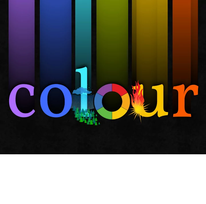

COLOUR PERCEPTION • personal and cultural associations a ff ect our experience of color → patterns established over time • long-held association are o f ten though not always universal • cool colours (blue/green) associated with: water/sky/forest • warm colours (yellow/red) associated with: heat of sun/fire
cool warm ‣ white/blue light: cool/calm ‣ yellow/red light: vibrant/stimulating ‣ can portray tranquility ‣ can portray warmth as well as danger and risk ‣ low arousal colours, especially ‣ high arousal colours, especially when used in pastel shades when used in saturated shades ‣ perceived to be further away from ‣ perceived to be closer to the viewer = viewer = enhances perception of perspective enhances perception of perspective chromodynamics COLOUR PSYCHOLOGY - CHROMODYNAMICS • colour a ff ects both body and mind: • red is known for being able to stimulate sense and raise blood pressure • blue is known for having the opposite e ff ect, being calming for both body and mind • generalisation cannot be made as hue and saturation of colour will a ff ect the e ff ect: • so f t blues tend to be seen as calm and are associated with tranquility • vibrant blues/turquoises can be associated with lush tropical settings and therefore more stimulating and exciting in comparison • generally, perception relies more on previous experiences than the actual experience of seeing the colour
RED ‣ associations: fire / blood / energy / war / danger / passion / desire / love ‣ strong impact colour with high visibility ‣ expression of urgency / alert / error
ORANGE ‣ associations: sunshine / joy / health / enthusiasm / happiness/ creativity ‣ strong impact colour with high visibility ‣ expression of strength / endurance
YELLOW ‣ associations: sunshine / joy / happiness / intellect / energy / caution / jealousy ‣ e ff ect depending in additional colours ‣ expression of pleasant and cheerful emotion, used for highlights; if overused or in dull shades - can become unappealing
GREEN ‣ associations: nature / growth / hope / harmony / safety / fertility / money ‣ calm impact, suggesting experience ‣ expression of restful and calm emotions; also used for eco / green products
BLUE ‣ associations: sky / water / depth / loyalty / trust / truth / intelligence / wisdom ‣ calm and tranquil impact ‣ expression of depth, expertise and stability
PURPLE ‣ associations: royalty / luxury / ambition / nobility / creativity / mystery ‣ impact varies with hues ‣ expression of nostalgia / romance
‣ of course, colour dynamics are much more nuanced and complex than basic colour theory ‣ light, combination and context combine for final expression and message ‣ cultural traditions and interpretations influence user perception COLOUR EXPRESSIONS • colour is very subjective, influenced by personal experience • cultural traditions a ff ect interpretations - as do shade and combination • context a ff ects expression and interpretations of colours presented
‣ colour meanings and interpretations evolve all the time ~ some remain constant, while new associations develop ‣ colour associations are getting more complex, relating to traditional understanding as well as new technical developments COLOUR EXPRESSIONS • while meanings and interpretations change - certain constants will remain, especially if culturally rooted • growing complexity of associations of colours to subjects/concepts/emotions through media overload, common pattern remain but take on additional connections • digital interfaces introduced entirely new functions and interactions - alongside common patterns of colours codes, from LED lights (green/red) to interfaces of TV/DVD and game consoles as well as computers and mobiles. story: Jon Hicks - colour blind - can not see the di ff erent if LED on TV for on/stand-by is on or o ff
yellow red blue orange purple green yellow-orange red-orange red-purple In traditional colour theory, blue-purple blue-green yellow-green these are the 3 pigment colours which can not be mixed or formed by any combination of other colours. All other colours are derived from These are the colours created by These are the colours created by mixing the these 3 hues. mixing the primary colours. secondary colours. COLOUR THEORY • basic colour definitions
colour combinations COLOUR COMBINATIONS • in nature / life — colour varies depending on whether object is viewed incandescent, florescent or natural sunlight shades can appear quite di ff erently under di ff erent circumstances, eg: grass in the morning / noon / evening • in print — full control over output via paper type, printer and ink combinations can still go wrong but can be experimented with, tested and edited to fit purpose • on screen — e ff ects of colour can be enhanced, deteriorated or subdued due to backlight displays colour combinations can make use of this bright colour display but need to consider the light source carefully
COLOUR COMBINATIONS • colour schemes need to be designed with consideration of e ff ect of combined colours • careful selection for optimum legibility and accessibility • classic “ NO GO “ : green/blue and red 1—on screen, colour appear to pulsate or shimmer, distraction/confusion 2—colour blindness can make text entirely illegible
✔ COLOUR COMBINATIONS • combination of green/blue with red • colours on opposite side of spectrum, especially at full chroma, => too vibrant, particularly for onscreen display • green and blue are ajacent and more harmonious, less extreme pulsating e ff ect
An explanation of colorblindness An explanation of colorblindness is a post on The Hickensian photo courtesy of David Shrigley COLOUR BLINDNESS - http://www.hicksdesign.co.uk/journal/an-explanation-of-colorblindness • photo to illustrate colour blindness, via post on The Hickensian (blog of Jon Hicks)
colour scheme combination of tones and shades within the same colour / hue COLOUR SCHEMES - MONOCHROMATIC • colour scheme created within the range of single hue • expression: calm • variation achieved through di ff erence in colour intensity/saturation, shade and tone/chroma
MONOCHROMATIC COLOUR SCHEME :: http://symbolicons.com/ • warm and harmonious colour scheme • high contrast with white, used for main text elements • branded elements using darker chromatic shades, dominant warm yellow used for CTA and info
MONOCHROMATIC COLOUR SCHEME :: http://symbolicons.com/ • colour scheme extracted via bookmarklet from http://wearepandr.com/labs/colour_bookmark • limited colours and shades for design with addition of accent colour (white/pale blue/green)
colour scheme combination of adjacent colours COLOUR SCHEMES - ANALOGOUS • combination of colours near each other on colour spectrum • expression: harmony • similar to monochromatic colour scheme but with additional shades, for a more nuanced colour scheme
ANALOGOUS COLOUR SCHEME :: http://adaptd.com/ • expanded analogous colour scheme • harmonious and vibrant impact
ANALOGOUS COLOUR SCHEME :: http://adaptd.com/ • colour scheme extracted via bookmarklet from http://wearepandr.com/labs/colour_bookmark • colour range selected uses adjacent colours for impact and harmony
colour scheme combination of 2 colours combination of 4 colours (each pair adjacent to each other) from opposite sides of the colour spectrum from opposite sides of the colour spectrum COLOUR SCHEMES - SPLIT // COMPLEMENTARY • combination of colours near each other on colour spectrum • expression: harmony • similar to monochromatic colour scheme but with additional shades, for a more nuanced colour scheme
COMPLEMENTARY COLOUR SCHEME :: http://www.kaleidoscopeapp.com/ • expanded complementary colour scheme • main 2 colours used for CTA and interaction
COMPLEMENTARY COLOUR SCHEME :: http://www.kaleidoscopeapp.com/ • purple as dominant colour within colour scheme, varying into blues • variations of shades with addition of red accent
colour scheme combination of 3 colours evenly spaced around the colour wheel COLOUR SCHEMES - TRIADIC • combination of 3 colours - spots on colour circle form even sided triangle • expression: vibrance / memorability
TRIADIC COLOUR SCHEME :: http://www.gi f trocket.com/ • colour scheme of 3 colours combined, with varying shades spanning into adjacent colours • subdued / desaturated tones, complemented by natural colours for warm and friendly feel
TRIADIC COLOUR SCHEME :: http://www.gi f trocket.com/ • natural tones for all background for so f t feel • accentuatued by mutiple colours
colour scheme combination of colours, o f ten 2 groups of similar hues, chosen speci f ically from the colour spectrum COLOUR SCHEMES - COMPOUND • combination of colours specifically chosen, usually 2-3 groups of selected tones • expression:
COMPOUND COLOUR SCHEME :: http://www.youknowwhodesign.com/ • colour scheme of 2 main colours (dark pink & teal) combined with natural cream and so f t greys • subdued / desaturated tones with the natural tones convey a friendly and elegant image
Recommend
More recommend