Co-conspirators Advances in Visualizing Categorical Data Using the - PowerPoint PPT Presentation
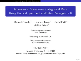
Co-conspirators Advances in Visualizing Categorical Data Using the vcd, gnm and vcdExtra Packages in R Michael Friendly 1 Heather Turner 2 David Firth 2 Achim Zeileis 3 1 Psychology Department York University 2 University of Warwick, UK Heather
Co-conspirators Advances in Visualizing Categorical Data Using the vcd, gnm and vcdExtra Packages in R Michael Friendly 1 Heather Turner 2 David Firth 2 Achim Zeileis 3 1 Psychology Department York University 2 University of Warwick, UK Heather Turner 3 Department of Statistics Achim Zeileis University of Warwick David Firth Universit¨ at Innsbruck Universit¨ at Innsbruck University of Warwick CARME 2011 Rennes, February 9–11, 2011 Slides: http://datavis.ca/papers/adv-vcd-4up.pdf 1 / 53 2 / 53 Outline Brief History of VCD Hartigan and Kleiner (1981, 1984): representing an n -way contingency table by a “mosaic display,” showing a (recursive) Introduction decomposition of frequencies by “tiles”, area ∼ cell frequency. Generalized Mosaic Displays: vcd Package Generalized Nonlinear Models: gnm & vcdExtra Packages e.g., a 4-way table of viewing TV 3D Mosaics: vcdExtra Package programs Freq ~Day + Week + Time + Network Models and Visualization for Log Odds Ratios 3 / 53 4 / 53
Brief History of VCD Brief History of VCD Friendly (1994): developed the connection between mosaic Visualizing Categorical Data (Friendly, 2000) displays and loglinear models But: mosaic-like displays have a long history (Friendly, 2002)! Showed how mosaic displays could be used to visualize both observed frequency (area) and residuals (shading) from some Birch (1964) von Mayr (1877) model. 1 st presented at CARME 1995 (thx: Michael & J¨ org!) 2002: vcd project at TU & WU, Vienna (Kurt Hornik, David Meyer, Achim Zeileis) �→ vcd package 5 / 53 6 / 53 Visual overview: Models for frequency tables Visual overview: R packages Related models: logistic regression, polytomous regression, log odds models, ... Goals: Connect all with visualization methods 7 / 53 8 / 53
Extending mosaic-like displays Generalized mosaic displays vcd package and the strucplot framework Initial ideas for mosaic displays were extended in a variety of ways: Various displays for n -way frequency tables pairs plots and trellis-like layouts for marginal, conditional and flat (two-way) tables of frequencies partial views (Friendly 1999). fourfold displays mosaic displays varying the shape attributes of bar plots and mosaic displays sieve diagrams double-decker plots (Hofmann 2001), association plots spine plots and spinograms (Hofmann & Theus 2005) doubledecker plots residual-based shadings to emphasize pattern of association in spine plots and spinograms log-linear models or to visualize significance (Zeileis et al., Commonalities 2007). All have to deal with representing n -way tables in 2D dynamic interactive versions (ViSta, MANET, Mondrian): All graphical methods use area to represent frequency linking of several graphs and models Some are model-based — designed as a visual representation selection and highlighting across graphs and models of an underlying statistical model interactive modification of the visualized models Graphical methods use visual attributes (color, shading, etc.) to highlight relevant statistical aspects 9 / 53 10 / 53 Fourfold displays for 2 × 2 tables Familiar example: UCB Admissions General ideas : Data on admission to graduate programs at UC Berkeley, by Dept, Model-based graphs can show both data and model tests (or Gender and Admission other statistical features) > structable(Dept ~ Gender + Admit, UCBAdmissions) Visual attributes tuned to support perception of relevant Dept A B C D E F statistical comparisons Gender Admit Male Admitted 512 353 120 138 53 22 Quarter circles: radius ∼ √ n ij ⇒ Gender: Male Rejected 313 207 205 279 138 351 Female Admitted 89 17 202 131 94 24 1198 1493 area ∼ frequency Rejected 19 8 391 244 299 317 Independence: Adjoining quadrants or, as a two-way table (collapsed over Dept), Admit: Admitted Admit: Rejected ≈ align Odds ratio: ratio of areas of > structable(~Gender + Admit, UCBAdmissions) diagonally opposite cells Admit Admitted Rejected Gender Confidence rings: Visual test of Male 1198 1493 H 0 : θ = 1 ↔ adjoining rings Female 557 1278 557 1278 overlap Gender: Female 11 / 53 12 / 53
Fourfold displays for 2 × 2 × k tables Mosaic displays Stratified analysis: one fourfold display for each department Tiles: Area ∼ observed frequencies, n ijk Each 2 × 2 table standardized to equate marginal frequencies Friendly shading (highlight association pattern ): Shading: highlight departments for which H a : θ i � = 1 � Residuals: r ijk = ( n ijk − ˆ m ijk ) / ( ˆ m ijk ) Color— blue: r > 0 , red: r < 0 Dept: A Dept: C Dept: E Saturation: | r | < 2 (none), > 4 (max), else (middle) Gender: Male Gender: Male Gender: Male 512 313 120 205 53 138 (Other shadings highlight significance ) Admit: Admitted Admit: Rejected Admit: Admitted Admit: Rejected Admit: Admitted Admit: Rejected (Other color schemes: HSV, HCL, . . . ) Model: ~Dept+Gender+Admit Model: ~(Dept*Gender) + Admit Model: ~(Admit + Gender) * Dept 89 19 202 391 94 299 Gender Gender Gender Male Female Male Female Male Female Gender: Female Gender: Female Gender: Female A A A Dept: B Dept: D Dept: F Gender: Male Gender: Male Gender: Male B B B 353 207 138 279 22 351 C C C Dept Dept Dept Admit: Admitted Admit: Rejected Admit: Admitted Admit: Rejected Admit: Admitted Admit: Rejected D D D E E E F F F 17 8 131 244 24 317 Admitted Rejected Admitted Rejected Admitted Rejected Admitted Rejected Admitted Rejected Admitted Rejected Admit Admit Admit Gender: Female Gender: Female Gender: Female 13 / 53 14 / 53 Mosaic displays: Fitting & visualizing models Mosaic displays: Fitting & visualizing models Mutual independence model: Dept ⊥ Gender ⊥ Admit Joint independence model: Admit ⊥ (Gender, Dept) > berk.mod0 <- loglm(~Dept + Gender + Admit, data = UCB) > berk.mod1 <- loglm(~Admit + (Gender * Dept), data = UCB) > mosaic(berk.mod0, gp = shading_Friendly, ...) > mosaic(berk.mod1, gp = shading_Friendly, ...) Model: ~Dept+Gender+Admit Model: ~Admit + (Gender*Dept) Gender Gender Male Female Male Female Pearson Pearson residuals: residuals: A A 20.2 10.7 B B 4.0 C C 2.0 Dept 4.0 Dept 0.0 2.0 0.0 −2.0 −2.0 D D −4.0 −4.0 E E −14.0 −10.2 F F Admitted Rejected Admitted Rejected Admitted Rejected Admitted Rejected Admit Admit
Mosaic displays: Fitting & visualizing models Double decker plots Conditional independence model: Admit ⊥ Gender | Dept Visualize dependence of one categorical (typically binary) > berk.mod2 <- loglm(~(Admit + Gender) * Dept, data = UCB) variable on predictors > mosaic(berk.mod2, gp = shading_Friendly, ...) Formally: mosaic plots with vertical splits for all predictor Model: ~(Admit + Gender) * Dept dimensions, highlighting response Gender Male Female Pearson residuals: Admit A 2.33 2.00 B C 0.00 Dept Rejected D −2.00 E −3.13 F Admitted Admitted Rejected Admitted Rejected Male Female Male F Male Female Male Female MaleFemale Male Female Gender Admit A B C D E F Dept 18 / 53 The strucplot framework The strucplot framework Components of the strucplot framework: A general, flexible system for visualizing n -way frequency tables: integrates tabular displays, mosaic displays, association plots, sieve plots, etc. in a common framework. n -way tables: variables partitioned into row and column variables in a “flat” 2D display using model formulae arguments allow for fitting any loglinear model via loglm() in the MASS package. high-level functions for all-pairwise views ( pairs() ), conditional views ( cotabplot() ). low-level functions control all aspects of labeling, shading, spacing, etc. 19 / 53 20 / 53
Recommend
More recommend
Explore More Topics
Stay informed with curated content and fresh updates.
