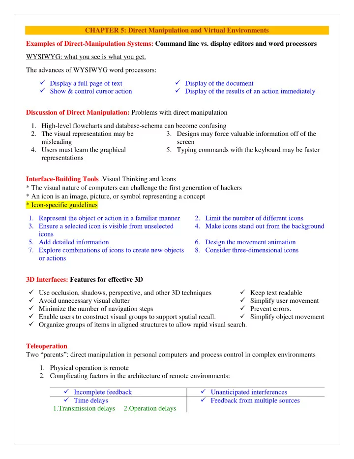

CHAPTER 5: Direct Manipulation and Virtual Environments Examples of Direct-Manipulation Systems: Command line vs. display editors and word processors WYSIWYG: what you see is what you get. The advances of WYSIWYG word processors: Display a full page of text Display of the document Show & control cursor action Display of the results of an action immediately Discussion of Direct Manipulation: Problems with direct manipulation 1. High-level flowcharts and database-schema can become confusing 2. The visual representation may be 3. Designs may force valuable information off of the misleading screen 4. Users must learn the graphical 5. Typing commands with the keyboard may be faster representations Interface-Building Tools .Visual Thinking and Icons * The visual nature of computers can challenge the first generation of hackers * An icon is an image, picture, or symbol representing a concept * Icon-specific guidelines 1. Represent the object or action in a familiar manner 2. Limit the number of different icons 3. Ensure a selected icon is visible from unselected 4. Make icons stand out from the background icons 5. Add detailed information 6. Design the movement animation 7. Explore combinations of icons to create new objects 8. Consider three-dimensional icons or actions 3D Interfaces: Features for effective 3D Use occlusion, shadows, perspective, and other 3D techniques Keep text readable Avoid unnecessary visual clutter Simplify user movement Minimize the number of navigation steps Prevent errors. Enable users to construct visual groups to support spatial recall. Simplify object movement Organize groups of items in aligned structures to allow rapid visual search. Teleoperation Two “parents”: direct manipulation in personal computers and process control in complex environments 1. Physical operation is remote 2. Complicating factors in the architecture of remote environments: Incomplete feedback Unanticipated interferences Time delays Feedback from multiple sources 1.Transmission delays 2.Operation delays
Virtual and Augmented Reality : Virtual reality breaks the physical limitations of space and allow users to act as though they were somewhere else Augmented reality shows the real world with an overlay of additional overlay Situational awareness shows information about the real world that surrounds you by tracking your Movements in a computer model Augmented reality is an important variant Successful virtual environments depend on the smooth integration of: 1. Visual Display 2. Head position sensing 3. Hand-position sensing 4. Force feedback 5. Sound input and output 6. Cooperative and competitive virtual reality WEEK 7-CHAPTER 7: Command and Natural Languages The Basic Goals of Language Design 1. Precision 2. Speed in learning 3. Ease in writing and reading 4. Compactness 5. Simplicity to reduce errors 6. Ease of retention over time Higher-Level Goals of Language Design Compatibility Flexibility Visual appeal Expressiveness to encourage creativity Close correspondence between reality and the notation Functionality to Support User’s Tasks . Users do wide range of work: text editing electronic mail financial management airline or hotel reservations inventory manufacturing process control Gaming Designers should determine functionality of the system represent low-level interface syntax create a list of task actions and objects create a table of user communities and tasks evaluate destructive identify error conditions and prepare error messages allow shortcuts for expert users determine hierarchy of importance of user communities Six Potential Abbreviation Strategies 1. Simple truncation 2. Vowel drop with simple truncation 3. First and last letter 4. Phonics: Focus attention on the sound. 5. First letter of each word in a phrase: Use 6. Standard abbreviations from other with a hierarchical contexts: Use familiar abbreviations. Natural Language in Computing Natural-language interaction Text-database searching Natural-language text generation Adventure games and instructional systems Natural-language queries and question answering
WEEK 9 CHAPTER 6: Menu Selection, Form Fill-In, and Dialog Boxes The primary goal for menu, form fill-in, and dialog-box designers is to create a sensible, comprehensible, memorable, and convenient organization relevant to the user's task. Single Menus Binary Menus ( Mnemonic letters – Radio Buttons – Button Choice) Multiple-item Menus Multiple-selection menus or check boxes Pull-down, pop-up, and toolbar menus Pull-down menus: Always available to the user by making selections on a top menu bar EX(Key board shortcuts - Toolbars, iconic menus, and palletes).Appear on a display in response to a check or tap with a pointing device. Menus for long list ( Scrolling menus, combo boxes, and fisheye menus - Sliders and alpha sliders – Two-dimensional menus) Embedded menus and hotlinks. Allow users reading about people, place. Combination of multiple menus Menu Maps Tree-structured menus Linear menu sequences and simultaneous menus Acyclic and Cyclic Networks Linear: Guide the user through complex decision-making process (Ex: Wizards) Simultaneous: Present multiple active menus at the same time and allows users to enter choices in any order. Menu Maps: Menu maps can help users stay oriented in a large menu tree &Effective for providing overviews to minimize user disorientation. Content Organization 1. Task-related grouping in tree organization 2. Item Presentation Sequence 3. Menu layout Titles: For single menus, use a simple descriptive title. For tree-structured menus, use the exact same words in the higher-level menu items as in the titles for the next lower-level menu) Techniques Graphic layout and design Establish guidelines for consistency of at least these menu components: Titles Item placement Instructions Status reports Error messages Fast Movement through Menus (Keyboard shortcuts) Data Entry with Menus: Form Fill-in, Dialog Boxes, and Alternatives Form Fill-in Format-specific field Novel design combining menus and direct manipulation Dialog Boxes a) Internal layout (Meaningful title-Standard buttons-Top-left to bottom-right sequencing) b) External Relationship (Size small - Easy to make disappear - Clear how to complete/cancel)
Week10 CHAPTER 10: Quality of Service Models of response-time impacts Response time: The number of seconds it takes from the moment users initiate an activity until the computer presents results on the display. User think time: The number of seconds the user thinks before entering the next action. Designers of response times and display rates in HCI must consider: cost task complexity user expectations error handling procedures error rates speed of task performance complex interaction of technical feasibility Overall majority of users prefer rapid interactions - Lengthy response times (15 seconds) are detrimental to productivity - Rapid response times (1 second or less) are preferable, but can increase errors for complex tasks Display Rate Reading textual information from a screen Cognitive human performance Limitations of short-term and working memory Any cognitive model must emerge from an understanding of human problem-solving abilities Magic number seven - plus or minus two - The average person can rapidly recognize seven chunks of information at a time - This information can be held for 15 to 30 seconds in short-term memory - Size of the chunks depends on the person' s familiarity with the material Short-term memory and working memory are used in conjunction for processing information and problem solving – Short-term memory processes perceptual input – Working memory generates and implements solutions People learn to cope with complex problems by developing higher-level concepts using several lower-level concepts brought together into a single chunk Short term and working memory are highly volatile – Disruptions cause loss of memory – Delays require that memory be refreshed Source of errors Conditions for optimum problem solving - Longer response time causes uneasiness in the user because the penalty for error increases. - Shorter response time may cause the user to fail to comprehend the presented materials. - Progress indicators shorten perceived elapsed time and heighten. Summary – Users pick up the pace of the system to work more quickly with shorter response time – Higher throughput of work demands more attention must be paid to minimizing the cost of delay of error recovery
Recommend
More recommend