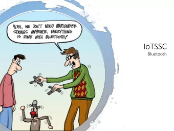
Beyond Beyond Journey Journey Times Times Bluetooth journey - PowerPoint PPT Presentation
Beyond Beyond Journey Journey Times Times Bluetooth journey time process Moving beyond basic journey times Modelling Route analysis Traveller segmentation Visualisation and interaction Raw observation vs modelling Moving from what
Beyond Beyond Journey Journey Times Times
Bluetooth journey time process
Moving beyond basic journey times Modelling Route analysis Traveller segmentation Visualisation and interaction
Raw observation vs modelling Moving from “what are we seeing right now?” to “how can we find what we want to know, given everything we currently know ?”
Combining information Live matches Historical patterns
Incident alarms Categorisation + normalisation + trend detection
Predictive modelling Categorisation + normalisation + statistical modelling + information balancing
Whole-journey simulation Journey times for each segment change as a vehicle moves along a journey. Rather than adding simultaneous journey time snapshots, simulate a vehicle’s journey through a network with dynamic journey times .
Variable Speed Limit automation Only turn on VSL when it can make a difference: avoid driver frustration. Use radar rather than BT: better for measuring density. Have to respond quickly to imminent congestion, but not confuse drivers with too many speed limit changes.
Methods Machine learning Statistics and signal processing (e.g. clustering, SVM, DNN) (filtering, time series analysis) Complex, scalable, prone to overfitting Transparent, fast, can apply domain knowledge
Route analysis More than just “ how fast are vehicles getting from A to B?” Where do they go next? How do they get there? What does their whole journey look like?
Origin/destination Direct matching (detection at sensor A, then immediately at sensor B) vs Indirect matching (can travel via other sensors)
Indirect matching
Route choice analysis
Route choice analysis: changes over time
Linear routes
Linear routes
Traveller segmentation Categorising travellers* based on their typical behaviour , then analysing patterns and trends in their journeys. (* “travellers” includes other modes, not just drivers)
Upper South Island analysis Segmenting by frequency of detection
Upper South Island analysis
Other potential analyses Distinguishing modes by speed history Changes in origin/destination patterns: week vs weekend; term vs holiday Responses to severe congestion: alternative routes ; rat running Relationship of origin/destination to availability of public transport
Visualisation and interaction The key question for data visualisation and statistics: “Compared to what?” Provide the appropriate level of context and complexity to suit each user’s needs.
Regular commuters Set commuting route Familiar with normal patterns Just want to know: “is it worse than usual?” Highlighted dashboards; apps; push notifications
Other drivers Visitors; professional drivers Real-time route options Predictions/normal times for planning ahead
Operations Quick access to detailed context : across network over time extrinsic influences
Analysts and planners Pre-defined reports for monitoring and governance Consistency is important
Analysts and planners Interactive tools for exploration
journey times predictive modelling incident alarms driver advice origin/destination analysis VSL automation reporting tools traveller segmentation analytical tools route choice analysis Map tiles by Stamen Design, under CC BY 3.0. Data by OpenStreetMap, under ODbL., and by Google. Some icons by Scott de Jonge, Freepik, Egor Rumyantsev from www.flaticon.com, licensed by CC BY 3.0
Recommend


More recommend
Explore More Topics
Stay informed with curated content and fresh updates.