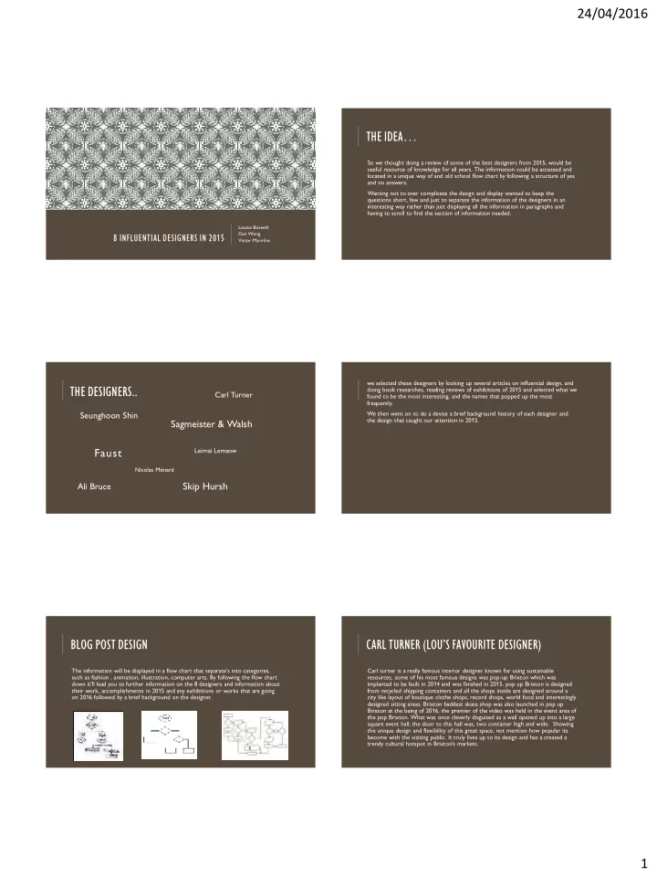

24/04/2016 THE IDEA… So we thought doing a review of some of the best designers from 2015, would be useful resource of knowledge for all years. The information could be accessed and located in a unique way of and old school flow chart by following a structure of yes and no answers. Wanting not to over complicate the design and display wanted to keep the questions short, few and just to separate the information of the designers in an interesting way rather than just displaying all the information in paragraphs and having to scroll to find the section of information needed. Louise Boswell 8 INFLUENTIAL DESIGNERS IN 2015 Dan Wong Victor Marinho we selected these designers by looking up several articles on influential design, and THE DESIGNERS.. doing book researches, reading reviews of exhibitions of 2015 and selected what we Carl Turner found to be the most interesting, and the names that popped up the most frequently. Seunghoon Shin We then went on to do a devise a brief background history of each designer and Sagmeister & Walsh the design that caught our attention in 2015. Faust Leimai Lemaow Nicolas Ménard Ali Bruce Skip Hursh BLOG POST DESIGN CARL TURNER (LOU’S FAVOURITE DESIGNER) The information will be displayed in a flow chart that separate's into categories, Carl turner is a really famous interior designer known for using sustainable such as fashion , animation, illustration, computer arts. By following the flow chart resources, some of his most famous designs was pop-up Brixton which was down it'll lead you to further information on the 8 designers and information about implanted to be built in 2014 and was finished in 2015. pop up Brixton is designed their work, accomplishments in 2015 and any exhibitions or works that are going from recycled shipping containers and all the shops inside are designed around a on 2016 followed by a brief background on the designer. city like layout of boutique clothe shops, record shops, world food and interestingly designed sitting areas. Brixton baddest skate shop was also launched in pop up Brixton at the being of 2016, the premier of the video was held in the event area of the pop Brixton. What was once cleverly disguised as a wall opened up into a large square event hall, the door to this hall was, two container high and wide. Showing the unique design and flexibility of this great space, not mention how popular its become with the visiting public. It truly lives up to its design and has a created a trendy cultural hotspot in Brixton’s markets. 1
24/04/2016 POP UP BRIXTON PICTURES LEIMAI LEMAOW.. IKEA BUCKET HAT LEIMAI LEMAOW Originally a scouse graffiti writer, based around Manchester and was commissioned on several productions in cities like Manchester she has slowly started to make a boom in the fashion design industry. She made waves by reproducing and putting up for sale the ikea bucket hat in 2015. the bucket hat craze came in early 2014 and is influenced by the 1990’s popular styled fashion which has been repacked and rebranded as the ‘Neo - retro’ era ( basically what our generation is calling the fashion these days because it’s a clash of 60- 90’s). By late 2015, and into the new year Leimai had launched her own clothing line Called Toromai, in the first 48 hours of launch several of the jumper collections had sold out and more clothing needed to be produced. Keep your eyes open for more unique one off fashion collections coming from Leimai and Toromai. SEUNGHOON SHIN FRAUST New York is a taggers jungle, all the amateur scribbles Was hitting the pages of design draw and carve the landscape of new York. But magazines after is work on project beautiful handmen ship is not an omen. Faust takes monsoon in south Korea, it was beautifully designed calligraphy to new York streets. Faust grounds is idea in a graffiti writer needn’t’ change part of the black pencil awards, his style of artwork to be a legitimate fine artist, part of the A&AD awards. letters are enough. Graffiti art 365 magazine even argues that he is more of an installation designer, who Seoul, South Korea is a vibrant and has taken to the streets of new York, as he truly happening city, in the monsoon proves vandalism has design techniques, and is its own season takes away colour and culture of the art world these days and shouldn’t be energy from the streets and seen as a less form of art compared to installation art or conceptual art. people. So with help from Pantone, the project team painted the In 2015 Faust worked along side the new York streets with water-activated paint, museum of art, Fabergé all without revelling his identity but you don’t see anyone calling him the next to bring back colour during the Banksy. He is defiantly is one to watch in 2016 because monsoon season. several new York magazines have credited his work highly, including the times. Showing that graffiti is and can take the design and art world by storm. 2
24/04/2016 SKIP HURSH SAGMEISTER & WALSH In 2015 Skip Dolphin Hursh designed a ‘Computer arts front cover’ for Design Sagmeister & Walsh have been such a huge name in magazine ‘Computer arts’ the front cover graphic design and are truly able to communicate featured to be completely mobile and such powerful emotion and message visually interactive on the front cover’s iPad edition, through all their projects. In 2015 they designed the interactive front cover can be seen in link graphics for the Jewish museum, the design combines old fashioned religious typography and below. new school graphics beautifully. Along side this project Skip worked with When you look of the body of work they’ve Tumblr and made several animated computer produced for the client and how beautifully, its done art ‘Illustrations that were featured on the you can see why there so highly sort after to work website in 2015, some of which were with. The colour scheme and whole feel to the nominated for awards in design. He is truly the collection is very Jewish and up to date with the use master of animated art and gifs. of sacred geometry (which was made by in the Jewish religion but is heavily used in spirituality) and very used in recent fashion movements, geometric patterns are hot in fashion at the minute making the http://www.skiphursh.com/ design not only on point with the Jewish religion but trendy and unique to look at, the animations they made for the website are interactive patterns that formulate before your very eyes, elegantly. Nicolas Ménard ALI BRUCE graphic artist Is a French Canadian graphic artist currently based in London. Based on the west coast of America current works as In 2015 Nicolas made several Graphic art productions which a free lanced illustrator and has a love for adventure, Ali work has been heavily credited throughout 2015, were beautifully made for google play, he’s also designed and was published in a few magazines with her some of the animations you may have seen above the google collaboration work with the fashion line French logo on the home page. Some of his over clients include connection. Ali Illustration style is so loveable and is heavily influenced by traditional style tattoo art, this Universal, The new York times their website, Nike and adobe. can be seen in the drawing style and the content of what she draws, you could say her work is like a And has been credited for Adobe achievement awards, more cutesy goolish style of Ed Hardy's earlier Pictoplasma, Chromatic and Grafika. His animation films have creations. been screened and awarded in festivals around the world, With the ever popular growing demand for body art including Ottawa, Annecy and Anima. you can see why Ali works could be becoming hugely popular, and id agree it defiantly appeals to me and I Nicolas continues to work on personal projects, his whole am a 19 year old tattooed girl so id suspect him hitting her target audience, I say it leans more website is beautifully animated and designed its self and towards women as a general audience because of the features a shop where you can purchase his unique over use of pastel pink’s in her work. illustrations. Nicolas is increasingly becoming more known for his work with google and growing popular day by day, even I recognised a lot of his illustration work . BIBLIOGRAPHY http://www.sagmeisterwalsh.com/work/project/jewish-museum-identity/ http://www.skiphursh.com/ http://www.dandad.org/en/new-blood-black-pencil-winners-2015/ http://www.itsnicethat.com/articles/new-blood-winners http://seunghoon.com/ABOUT http://faustnewyork.com/ http://www.pastemagazine.com/articles/2015/07/the-23-best-designers-of-2015-so-far.html http://nicolasmenard.com/index.php http://www.alibruce.com/ 3
Recommend
More recommend