1 Information Processing Psychology Humans as information - PDF document
ICS 463: Intro to Human Computer Interaction Design 3. Understanding Users: Cognition Why Cognition in an ICS Course? Interacting with technology is cognitive Take into account cognitive processes involved and cognitive limitations of
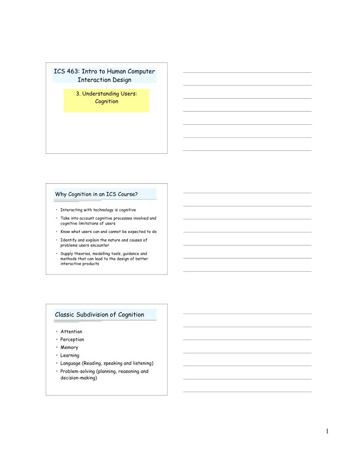
ICS 463: Intro to Human Computer Interaction Design 3. Understanding Users: Cognition Why Cognition in an ICS Course? • Interacting with technology is cognitive • Take into account cognitive processes involved and cognitive limitations of users • Know what users can and cannot be expected to do • Identify and explain the nature and causes of problems users encounter • Supply theories, modelling tools, guidance and methods that can lead to the design of better interactive products Classic Subdivision of Cognition • Attention • Perception • Memory • Learning • Language (Reading, speaking and listening) • Problem-solving (planning, reasoning and decision-making) 1
Information Processing Psychology • Humans as information processors (one model …) Attention Response Response Encoding Comparison Selection Execution Memory Variants on Information Processing • GOMS (Goals, Operations, Methods and Selection) – quantitative predictions of performance • Distributed Cognition – Cognition is distributed across individuals and artifacts • Parallel Distributed Processing (Connectionist) – Brain metaphor Perception 2
What’s the big deal? Constructivist Theories ACM Crossroads 3(1) Computations on Evidence: representations •Size and shape constancy to match models •Influence of context and expectations Ecological Theories Affordances and flow over time coordinate action in the world Examples: •Optical flow •Graspable, pushable objects 3
Gestalt Principles Draw some pictures … We make sense of the visual world by grouping things together or seeing them as wholes … • Proximity: objects close together • Similarity: objects of same shape, color • Closure: missing parts filled in • Continuity: lines seen as continuous • Symmetry: symmetric elements perceived as coherent figures How would you apply this to design? Three-dimensional cues • Size: larger is closer • Interposition and Shadows: obscured object is behind • Contrast, clarity, brightness decrease at a distance • Texture finer at a distance • Motion Parallax • Stereoscopic cues How would you apply this to design? Fidelity of Representation • Arbitrary mappings – “Red = danger” • Nonarbitrary mappings – Size → size, width → width, etc. • Iconic (resemblance) – File “folder” • Virtual reality When is fidelity important? What are the tradeoffs? 4
Processing Considerations See Lohse article, Handbook of HCI 1997: • Parallel Detection: color, value, angle, slope, length, texture • Serial Detection: shape, area, curvature, orientation, connection, containment How would we use this in design? Uses of Color • Segmentation: grouping related objects • Highlighting: – Drawing attention to important item – Distinguishing figure from ground • Search (by novices) • No advantage for many tasks • Avoid excessive use Suitability to Task • Different representations support different perceptual (and therefore cognitive) tasks • Let’s try an experiment … • See Lohse’s chapter, Handbook of HCI 1997 5
Related Techniques • Not too much, not too little info – too much info too much scanning – too little can’t remember info from other contexts • Structuring information to facilitate search – Group related items – Structural alignment of uniform data – Prefix with unique keys • Example: Unix man pages should not start every option description with “This option …” Attention Attention • “Taking possession of” some sensory information at the cost of others • Necessary for handling “high bandwidth” input with limited “processor power” • An active and selective process: extensive experimentation shows pre-attentive processing! – Example: The Cocktail Party Phenomenon 6
Peripheral: File Edit Format Tools Window Help On Demand: Related Techniques New Open Close Save • Spatial placement reflects priority Save As and immediacy of need Central • Color highlights foreground info • Visual and audio alerting to bring attention to periphery Be careful with peripheral messages: people may not notice. Memory Multi-Store Model of Memory • Sensory: milliseconds – Iconic (visual) – Auditory • Working (short term): seconds – “The magic number 7 plus or minus 2” • Long Term: permanent(?) • (WM vs. LTM boundary is probabilistic) 7
Design Implication of 7+-2? • Present only 7 options on a menu • Display only 7 icons on a tool bar • Have no more than 7 bullets in a list • Place only 7 items on a pull down menu • Place only 7 tabs on the top of a website page … etc. But this is wrong! Why? Factors affecting memory • Recognition versus Recall – Recognition usually much easier (knowledge in world, not head) but requires presentation of selection set • Modality – Multiple cues (visual, textual …) good – Avoid cross modal translations • Context Let’s try a memory experiment … • The Password Game! 8
Learning Learning is active • Manuals for computer software are really bad . . . • Would it matter if they were better? • Most people learn by – Watching others – Trying it (data driven, hypothesis driven) – Guided performance – Transfer and analogy Classic Theories of Learning • You don’t really need to know … – Naïve theories (tabla rasa) – Innate Knowledge (Plato) – Associationism – Kant’s Synthesis • Associative / Behavioristic Theories – Classical conditioning – Operant conditioning – Partial reinforcement and extinction – Errorless learning (?) – Spaced practice 9
Cognitive Theories • Tolman’s rats had mental maps! • Induction from examples – The role of negative examples • Case-based and learning by analogy • A Cognitive Theory (ACT) – Intended in part to explain skill acquisition – Declarative knowledge – Procedural knowledge through association and chunking – Autonomous stage Automatic and Controlled Processing Automatic Controlled • Not required • Attention required • No control • Conscious control • Hard to unlearn • Can modify • Parallel tasking possible if • Only one controlled task at no interference a time. • Can lose place if • Multitasking difficult but interrupted (don’t know possible with external where to resume) prompts Some Implications • If multitasking is required, and especially if interruptions are possible, provide explicit information about state: external representations are part of the cognitive system • Two sides of the automaticity coin: – Use uniform procedures (e.g., key chords) to leverage efficency of automaticity – Reminders, confirmations: if routine, responses may become automated, useless! • “Type the third letter of this sentence backwards to confirm that you want to delete all files.” (cf. Raskin) 10
A Few More Learning Concepts • Transfer – Near and Far Transfer – Thorndike’s Identical Elements – Negative Transfer • Depth of Processing and Integration – Process by semantics, not surface form – Relate to existing knowledge – ⇒ Study strategies! Implications for design? Errrors and Learning • We learn through errors (at some levels) • Yet errors can divert us from learning • Mistakes: based on misconceptions or faulty information – Requires semantic feedback • Slips: unintentional mal-execution of an action – Signal and allow undo … or just fix? Design Implications of Errors • Reduce conditions leading to errors – Selection rather than generation – Signaling context (but see next item) – Eliminating inconsistencies and modes – Checking potentially erroneous actions • Yet design for errors anyway – We make errors and learn through them – Immediate Feedback – Undo 11
Novices and Experts • Studies of Chess, Physics, much more: – Experts chunk, so remember more – Novices see surface structure; experts see semantic or problem-solving related structure • Design for transition from novice to expert – Give novices explicit, declarative methods of acting – Give experts efficient means of acting – Common example: icons & menus versus key chords Social Theories of Learning • Socio-Cognitive Conflict Theory • Vygotsky: Zone of Proximal Development • Legitimate Peripheral Participation • Collaborative Learning works through … – Explanation and justification (depth of processing) – Encountering alternatives (SCCT) – Acquisition of collaborative skills – Becoming a member of the community (LPP) Mental Models 12
Recommend
More recommend
Explore More Topics
Stay informed with curated content and fresh updates.
