
Visualising improvement Zaheer Ahmed Informatics Lead Clinical Effectiveness Group Clinical Effectiveness Group Queen Mary University of London London, England
Atrial Fibrillation Programme The atrial fibrillation programme in three inner London CCGs and the associated interactive dashboard. Authors. Zaheer Ahmed, Jack Dunne, Isabel Dostal, Kelvin Smith, Keith Prescott, Kambiz Boomla, Sally Hull, John Robson In three CCGs in east London, atrial fibrillation detection and management has been a focus of improvement schemes for the past 4 years with major improvement. The schemes includes education and guidelines, standard data entry templates and on-screen decision support and prompts, patient recall searches and performance dashboards. The IT support is facilitated by in-practice facilitators, typically one per CCG who inform practices how to use the IT tools. These anticoagulation results are now among the best in London and the pulse check programme in entire health economies is exceptional. The atrial fibrillation dashboard has been created (using Tableau) containing information for every practice in three east London CCGs – Newham, City and Hackney and Tower Hamlets. It contains practice level data on registered GP patients – but no individual level patient data. Waltham Forest CCG has recently been added only in the last year and does not currently have a systematic programme. This dashboard is run quarterly and distributed to every practice and the local CCGs. This dashboard displays several essential key performance indicators for each practice by CCG over almost four years 2014/15 - to date. The data: There are no exceptions or exclusions from this data. Atrial fibrillation CHADSVASC 1 or more on anticoagulant Atrial fibrillation on aspirin monotherapy Age 65 years or more with pulse regularity check in 5 years Age 65 years or more and major long term condition with pulse regularity check in 1 year
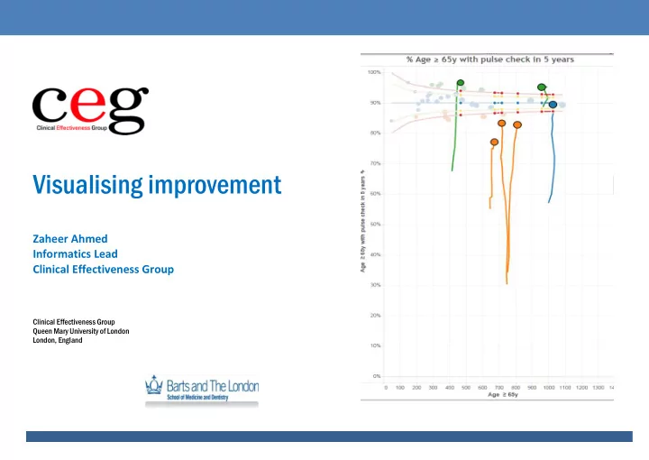
Visualisation This information is displayed dynamically over time showing trends The distribution is shown as a funnel plot against register size; with 95 and 99% control limits The data are mapped by practice in the CCG locality Results This dashboard shows substantial and important change in a relatively short time frame in the 3 CCGs taking part in a systematic programme of improvement over four years. Pulse checks have risen from under 50% to 90%. Aspirin monotherapy use has halved from 25% to <10% and anticoagulation in eligible people has risen from 63% to 78%. Impact Further work is currently being undertaken to evaluate the impact of pulse checks on AF prevalence. We also consider it notable that Barts Health Trust is the best “performing” Trust in London in terms of stroke admissions in relation AF anticoagulation. More people with AF who have a stroke in these localities are likely than anywhere else in London, to be on an anticoagulant.
Where we are – all practices in 4 CCGs
Example: Combined View p ulse checks age ≥ 65 years in Tower Hamlets showing practice and change over 3 years 2014-16
Using the AF dashboard You will see the opening page and you can ‘navigate’ to the required view – these include a cluster/network view or practice views. Alternatively use the TABS at the bottom of the page. The cluster view shows Total CCG and clusters The practice views include funnel plots, time trends A view showing all 3 CCGs (+1 Waltham Forest) A ‘consolidated’ view of pulse checks showing different graphs on one page Interactive buttons Top RIGHT you can switch CCGs – Select CCGs : Newham, Tower Hamlets or City and Hackney Below this, there is a slider with arrows either side – this moves the time frame by Quarter. The arrows below this, will ‘play’ the quarters automatically if you click on them. To display this Tableau file requires Tableau Reader. This is free, safe software and can be downloaded here. http://www.tableau.com/products/reader/download
Select different practices to se e how much they have improved or changed over time as the ‘trails’ show.
Published QOF results for all practices are available on Tableau Public platform Proportion of people with atrial fibrillation CHA 2 DS 2 VASC ≥2 on anticoagulation. Distribution in English CCGs by Region with and without exceptions 2015/16.
Tableau Public web link https://public.tableau.com/views/AFQoFAnalysis/QOFAFprevalenceovertime?%3Aembed=y&%3AshowVizHome=no&%3Adisplay_count=y& %3Adisplay_static_image=y&%3Aretry=yes Further details of this dashboard tool please contact: Shirley Dryden s.a.dryden@qmul.ac.uk Clinical Effectiveness Group Centre for Primary Care & Public Health Blizard Institute Queen Mary University of London Yvonne Carter Building 58 Turner Street London E1 2AB Tel: 020 7882 2553
Recommend
More recommend