Utility-Scale Solar 2016 An Empirical Analysis of Project Cost, - PowerPoint PPT Presentation
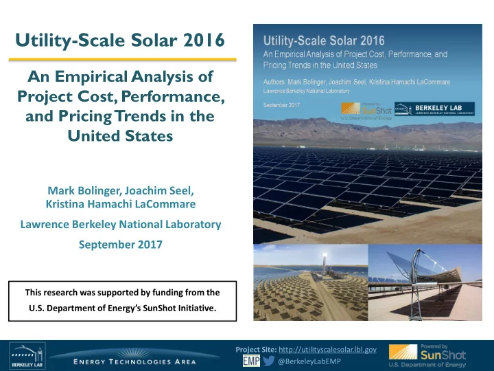
Utility-Scale Solar 2016 An Empirical Analysis of Project Cost, Performance, and Pricing Trends in the United States Mark Bolinger, Joachim Seel, Kristina Hamachi LaCommare Lawrence Berkeley National Laboratory September 2017 This research
Utility-Scale Solar 2016 An Empirical Analysis of Project Cost, Performance, and Pricing Trends in the United States Mark Bolinger, Joachim Seel, Kristina Hamachi LaCommare Lawrence Berkeley National Laboratory September 2017 This research was supported by funding from the U.S. Department of Energy’s SunShot Initiative. Project Site: http://utilityscalesolar.lbl.gov @BerkeleyLabEMP
Presentation Outline Strong growth of the utility-scale solar market provides increasing amounts of empirical project-level data that are ripe for analysis 1. Solar deployment trends (and utility-scale’s relative contribution) Key findings from analysis of the data samples (first for PV , then for CSP ): Project design, technology, and location 2. Installed project prices 3. Operation and maintenance (O&M) costs 4. Performance (capacity factors) 5. Power purchase agreement (“PPA”) prices 6. 7. Future outlook Project Site: http://utilityscalesolar.lbl.gov 2 @BerkeleyLabEMP
Utility-scale projects have the greatest capacity share in the U. S. solar market The utility-scale sector accounted for 72% of all new solar capacity added in 2016 and 61% of cumulative solar capacity at the end of 2016 PV is shown in W DC while CSP is in W AC Utility-Scale CSP Annual Solar Capacity Additions (MW) 20,000 125 Utility-Scale PV Cumulative Solar Capacity (GW) Commercial PV 0 16,000 100 Residential PV 10,636 10,612 12,000 75 10,445 Columns show annual capacity additions, 8,735 area shows cumulative capacity 110 7,084 877 3,922 4,149 8,000 50 6,337 250 8,672 2,855 1,803 4,000 25 75 784 69 267 70 22 9 0 0 2017E 2018E 2019E 2020E 2021E 2022E 2007 2008 2009 2010 2011 2012 2013 2014 2015 2016 Sources: GTM/SEIA Solar Market Insight Reports, Berkeley Lab We define “utility-scale” as any ground-mounted project that is larger than 5 MW AC Smaller systems are analyzed in LBNL’s “Tracking the Sun” series (trackingthesun.lbl.gov) Project Site: http://utilityscalesolar.lbl.gov 3 @BerkeleyLabEMP
Solar power was the largest source of U.S. electric- generating capacity additions in 2016 40 40% Utility-Scale Solar Note: This Total Solar (right axis) Distributed Solar graph follows 35 35% Total Annual Capacity Additions (GW AC ) Wind GTM/SEIA’s Solar Capacity Additions (% of Total) Other RE split between 30 30% distributed Gas and utility- Coal 25 25% Utility-Scale Solar Other non-RE scale solar, (right axis) rather than 20 20% our 5 MW AC threshold 15 15% 10 10% 5 5% Distributed Solar (right axis) 0 0% 2007 2008 2009 2010 2011 2012 2013 2014 2015 2016 Sources: ABB, AWEA, GTM/SEIA Solar Market Insight Reports, Berkeley Lab Led by the utility-scale sector, solar power has comprised >25% of all generating capacity additions in the United States in each of the past four years In 2016, solar made up 38% of all U.S. capacity additions (with utility-scale accounting for 26%), and was the largest source of new capacity, ahead of both natural gas and wind Project Site: http://utilityscalesolar.lbl.gov 4 @BerkeleyLabEMP
Solar penetration rates approaching or exceeding 10% in several states • Solar penetration rate varies considerably depending on whether calculated as a percentage of generation or load (e.g., see Vermont) • Contribution of utility- scale also varies (a minority in northeast states and Hawaii, a majority in other states and overall) Project Site: http://utilityscalesolar.lbl.gov 5 @BerkeleyLabEMP
Utility-Scale PV Photo Credit: Community Solar Amazon Solar Farm US East 1 Project Site: http://utilityscalesolar.lbl.gov 6 @BerkeleyLabEMP
Historically heavy concentration in the Southwest and mid- Atlantic, but now spreading to Southeast and Northwest 2015 Primarily fixed-tilt c-Si projects in the East Tracking (c-Si and, increasingly, thin- film) is more common in the Southwest Cumulative Capacity MW-AC % State 2016 2015 CA 54% 56% AZ 9% 12% NV 8% 7% GA 6% 3% NC 5% 6% Project Site: http://utilityscalesolar.lbl.gov 7 @BerkeleyLabEMP
Historically heavy concentration in the Southwest and mid- Atlantic, but now spreading to Southeast and Northwest 2016 Primarily fixed-tilt c-Si projects in the East Tracking (c-Si and, increasingly, thin- film) is more common in the Southwest Cumulative Capacity MW-AC % State 2016 2015 CA 54% 56% AZ 9% 12% NV 8% 7% GA 6% 3% NC 5% 6% Project Site: http://utilityscalesolar.lbl.gov 8 @BerkeleyLabEMP
Utility-scale PV continues to expand beyond California and the Southwest PV project population: 427 projects totaling 16,439 MW AC 8 16 Columns show annual capacity additions (left scale) Annual PV Capacity Additions (GW AC ) 7 9% 14 Cumulative PV Capacity (GW AC ) Areas show cumulative capacity (right scale) 6 12 21% All Other States 5 10 Southeast 4 29% 8 Southwest 4% California 3 6 7% 16% 22% 2 4 24% 8% 40% 76% 20% 1 2 47% 55% 69% 0 0 <=2010 2011 2012 2013 2014 2015 2016 Installation Year Strong percentage growth outside the established markets: 7 new states added their first utility-scale solar project: OR, ID, MN, VA, AL, KY, SC Georgia added 726 MW AC – the second-largest amount of new solar capacity among all states in 2016 Texas doubled its annual new capacity with 263 MW AC Florida started growth spree with 229 MW AC – with substantially more planned for coming years Project Site: http://utilityscalesolar.lbl.gov 9 @BerkeleyLabEMP
The eastward expansion is reflected in the buildout of lower-insolation sites 6.0 All PV Fixed-Tilt PV Tracking PV 5.5 Annual GHI (kWh/m 2 /day) 5.0 4.5 4.0 Median values shown, with error bars indicating 20th and 80th percentiles 3.5 2010 2011 2012 2013 2014 2015 2016 n=10 n=34 n=43 n=38 n=64 n=87 n=146 175 MW 478 MW 946 MW 1,344 MW 3,166 MW 2,870 MW 7,385 MW Installation Year 2016 was the 3 rd year of declining median solar resource (measured in long-term global horizontal irradiance (GHI)) as the market expands to less-sunny states Fixed-tilt PV is increasingly relegated to lower-insolation sites (note the decline in its 80 th percentile), while tracking PV is increasingly pushing into those same areas (note the decline in its 20 th percentile) All else equal, the buildout of lower-GHI sites will dampen sample-wide capacity factors (reported later) Project Site: http://utilityscalesolar.lbl.gov 10 @BerkeleyLabEMP
PV project population broken out by tracking vs. fixed-tilt, module type, and installation year PV project population: 427 projects totaling 16,439 MW AC 8 16 2.02 Columns show annual capacity additions (left scale) Annual Capacity Additions (GW AC ) 7 14 1.11 Cumulative Capacity (GW AC ) Areas show cumulative capacity (right scale) 6 12 5 Tracking Thin-Film 10 8.48 Tracking c-Si 4 8 4.74 Fixed-Tilt Thin-Film Fixed-Tilt c-Si 3 6 2 4 3.45 0.62 1 2 2.42 0.92 0 0 2007-2009 2010 2011 2012 2013 2014 2015 2016 Installation Year 2016 Trends : Increasing dominance of tracking projects (79% of newly installed capacity) relative to fixed-tilt projects (21%) Continued strong growth in c-Si capacity (77%) relative to thin-film capacity (23%). Largest c-Si manufacturers are Trina (22%), and Jinko (14%), Canadian Solar (14%) and SunPower (8%), while the thin-film market is dominated by First Solar (97% of the installed capacity). Project Site: http://utilityscalesolar.lbl.gov 11 @BerkeleyLabEMP
The median inverter loading ratio (ILR) has risen over time, though not much since 2013 1.45 Median values shown, with error bars indicating 20th and 80th percentiles 1.40 Inverter Loading Ratio (ILR) 1.35 1.30 1.25 1.20 All PV 1.15 Fixed-Tilt PV 1.10 Tracking PV 1.05 1.00 2010 2011 2012 2013 2014 2015 2016 n=10 n=34 n=43 n=38 n=64 n=87 n=144 175 MW 478 MW 946 MW 1,344 MW 3,166 MW 2,870 MW 7,325 MW Installation Year As module prices have fallen (faster than inverter prices), developers have oversized the DC array capacity relative to the AC inverter capacity (i.e., the ILR) to enhance revenue The ILR (DC:AC ratio) seems to have stabilized around 1.3 on average, though considerable variation remains Fixed-tilt PV has more to gain from a higher ILR than does tracking PV; the highest ILR projects tend to be fixed-tilt All else equal, a higher ILR should boost capacity factors (reported later) Project Site: http://utilityscalesolar.lbl.gov 12 @BerkeleyLabEMP
Median installed price of PV has fallen steadily, by over 65%, to around $2.2/W AC ($1.7/W DC ) in 2016 4.0 Median (DC) 10 Installed Price (2016 $/W) Individual Projects (DC) 3.5 9 Median (AC) 3.0 8 Installed Price (2016 $/W) Individual Projects (AC) 2.5 7 2.0 6 1.5 5 1.0 2016 4 3 2 1 0 2007-2009 2010 2011 2012 2013 2014 2015 2016 n=5 n=10 n=29 n=40 n=38 n=64 n=87 n=88 75 MW 175 MW 428 MW 915 MW 1,344 MW 3,166 MW 2,870 MW 5,497 MW Installation Year Installed prices are shown here in both DC and AC terms, but because AC is more relevant to the utility sector, all metrics used in the rest of this slide deck are expressed solely in AC terms The lowest 20 th percentile fell from $2.2/W AC ($1.6/W DC ) in 2015 to $2.0/W AC ($1.5/W DC ) in 2016 Minimum price among our 88 projects in 2016 was $1.5/W AC ($1.1/W DC ) This sample is backward-looking and may not reflect the price of projects built in 2017/2018 Project Site: http://utilityscalesolar.lbl.gov 13 @BerkeleyLabEMP
Recommend
More recommend
Explore More Topics
Stay informed with curated content and fresh updates.

