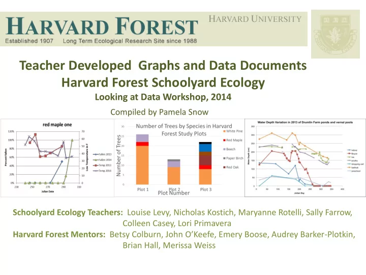

Teacher Developed Graphs and Data Documents Harvard Forest Schoolyard Ecology Looking at Data Workshop, 2014 Compiled by Pamela Snow Schoolyard Ecology Teachers: Louise Levy, Nicholas Kostich, Maryanne Rotelli, Sally Farrow, Colleen Casey, Lori Primavera Harvard Forest Mentors: Betsy Colburn, John O’Keefe, Emery Boose, Audrey Barker -Plotkin, Brian Hall, Merissa Weiss
Graph 1: End of the Growing Season for Red Maple #2 Versus Date of First Frost at Belchertown H.S. from 2008 to 2014 • Description of graph and related data End of Growing Season Compared to table: Graph #1 sets the end of the growing season for Red Maple #2 against a variable Date of First Frost (date of first frost) for analysis. 320 • X Axis: Year 310 • Y Axis: Day of the Year (Julian Date) Julian Date 300 290 • Teacher/Author: Louise Levy End of Growing Season 280 First frost • 270 School: Belchertown High School 260 • Level: 12 th Grade- Environmental Studies 2008 2010 2012 2014 2016 Year • Educational Objectives . To have the class Other notes about this graph and/or data table *2- I examine the data for "their" trees, noting differences in trends for different species and provide instructions for the pencil-and-paper part of the the physiological differences that this reveals. process for graphing the data from one year in order to Also, to help students brainstorm ways of determine the date of the end of the growing season. The making Oak data comparable to the other species. students split up the effort graphing the fall data, paired with the instructions for spring, and an additional step of calculating (subtracting) to reach the length of the growing season. This is the level of detail that allows all levels of students in my class to be successful. See data tables in Addendum.
Graph 2: Fall 2013 Leaf Fall Timing For the West Trees #1-#4 at Belchertown H.S. • Description of graph and related data table: Graph #2 shows a comparison of Leaf Fall of different species in the fall of 2013. • X Axis: Day of the Year • Y Axis: Number of Leaves Fallen • Teacher/Author: Louise Levy • School: Belchertown High School Other notes about this graph and/or data table*1- We discussed an “oak • Level : 12 th Grade- Environmental conundrum” at the data workshop. Using leaf fall data didn't work in comparing oaks Studies and beech to other species because all leaves do not drop on Oaks and Beech. This brings up the physiological differences in Oaks/beech vs others, and the crucial issue that • Educational Objectives : I would how we decide to set up data collection in an experiment can enormously influence the like to further develop micro- usefulness of that data. I do plan to go back through the Fall data for the Oaks to procedures for my students to help generate a "hindsight" data set, with the 2nd day of 100% color defining "fallen" . Going them succeed in graphing/data forward in the future, “fallen” will be defined as brown and curled. analysis of their Buds, Leaves and See data tables in Addendum. Global Warming project data.
Graph 3: Average Diameter At Breast Height (DBH) of Study Trees in Plot One By Species • Description of graph and related data table: Graph #3 shows a comparison of DBH by species using data from all Average DBH of Trees by Species 3 plots. 25 • X Axis: Tree Species 20 • Y Axis: Diameter at Breast Height (DBH) 15 10 • Teacher/Author: Nicholas Kostich 5 • School: Oakmont High School 0 • Level: 9 th Grade- Biology Average DBH Beech Eastern Hemlock Paper Birch Red Maple • Red Oak Unknown White Pine Witch Hazel Educational Objectives: I would like to teach students how to use Excel to graph large data sets. • Other notes about this graph and/or data table *- See data tables 3 and 4 in Addendum
Graph 4 : Number of Trees by Species in each of Oakmont High School’s Three Study Plots • Description of graph and related data table: Graph #4 shows the diversity and abundance of tree Number of Trees by Species in Harvard species in each plot. 30 White Pine Forest Study Plots Number of Trees 25 • X Axis : Plot Number Red Maple • Y Axis : Number of Trees 20 Beech • 15 Teacher/Author: Nicholas Kostich Paper Birch 10 Red Oak • School: Oakmont High School 5 • Level: 9 th Grade- Biology 0 Plot 1 Plot 2 Plot 3 • Plot Number Educational Objectives : I would like students to work with more complex graphing techniques as well as show the students how they can expand a simple bar graph. • Other notes about this graph and/or data table *- See data tables 5 and 6 in Addendum
Graph 5: Leaf Fall and Temperature for Red Maple One at Hollis-Brookline H.S. Over 2 Years • Description of graph and related red maple one data table: Graph shows timing of leaf fall for Red Maple Tree #1 and its 120% 70 relationship to temperature. 60 100% Low Temperature in F • 50 X Axis: Day of the Year (Julian Date) Percent fallen 80% • Primary Y Axis : Percent fallen 40 Fallen 2013 60% • Secondary Y Axis : Low temperature Fallen 2014 30 for the date of data collection Temp 2013 40% 20 Temp 2014 • Teacher/Author: Maryanne Rotelli 20% 10 • School: Brookline-Hollis High School 0% 0 230 250 270 290 310 • Level: 12 th Grade- Ecology Julian Date Other notes about this graph and/or data: Unfortunately our school does not have spring data for 2013 for • Educational Objectives : I want comparison as we only started this study in fall of 2013. Future work students to look at whether or not low could see the students plotting the color change compared to temperatures impact leaf drop rate from temperature and see if there was any differences between the years. one year to another. From personal Additionally the students can compare rates of leaf drop and color observation, the fall of 2014 seemed warmer than 2013. Did the leaves drop change between the different tree species. The other challenge for later? It does appear that some trees’ students is to learn how to graph two different types of data that leaves fell later than 2013. However, we requires use two y-axes. had a late spring in 2014 did that impact the leaf drop rate? Goal is for students to generate questions for which they can use their data to analyze and answer.
Graph 6: Timing of Leaf Fall and Temperature for Red Maple 5 at Hollis Brookline H.S. Over 2 Years • Description of graph and related data table: : Graph 6 shows timing Red Maple #5 - 2013 and 2014 of leaf fall for Red Maple Tree #5 and its relationship to temperature 100% 70 in 2013 and 2014. 90% 60 80% • X Axis: Day of the Year (Julian 50 Low Temperature in F 70% Date) Percent fallen • 60% Primary Y Axis : Percent fallen 40 Fallen 2013 • Secondary Y Axis : Low 50% Fallen 2014 30 temperature for the date of data 40% Temp 2013 collection 30% 20 Temp 2014 20% • Teacher/Author: Maryanne Rotelli 10 10% 0% 0 • School: Brookline-Hollis High 230 240 250 260 270 280 290 300 School Julian Date • Level: 12 th Grade-Ecology • Educational Objectives: See notes for Graph #5.
Graph 7: Timing of Leaf Fall and Temperature on White Birch 6 at Hollis Brookline H.S. Over 2 Years • Description of graph and related data table: Graph 7 shows timing of White Birch #6 -2013 & 2014 leaf fall for White Birch# 6 and its relationship to temperature in 2013 100% 70 and 2014. 90% 60 80% • X Axis: Day of the Year (Julian Date) 50 70% • Primary Y Axis : Percent fallen 2013 Fallen 60% 40 2014 Fallen • 50% Secondary Y Axis : Low temperature 30 Temp 2013 40% for the date of data collection Temp 2014 30% 20 • 20% Teacher/Author: Maryanne Rotelli 10 10% • 0% 0 School: Brookline-Hollis High School 235 245 255 265 275 285 295 305 • Level: 12 th Grade- Ecology • Educational Objectives: See notes from Graph #5.
Graph 8: Timing of Leaf Fall and Temperature for Red Oak Seven at Hollis Brookline H.S. Over 2 Years • Description of graph and related data table: Graph 8 shows timing Red Oak #7 -2013 & 2014 of leaf fall for Red Oak #7 and its relationship to temperature in 2013 100% 70 and 2014. 90% 60 80% • X Axis: Day of the Year (Julian 50 70% Date) 2013 Fallen 60% 40 • Primary Y Axis : Percent fallen 2014 Fallen 50% 30 • Temp 2013 Secondary Y Axis : Low 40% temperature for the date of data 30% 20 Temp 2014 collection 20% 10 10% • Teacher/Author: Maryanne Rotelli 0% 0 235 245 255 265 275 285 295 305 • School: Brookline-Hollis High School • Level: 12 th Grade- Ecology • Educational Objectives: See notes on Graph #5 above.
Recommend
More recommend