Search Engine Research and Color, Design, and Usability CS 115 - PowerPoint PPT Presentation
Search Engine Research and Color, Design, and Usability CS 115 Computing for the Socio-Techno Web Instructor: Brian Brubach Announcements Remote project milestone 2 meetings tomorrow Reading for guest speaker on Tuesday Assignment 4
Search Engine Research and Color, Design, and Usability CS 115 Computing for the Socio-Techno Web Instructor: Brian Brubach
Announcements • Remote project milestone 2 meetings tomorrow • Reading for guest speaker on Tuesday • Assignment 4 updates • Moving Assignment 2 pages to public folder
Search Engine Research and Health Care Discussion
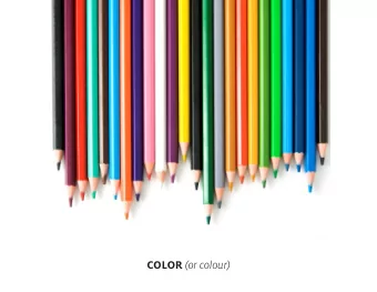
Color
Color theory in web pages • How many colors do you have to choose from with RGB?
Color theory in web pages • How many colors do you have to choose from with RGB? • 256 × 256 × 256 = 16,777,216 • 2 * × 2 * × 2 * = 2 +, = 2 , × 2 +- ≈ 16 × 1,000,000 (CS way to estimate it) • How many should you use? • Too many is disruptive/confusing/ugly • Too few is boring, less ability to emphasize • Color should support the process of conveying information • Look at number of colors and color palette of websites you like • Pause a movie, you’ll see fewer distinct colors than occur in real life
Emotional responses and meaning • Many theories about meanings and responses to colors • Good starting point and structure for new designers • If you find a theory that speaks to you, use it • Examples • Red à strength, passion, energy, excitement • Orange à similar to red, but less aggressive (more “cheerful”) • Yellow à refreshment, energy • Green à nature, health, well-being • Blue à calm, peace, stability, trust • Purple à sophistication, spirituality • White à purity, trust • Black à depth, power, steadiness
Cool/warm • Cool colors à Green, Blue, Violet • Appear distant • Great for backgrounds • Warm Colors à Red, Orange, Yellow • Appear closer • Great for menus
Some other color notes • Red à Most “active” color • The only color that stands up to the contrast of black and white if using only one color • Green à Least “active” color • Yellow à Brightest color • Blue à Darkest color • High readability combinations • Black text on white background • Blue text on white background • Black text on yellow background
More color definitions • Primary colors à Red, Yellow, and Blue (notice not RGB) • Secondary colors à combinations of primary colors • Tertiary colors à between primary and secondary • E.g., red-orange • Hue à pure color (e.g., red, blue) with no white or black added • Shade à pure color with black added, extending from pure hue to black • Tint à pure color with white added, extending from pure hue to white • Tone à pure color with grey added, extending from pure hue to gray • A pure color is at full saturation • As saturation diminishes colors fade to gray
12-hue color wheel
Color wheel classifications • Complimentary Colors • Opposite on wheel • Highest contrasts • Analogous Colors • Close to each other on wheel • Lowest contrast • Harmonic colors • Equally-spaced on wheel • Appealing to the eye • Harmonic dyad à Two complimentary colors • Harmonic triad à Three equally-spaced colors
Color blind accessibility • Always check for color blind accessibility • https://css-tricks.com/accessibility-basics-testing-your-page-for-color- blindness/
Approaches to assigning colors • Approach 1 à Main/Support/Emphasis colors • Main color • Occupies most of the web page area and defines the tone of the web page • Support color • Color close to the main color and that supports it • Can often be an analogous color • Emphasis color • Used to emphasize certain elements of the web page • It contrasts with the Main and Support colors • Suggested à complement of main color or analogous to complement of main color
Approaches to assigning colors • Approach 2 à Monochromatic • A main color is chosen • Use different tints, shades, and saturations of that color • Approach 3 à Harmonic Triad • Select three equidistant colors on the wheel • Colorful and balanced design
Color choosing resources • https://coolors.co/ • http://paletton.com
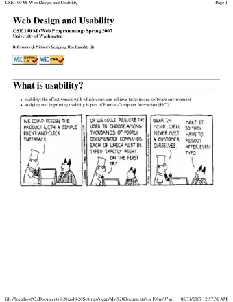
Usability Guidelines
Usability • Measures ease of interaction between user and website • Speed à How fast users can accomplish a task • Includes configuration of the web site and page loading time • Learnability à How easily users learn to interact with the site • Efficiency à How many errors the user makes while completing a task • Memorability à How well users remember how to use the site after learning it • Aided by consistent interface and logical steps for a task • User Preference à How much the user enjoys using the interface
Create Predictable Links • Links stand out from the rest of the text • Visited and unvisited colors easy to tell apart • users want to know what they have visited • Removing underlines from links makes user confuse links with text • Give links descriptive names (not “Click Here” or “Next”) • Indicate where links go (e.g., “Next: Cleaning Instructions”) • If using images for links, distinguish them from the text and indicate that they should be clicked
Use Descriptive Titles • Titles should describe the site associated with them and page user is on • Titles are used as default bookmark names • a descriptive name will help identify each bookmark
Page width and length • Avoid a page width that will force horizontal scrolling • Use relative widths (e.g., percentages) rather than fixed widths • Avoid wide text blocks (e.g., entire width of a desktop screen) • Some recommend at most 75-80 characters or even less • Up to 100-120 characters still common • Avoid long pages should be avoided
Layout • Page layout should indicate exactly how to accomplish the main task associated with the page. • No elements (e.g., ads, graphics, etc.) should draw attention from components that perform the main task
Legibility • Consider font and color • Avoid weird fonts • Smaller fonts can cause trouble • Black text on white background is preferable • Text brightness should be significantly different from background • Remember monitors vary
Cross-platform and cross-browser compliance • Check your pages on Windows, Macs, and Unix OS, using different versions of each possible browser • Do not use browser specific features • Do not assume standard HTML and CSS work the same across platforms
Visual consistency • Pages clearly belong to the same site • Use logos or banners • Keep consistent layout and configuration of elements • Navigation bar is consistent in its placement and appearance • Consistent coloring • If the layout is not consistent, you can use identical colors and shape elements to make pages appear consistent
Navigation
Navigation • Users should be clear about: • Where they will go when selecting a link • Where they are in the site • How to get back to a recognizable starting place
Navigation approach 1: sequential organization • Pages follow a certain order and link to one another in order • Appropriate for… • Describing sequence of steps to complete a task • Telling a story • Presenting chronological information
Navigation approach 2: hierarchical organization • Appropriate for sites with large number of pages • A main page has categories with subcategories, etc. • Users should know their position in the structure
Navigation approach 3: web-based organization • Most common organizational structure • Web-like structure • Does not force one of the organizations previously discussed • Pages link to one another based on content • A page could be accessible only from one particular page • A page can connect to many pages
Other resources • The Design of Everyday Things by Don Norman • Great general design guide (not about web design)
Recommend


More recommend
Explore More Topics
Stay informed with curated content and fresh updates.