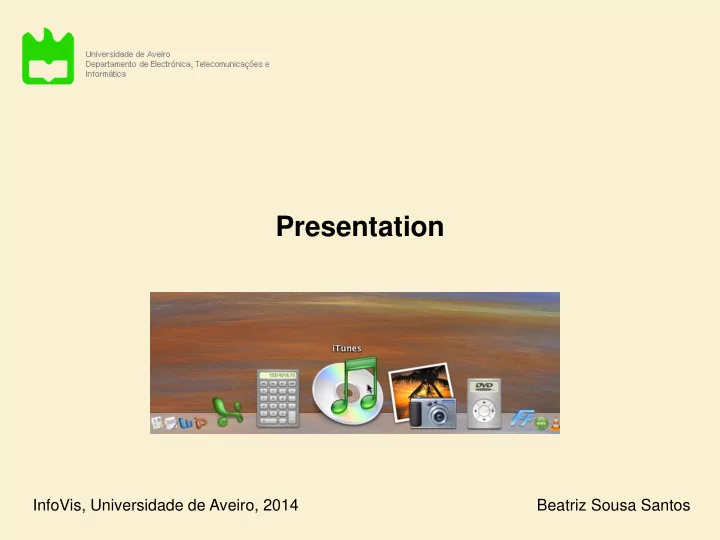
Presentation InfoVis, Universidade de Aveiro, 2014 Beatriz Sousa - PowerPoint PPT Presentation
Presentation InfoVis, Universidade de Aveiro, 2014 Beatriz Sousa Santos A problem In some situations everything relevant must be to hand ! Support for report preparation. Many sources of content are visible and ready to hand (Spence, 2007)
Presentation InfoVis, Universidade de Aveiro, 2014 Beatriz Sousa Santos
A problem In some situations everything relevant must be to hand ! Support for report preparation. Many sources of content are visible and ready to hand (Spence, 2007) Visibility acts as a reminder and spatial memory
The presentation issue • The issue of layout is important due to the limited screen real estate • Irrespective of how data may be represented decisions have to be made: – how the representation is to be displayed – whether it is to be displayed
Space limitations – Scrolling – Overview + detail – Distortion – Suppression suppression + distortion – Zoom and pan
Time limitations – Rapid serial visual presentation – Space and time resources – Presentation modes – Manual control
7.1 A PROBLEM Many of us have found ourselves with a report that has to be completed by a deadline, with the result (Figure 7.1) that the dining room table, extended to its 12- guest state, is covered by piles of paper as well as reports, books, clippings and slides; perhaps with more arranged on the floor and on a couple of chairs. • Scrolling is an obvious solution when a document is There may even be piles on top of piles. Such a presentation of vital information makes a lot of sense: everything relevant is to hand (hopefully!) and, moreover, its very visibility acts as a reminder (Bolt, larger than the display area 1984, page 2) of what might be relevant at any particular juncture, possibly triggering a situated action (Suchman, 1987). In this environment I can concentrate on creative tasks rather than organisation. Despite the availability of high-resolution displays and powerful workstations I still write most of my reports in this way. Why? Because the display area provided by the typical workstation is far too small to support, visibly, all the sources that are relevant to my composition. 7.2 THE PRESENTATION • A long document can be moved past a “window” PROBLEM I am not alone in the sense of having too much data to fit onto a small screen. A very large and expensive screen, for example, would be needed to display the London Underground map in sufficient detail(Figure 1.1), and it would be difficult or impossible to present, on a normal display, the complete organisation chart of IBM or ICI. Moreover, the recent emergence of small and mobile information and communication devices such as PDAs and wearable displays has additionally identified a pressing need for a solution to the ‘ too much data, too little display area’ problem: the presentation • Often it is not a satisfactory solution problem . How can it be solved, mindful of the need to support the activity of visualising the underlying data? 7.2.1 Scrolling An obvious solution is to scroll the data into and out of the visible area. In other words, to provide a means whereby a long document can be moved past a window until it reaches the required ‘page’ (Figure 7.2). This mechanism is widely used, but carries with it many penalties. One relates to the "Where am I?" problem: I’m working on Chapter 2, (it may be section 2.3, I don’t know) • Scrolling hides most of a document: and I want to remind myself of a figure that is in chapter 5, it may be in section 5.3 – or was it 5.6? All I can do is operate the scrolling mechanism and look out for the figure I need, albeit assisted by various cues such as the page number indicated in the scrolling mechanism. With a scrolling mechanism, most of a document is hidden from view. I have the same problem when using a there is not a view of context as well as detail microfilm reader, with the additional complication that if I move the tray to the left, the image moves to the right. A similar difficulty applies to my use of the famous London ‘AtoZ’ street directory. I’m driving along a road that goes off the edge of the page, so I desperately need whatever page contains the continuation of that road (and quickly!). Even if I get it, I will typically have trouble locating the same road on the new page. These and other similar problems can be ameliorated by the provision of context . Much of this chapter, in fact, is concerned with deciding how to provide context .
• Two separate views of detail and of context can be combined in a overview + detail view “You are here”
Another example Detail plus Overview. Miniatures of pages of a pdf document provide useful context while attention is paid to detail of one page (Spence, 2007)
• In DragMag (Ware and Lewis, 1995) a small region of interest a context map can be flexibly positioned to provide a magnified view DragMag used with satelite imagery http://www.ibiblio.org/openvideo/video/chi/chi95_03_m1.mpg • The use of a magnifying glass masks detail around the magnified region: the focus + context problem
• Distortion offers a way of solving the focus + context problem (a) An information space containing documents, emails, e • The bifocal display (Spence and Apperley, 1982) is based on a simple metaphor direction of view • Part of an information space can be (b) The same space wrapped around two uprights. viewed in detail; a bird’s eye view is provided of the remainder http://www.youtube.com/watch?v=DaF5brrdpJw http://www.youtube.com/watch?v=gNTQaH8MM98&NR=1 (c) Appearance of the information space when viewed from an appropriate direction
An early illustration of the Bifocal display principle (Spence, 2007) http://www.youtube.com/watch?v=RN3Z4XojDP4
Application example: Distortion generated without discontinuities (Spence, 2007) A sequence of amino acids within a protein: - each letter refers to an amino acid - color denote an attribute The one dimensional long sequences encode three dimensional information The user needs to be aware of the complete sequence when comparing it with other representations of the protein
The Table Lens (Rao and Card, 1995) - without distortion; - with distortion (expansion) to show names http://www.youtube.com/watch?v=qWqTrRAC52U
• This simple but powerful concept can be generalized X-distortion • It is possible to use X and Y distortion July Mar April May June Aug Sept Oct 11Sun Check slides, notes. Family barbeque 12 Mon Fly LA Kathy to airport Model Maker 13 Tue 14 Wed 15 Thur 16 Fri X and Y -distortion Flight to SFO Tutorial set-up Tutorial United flight Heathrow Pointer Color OHs Jane+John Call Kathy 17Sat Fly LHR Kathy to collect Chapter 2/ see Dave March Calendar interface using X and Y distortion (Bederson et al., 2003, 2004)
Examples of continuity across the boundary of the distorted region (Spence, 2007) http://www.youtube.com/watch?v=FDYo9uvrNJ0&NR=1
Equal X- and Y-distortion centred around a manually chosen location in the Macintosh OSX ‘dock’ (Spence, 2007) (Spence, 2007) Distorted map on a Table http://www.youtube.com/watch?v=m0LNHtRbaCA&NR=1
The Perspective Wall applies a 3D effect to the Bifocal Display (Mackinlay et al.,1991) http://www.youtube.com/watch?v=hYUZbrWtCZg
• Furnas proposed a Degree of Interest (DoI) to determine which data should be represented and presented and which should not • The Degree of Interest of any item is expressed as a function of: – A priori importance (API) – Distance (D) between that item and the item which is currently the user’s focus of interest
Example (Spence, 2007) 3- The context defined by setting an upper threshold of unity for distance from a focus Considering only Distance : 1-The organization tree of a company Context President S Focus S P P K M N N K M F G 4- Display that might be associated with the focus and context defined 2- Distance ’D ’ of each node from the focus of attention 2 1 3 3 Focus P 2 2 4 4 1 1 1 2 2
10 9 9 9 Considering a priori importance: Each node in the organization tree 8 has been assigned an API 8 8 8 8 7 7 7 6 6 8 Context 8 6 6 Nodal values of Degree of Interest : 8 DoI =API – D Focus 6 6 4 4 Setting a lower limit of 6 for DoI identifies 6 the nodes within the shaded region 6 6 4 4
Example: Part of an engineering drawing The engineering drawing simplified in the context of a suspected fault (Spence, 2007)
Suppression finds valuable application in the Magic Lens (Stone et al., 1994) Magic Lens: (a) shows a conventional map of an area, (b) shows the location of services (gas, water and electricity pipes) (c) a (movable) Magic Lens shows services in an area of interest, in context (Spence, 2007)
A molecular surface of the protein transferase colored by electrostatic potential bound to DNA shown as a schematic. (ID = 10mh). The magic lens window allows a view of the atomic structure bonding to be shown, with the bound ligand structure highlighted as cylinders, thereby providing a view inside the protein (Spence, 2007)
The Magic Lens in Augmented Reality for Data Visualization http://www.youtube.com/watch?v=3zIq_qb8CSE&NR=1
(Spence, 2007) A combination of distortion and suppression can be beneficial It is a map appropriate to a journey from one city to another This example uses the concept of rubber sheet distortion detail distortion
1 2 3 Panning is the smooth movement of a viewing frame over a 2D image
Recommend
More recommend
Explore More Topics
Stay informed with curated content and fresh updates.










![[SLIDE] So, there I was, sitting at my desk earlier this year getting on with my work when an](https://c.sambuz.com/146619/slide-s.webp)
