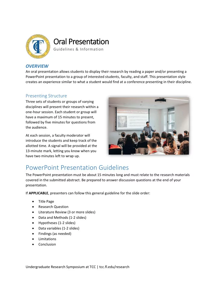

Oral Presentation Guidelines & Information OVERVIEW An oral presentation allows students to display their research by reading a paper and/or presenting a PowerPoint presentation to a group of interested students, faculty, and staff. This presentation style creates an experience similar to what a student would find at a conference presenting in their discipline. Presenting Structure Three sets of students or groups of varying disciplines will present their research within a one-hour session. Each student or group will have a maximum of 15 minutes to present, followed by five minutes for questions from the audience. At each session, a faculty moderator will introduce the students and keep track of the allotted time. A signal will be provided at the 13-minute mark, letting you know when you have two minutes left to wrap up. PowerPoint Presentation Guidelines The PowerPoint presentation must be about 15 minutes long and must relate to the research materials covered in the submitted abstract. Be prepared to answer discussion questions at the end of your presentation. If APPLICABLE , presenters can follow this general guideline for the slide order: Title Page Research Question Literature Review (3 or more slides) Data and Methods (1-2 slides) Hypotheses (1-2 slides) Data variables (1-2 slides) Findings (as needed) Limitations Conclusion Undergraduate Research Symposium at TCC | tcc.fl.edu/research
Preparing a PowerPoint Presentation General Tips Take time to practice going through the entire PowerPoint multiple times You are allowed note cards to assist in your presentation; if needed, make short bullet-point notes to help you remember what you want to say Make eye contact with the audience during your presentation Speak slowly and project your voice Use the podium as needed Slide Design Tips The following tips/suggestions have been prepared to help improve the effectiveness of oral communication: You have the freedom to display your research materials in various forms of text, figures, charts, schematics, and photographs, as long as all media is readable/visible from at least 6 feet away. The PowerPoint should provide enough material to explain the research to an audience that has limited knowledge of your topic. The content should stimulate discussion and initiate questions. You can use different font sizes and colors to draw attention. Use high-resolution photographs. Avoid overwhelming viewers with too much information. Be clear and concise in all statements. Undergraduate Research Symposium at TCC | tcc.fl.edu/research
Please use the following list while creating your PowerPoint and then double check this list after you complete it. We will use these points to assess your PowerPoint. Layout and formatting: � The number of slides for my presentation (i.e., approximately 1 per minute) is correct. � My slides have a dark background (black, navy blue, burgundy etc.). � My slides have light font (white, beige, etc.). � My slides have sufficient contrast between the background and the text to be easily read by the audience. � I used no more than three colors for the text and headings in my PowerPoint slides. � I avoided using colors that cannot be distinguished by people who are color blind (i .e. red/orange and green combinations) and colors that may be misinterpreted by audience members (e.g., UF's blue and orange; FSU's garnet and gold; Christmas red and green). � The font on my PowerPoint a is a san serif font (e.g., unadorned like Arial, Calibri, Courier, Franklin Gothic, Lucida), not a serif font (e.g., adorned like Times New Roman, Baskerville, Bookman, Garamond, Georgia) � The text is mostly in bullet form with minimal use of full sentences and paragraphs (unless paragraph s are appropriate for my disciplines- such as literature, history, etc.). � There are no more than 6 bullet points per slide. � The smallest font on my slides is 20-pt. � The title can be easily read from across a room (e.g., 44+ pt. font). � Authors' names are prominent on my first slide. � There are sufficient graphics (e.g., pictures, graphs, illustrations, diagrams, etc.) and text to appeal to all audiences (optimally about 50% images and 50% text depending on the discipline). � My graphics and images are not pixilated (original image is large enough not to look as if it is made of large square dots - usually 1000 x 1000 or larger). � My graphics and images are not distorted (stretched disproportionally wide or tall - out of proportion). � My graphics are two-dimensional, simple, and can be easily understood (no unnecessary gridlines, labels, shadows). � I created my graphs within the PowerPoint slide; I did not import a picture of a graph or a graph from another program. � I have eliminated redundant information and pictures that do not communicate important information. � I organized information within my slides in a logical, sequential, and discernable order. � My slides are aesthetically appealing (color and layout). � My presentation is focused on a small number of main ideas. � The language I use on my slides is accessible to my anticipated audience. � I used capital and lower-case letters appropriately (not all caps or all lower-case). � I have used one simple type of animation (e.g., appear/disappear , fade in/fade out) to direct my audience's attention to information on the slide.
Recommend
More recommend