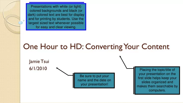

Presentations with white (or light) colored backgrounds and black (or dark) colored text are best for display and for printing by students. Use the largest sized text whenever possible for easy and clear viewing. One Hour to HD: Converting Your Content Jamie Tsui 6/1/2010 Placing the topic/title of your presentation on the Be sure to put your first slide helps keep your name and the date on slides organized and your presentation! makes them searchable by computers.
Always try to Learning Objectives provide a title for each slide At the end of the session, learners will be able to: List learning objectives and keywords on Understand the benefits of HD and 16:9 presentations your second slide to set the context of your Create a new 16:9 presentation in PowerPoint. presentation, and to make it more easily Convert their existing 4:3 presentation to 16:9 format. searchable. Keywords: PowerPoint, presentation, ppt, 2003, 2007, 2010 *** Referral for person/handout that can write good objectives.
Benefits of HD: Slide Layout Ideas
Oligodendrocytes • Each myelinates many axons. • Also approach closely to neuron cell bodies. node of Ranvier oligodendrocyte Because of the wide format for HD, you have lots of room to axon display your content. Try Cite images as organizing your content into two necessary. columns whenever possible, with text on one side, and myelin images/videos on the other. CM 138(1)
Node of Ranvier Sympathetic Ganglion Label images whenever possible. Low resolution images will appear blurry when stretched to fit your high resolution PowerPoint
Although you have a lot of space for Cases your presentation with the wider format, avoid over-filling the area with walls of text that may be hard to read. Case 1: The patient is a 45 year-old male who presents with rapidly progressive leg weakness. Yesterday, he noticed the onset of vague, but persistent tingling in his distal lower extremities. When he went to bed last night, he did not perceive any weakness. This morning he noticed that both legs were "rubbery" and definitely weak. As the day has progressed, his weakness has worsened. It is now 3 p.m. and he last urinated 8 hours ago. About 14 days ago, he had a flu-like illness. His past medical history is otherwise unremarkable. On examination, he is afebrile. BP 130/85, pulse 90 regular, respirations 16. His general medical examination is normal. The neurologic examination is remarkable for 4/5 weakness in all muscle groups of both lower extremities, and absent muscle stretch reflexes in all areas. The sensory examination is normal, except for subjective tingling in his toes. Babinski's sign is not present. Case 2: A 20 year-old male presents with a 2-day history of left-sided facial weakness. He awoke yesterday morning and noticed that the left side of his face was "drooping." He also noted an unpleasant tingling sensation over the left side of his face, although he denies numbness. The weakness has worsened since he first noticed it, and he now has a mild headache. T oday he has pain in his left ear. His past medical history is unremarkable. On exam, his temperature is 37.5. His vitals are otherwise normal. The general examination is remarkable for a few vesicular lesions in the left external auditory canal. The neurologic examination shows moderate weakness affecting the left frontalis, orbicularis oculus, orbicularis oris, and platysma. All muscles are equally weak. Sensation over the face is normal. Screening examination of audition demonstrates hyperacusis affecting the left ear.
Font Size Comparison 72 60 48 - Titles 36 - Headings 24 – Text – Minimum recommended font size. 18 14 12 10 8
Benefits of HD: Increased Resolution
Low-Res to High-Res Image Comparison The following slides provide comparison of low 1080 pixels high resolution images vs. high resolution images when displayed on a high resolution (1920 pixels wide by 1080 pixels high), widescreen (16:9 aspect ratio) PowerPoint presentation. In general, we recommend using at least 3 megapixel images for full-screen image slides. 1920/1080 = 16/9 1920 pixels wide
Try to use high resolution images Note the black bars that whenever possible. Otherwise, your appear when you use a image will appear blurry when 4:3 aspect ratio image in stretched to fit your high resolution a 16:9 aspect ratio PowerPoint presentation. presentation. Low-Res 1024x683 (0.7 Megapixel) Low-Res 1024x683 High-Res 2808x1872 (5 image stretched to fit 1920x1080 image stretched to fit Megapixel) image shrunk to fit 1920x1080 presentation presentation 1920x1080 presentation
Note that there are no black bars when the aspect ratio of the image matches the aspect ratio of the presentation (16:9). Low-Res 1024x573 (0.6 megapixel) Medium-Res 1712x958 (1.7 image fitted to 1920x1080 megapixel) image fitted to presentation 1920x1080 presentation
Ultra High-Res 5616x3744 Ultra High-Res 5616x3744 Ultra High-Res 5616x3744 Low-Res 333x500 (0.2 Super Low-Res 160x240 (21 megapixel) image fitted (21 megapixel) image fitted (21 megapixel) image fitted (0.04 megapixel) image megapixel) image fitted to presentation to presentation to presentation to presentation fitted to presentation
Creating A New 16:9 PowerPoint
How to Create a New 16:9 PowerPoint Select “ File ” then “ New ” PowerPoint 2007, 2010: ◦ Select “ Design ” tab, then “ Page Setup ” ◦ Select “ Slides sized for: On screen Show ( 16:9 ) ” PowerPoint 2003: ◦ Select “ File ” then “ Page Setup ” ◦ Select “ Slides sized for: Custom ” ◦ Enter Width: 10.0 inches ◦ Enter Height: 5.63 inches ◦ Set orientation to Landscape
New 16:9 PowerPoint Slide
Using the School of Medicine T emplate Alternatively, we recommend that you download the School of Medicine PowerPoint template from: http://med.stanford.edu/irt/teaching/gohd Simply open the PPTX file, and start creating your presentation – it is automatically formatted in wide HD format, and offers many customized School of Medicine slide templates. Requires PowerPoint 2007 or PowerPoint 2010.
Benefits of Using the SoM T emplate The SoM template: ◦ has many predefined slide layouts that you can use to quickly build your presentation, including predefined image placeholders. ◦ follows OME guidelines for including a title slide (with name, date, and title placeholders) and a learning objectives slide (with learning objectives and keywords placeholders) ◦ follows OME guidelines for dark text on a light background, which allows students to mark up printed slides, saves ink when printing, and displays better in videocapture.
School of Medicine T emplate
Converting Your Existing 4:3 Presentation to 16:9
How to Convert Your 4:3 PowerPoint to 16:9 Converting your existing 4:3 PowerPoint to 16:9 is a slightly different process. There are two methods to convert your existing 4:3 presentation to 16:9. ◦ Manual Method (Recommended): Make a copy of your existing 4:3 presentation, convert the copy to the 16:9 format, adjust and reposition the distorted images. Works for PowerPoint 2003, 2007, 2010, and Keynote. ◦ XML Method: Edit a hidden setting within your presentation’s XML file. Works for PowerPoint 2007+. Contact EdTech for help.
Manual Method Pros: ◦ Simple and intuitive. ◦ User controls final layout. ◦ Works with any version of PowerPoint. ◦ Keeps relative arrangement of text and images. Cons: ◦ Can be time consuming if you have a lot of images. Expect to take about 15-20 seconds per image in your presentation, or about 10-15 minutes for your entire presentation.
Manual Method (cont.) Make a copy of your 4:3 PowerPoint file with a different name (e.g. MyPresentation16-9.ppt). On your 16:9 PowerPoint, ◦ For PowerPoint 2003: Select “ File ”, then “ Page Setup ” ◦ For PowerPoint 2007, 2010: Select “ Design ” then “ Page Setup ” ◦ Enter Width: 13.33 inches ◦ Enter Height: 7.5 inches (should be by default) ◦ Set orientation to Landscape
Manual Method (cont.): Images Stretched Change Page Setup from 4:3 to 16:9 Stretched 16:9 – Original 4:3 Pictures are stretched
Manual Method (cont.): T ext and Images Change Page Setup from 4:3 to 16:9 Stretched 16:9 – Text moves Original 4:3 relatively with shapes/images
Correcting the Image Distortion There are many ways to correct the distorted images. The primary technique we recommend is the: Format Picture T echnique
Manual Method: “Format Picture” PPT 2003 Format Picture Method for PowerPoint 2003: ◦ Right click on the image, and select “Format Picture” ◦ Select “Size” tab • Uncheck “Lock Aspect Ratio” box • Change the “Width:” percentage to equal the “Height:” percentage • Check the “Lock Aspect Ratio Box” Shortcut: Click the up arrow once on “Height:”, and then click the down arrow once on “Height:”. ◦ Click the “OK” button to save. ◦ Reposition or resize (drag corner) image if necessary.
Recommend
More recommend