
Leaflets: Consumer’s perspective European Medicines Agency London, 23 February 2011
Problem Is it’s role being fully fulfilled? – Too much technical information – Small letters Is there a possibility for improvement?
Objective – To Improve medicines’ leaflets
Methodology
How can we do this? We have to know what consumer’s preference is and ask some questions : – What is a good font size and leaflet size? – What are the aspects that improve reading? – Other questions – Focus Group.
Methodology 2 phases • 1 -we chose thirteen OTC drug leaflets and submitted them to two focus groups. according with the results of the first phase • 2 - we produced new leaflets and submitted them to the appreciation of other two focus groups. Each focus group had 8 participants 1h30
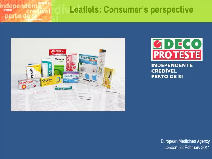
Chosen leaflets Good font size, general advice in the Small leaflet, good font size, general advice beginning in a box , index in the beginning Watermark in the background, general Use of Bold in the text, index, general advice in the beginning, index, small leaflet advice in the beginning
Chosen leaflets Posology in a table, titles with shading,index, general advice in the Name of the drug in several countries, index, beginning in a box, adverse effects by general advice in the beginning frequency Leaflet in one column, use of bold, general Titles on the left side in a bar advice in the beginning, index
Chosen leaflets Titles in colour, body text in black, Text in blue, posology in a table , scheme small leaflet, box with general on how to open the blister information at the beginning Titles and subtitles clearly divided: with Small leaflet, titles in colour, body text shading (titles) subtitles in bold. Titles in black, titles in a question format and subtitles in a question format
Chosen leaflets Leaflet in a booklet format
Results
1st Phase Leaflets were seen as a safety factor Leaflets could be read integrally or just scanned. – The characteristics of the leaflet could facilitate or inhibit the reading
1st Phase Promoters Short Less technical language Good layout: – big font size, – more text spacing, – colour
1st Phase Inhibitors Long leaflet Technical language Less friendly layout – small characters, – text without a good spacing, – excessive use of bold “ (Nurofen) I don’t want to read it. Too big, font size is too small, no spacing between lines and between paragraphs. I would have given up”
1st Phase Overall the information presented in the leaflets is seen as : – too technical – difficult to read and understand by a lay person. The majority of leaflets have a visual presentation that doesn’t invite it’s reading or is even an obstacle to the reading
1st Phase Good Leaflets Be Clear (the information should be readable) The language should be simple and accessible (with common language and without technical terms) The size and quantity of information play a great role – Bigger leaflets are always rejected (Nurofen) – Smaller leaflets tended to be preferred ( Ilvico, picolax) – Leaflets with an intermediate size could be preferred if the language is clear and the information is well organized (Mebocatuss).
1st Phase Good Leaflets Have Good titles with highlights and bolds Should guide the reader, - highlights of irrelevant information are an element of confusion Have a Good organization with clear separation of the main subjects – The organization by themes and sub-themes is not always clear e.g. interaction with other drugs within the title of contra-indications.This feature was also found in our study of 2007
1st Phase Good leaflet s Font size – Is essential for reading, – a very small font size complicates and could discourage its reading Spacing between lines – A compact text is seen with distaste – Spacing makes the reading easier and organizes the information
1st Phase Good leaflet s Have Titles in a question format – Is not essential. However, it is an instrument which makes the leaflet more accessible specially if the leaflet is big Have a Posology in a table – it seems essential to use tables because the information is easier to see e.g. which dose for which user
1st Phase Good leaflet s Colours – Black is the colour indicated for the body text because it is easier to read – use of other colours in the titles facilitate its highlight and makes the leaflet visually attractive – It seems that light colors are preferred ( Ilvico, Mebocatuss) Sentences – shouldn’t be interrupted when there is a change of the page or column – Short
1st Phase Information Have Adverse effects by incidence Is not considered to be essential, but could help to better understand the risks of the drug, particularly when there are many adverse effects Have the Name of the drug in other countries Is not essential, but could be put in a section of other information, that consumers see as an optional reading Have a free phone line tool Is a consumer’s suggestion, seen as a safety factor
1st Phase Information hierarchy Have an Hierarchy of information according to importance 1. Therapeutical indication, 2. Contra-indications, 3. Posology, 4. Adverse effects, 5. Other informations . 6. Name of the manufacturer should be one of the last features on the leaflet, 7. Composition (some consumers)
2nd phase Size of the leaflet matters! so we reformulated two leaflets with different sizes within the preferred ones (Ilvico, Mebocatuss). – according to the findings of the first phase
2nd Phase 13 leaflet proposals were printed in regular paper with an A5 format. New leaflets were compared with the original ones .
Leaflets were changed according to the following characteristics: Language (revision, to make the texts clearer); Change the order of information; Organize the information by contents with titles and subtitles e.g. precautions title and precautions to pregnant in a subtitle; Titles in a question format Posology in a table Bigger line and characters spacing Bigger font size Highlights on titles and sub-titles Titles in colour and body text in black Few bolds Lateral bar 1 and 2 columns Index
Proposal 1 Same hierarchy
Proposal 2 Same order Adverse effects by Frequency (explanation) bold (incidence) Mebocatuss Posology table inline with the text
Proposal 3 Same order General recommendations in a box in the beginning of the leaflet
Proposal 4 Hierarchy •Adverse effects are better explained by frequency •Therapeutical indications •and in bold (incidence) •Posolgy + if I forgot to take •Contra-indications •Adverse effects •Posology table inline with the text •Precautions •Composition • Active principle&other ingredients •Interaction with other drugs •Overdose •Storing •Other recommendations •Manufacturer
Proposal 5 Hierarchy •Therapeutical indications •Identification (active principle) •Adverse effects are better explained •Posolgy + if I forgot to take •Contra-indications by frequency and in bold (incidence) •Adverse effects •Precautions •Interaction with other drugs •Overdose •Storing •Other ingredients •Recommendations •Manufacturer
Proposal 6 Hyerarchy •Therapeutical indications •Contra-indications •Posolgy + if I forgot to take •Adverse effects •Precautions •Interaction with other drugs •Overdose •Composition -active principle & other Ing. •Adverse effects by frequency explain better •Storing and in bold (incidence) •Recommendations •Manufacturer
Lateral Bar
2nd Phase Ideal leaflet Small or medium size; Big font size; Good spacing between characters and lines; Good division in titles and subtitles, preferably with colour and with highlights; Bullets when there’s a list; Posology in a table; Body text in a black color;
2nd Phase Ideal leaflet Sentences without interruption at the end of the column or page; General recommendation in a box in the begging of the leaflet; Titles in a question format; Index; Technical terms explained in a common language; Maximum duration of treatment; Following the order
2nd Phase Order preferred was: Drug identification; Therapeutically indications; Contra-indications (because its reading is mandatory and increases patient safety); Posology; Adverse effects; Precautions; Other informations.
Thank you!
Recommend
More recommend